Tile Bar
The TileBar control is a bar with tiles that support the dropdown functionality. The TileBar consists of tiles (TileBarItem objects) arranged in a single row. Any tile can be associated with a dropdown control via the TileBarItem.FlyoutContent property. In this case, this tile displays a dropdown button used to invoke the dropdown control.
You can assign any control to the TileBarItem.FlyoutContent property, including another Tile Bar control. In this case, when you click an item’s dropdown button, another Tile Bar is displayed in a dropdown window.
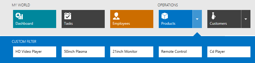
For a Tile Bar control displayed in a dropdown, set the TileBar.ItemColorMode property to Inverted to achieve a tile color different from the TileBar’s background.
Tiles in the Tile Bar can be of different widths. Use the TileBarItem.Size property to specify the item size.
See the following examples to learn more: