Layout Management
- 4 minutes to read
This section contains layout management solutions that help you build application layouts of any type and complexity – from simple flow layouts to complex data entry forms and Visual Studio-inspired Dock Window interfaces.
Note
Controls and components for creating Windows Modern-inspired application layouts are gathered separately in the Windows Modern UI section.
Dock Layout Manager
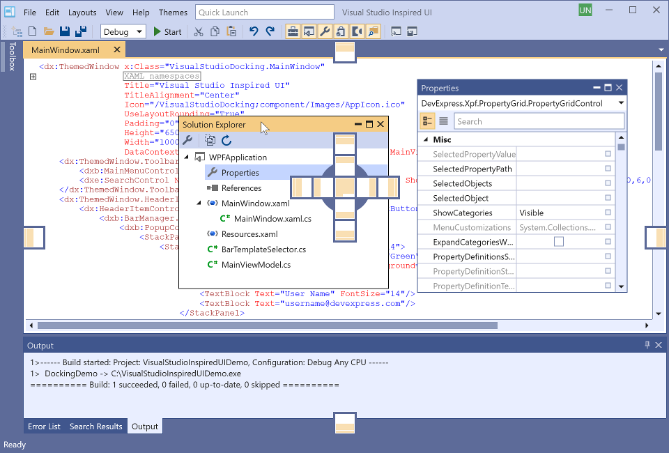
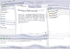
The Dock Layout Manager component solves two tasks at once: it implements a docking UI and builds a control layout. With this control, you can emulate the Visual Studio UI. This component includes the following features.
- Visual Studio-style docking hints
- Tabbed containers
- Drag & Drop support
- Closed panels toolbar
- Float state settings
- Automatic splitter availability
- Auto-hide containers
- User customization options
- Built-in context menu
- Layout persistence
- Multiple monitor support.
Tip
Topic: Dock Layout Manager
Tile and Layout
The following controls allow you to create customizable and persistent control layouts:
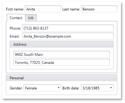
Layout Control
The Layout Control allows you to generate windows and pages with a wide variety of layout scenarios. The Layout Control maintains a consistent layout of child controls, so that they never overlap when the window is resized, when controls are added or removed, or when the font settings of the controls are changed.
The Layout Control includes the ScrollBox, which is a tiny container that positions its child controls absolutely and displays the scroll location within the page.
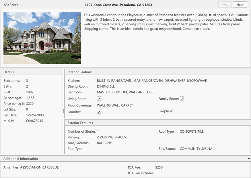
Data Layout Control
The Data Layout Control is a data-aware version of the Layout Control that generates a layout based on the data source.
Tile Layout Control
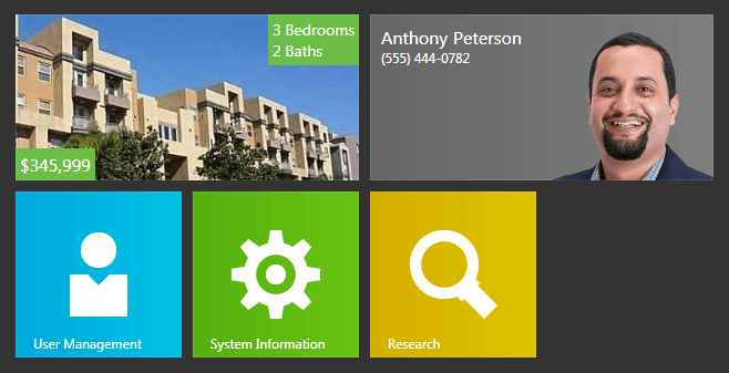
The Tile Layout Control allows you to build a layout of tiles that support grouping and content animation.
Dock Layout Control
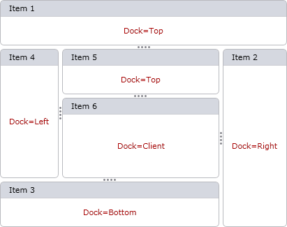
The Dock Layout Control hosts any UIElement object. Your users can dock these elements to any edge of your application, or make them occupy the control’s remaining region.
Flow Layout Control

The Flow Layout Control accepts all UIElement objects and arranges them one after another in rows or columns.
Tab Control
A control that implements a tabbed layout of items and supports the following features:
- Multiple Views that affect the control’s layout, behavior, and style.
- Customizable header position, alignment, and orientation.
- Adding and removing tabs at runtime.
- Built-in integration with the ThemedWindow.
- Extended styling capabilities.
Tip
Topic: Tab Control
Workspace Manager
A component that helps you save and restore an application’s control layout. You can create multiple states (or layouts) for visual controls and then use the Workspace Manager to switch between them at runtime. You can use it with any DevExpress visual control that supports serialization (Bar Manager, Dock Layout Manager, Data Grid, and many more). The target visual control may also contain other serializable DevExpress controls as children.
Tip
Topic: Workspace Manager
Carousel
A control that arranges any visual elements along the specified path and allows you to cycle through these elements, applying animation effects.
- Control how any dependency property value changes along the movement path.
- Specify additional animations for element transitions.
- Customizable navigation path.
- Fully customizable Carousel content.
- Easily build 3D-like Carousel views.
- A pre-built navigation control.
- An easy way to build advanced layouts such as a Book View or an iPod style Album Cover Flow.
- Can be used as a panel in any ItemsControl. We also provide our own CarouselItemControl to simplify typical data visualization requirements.
Tip
Topic: Carousel
Book Control

Uses a book metaphor to display information on screen. This control displays data records as book pages and includes a life-like page turning UI. To navigate contents within the book, you “drag” individual pages to one side or the other. You can populate individual pages with info using content templates and bind the control to data, so that each page represents a single record.
Tip
Topic: Book Control