Menus
- 4 minutes to read
You can provide your applications with various context menus of different appearances and functionality. This document demonstrates how to implement and customize these menus.
Menu Types
There are three available types of context menus/popup controls.
- Popup Menu - a regular popup menu.
- Radial Menu - a Microsoft Note 2013 inspired pop-up menu in which items are arranged in a circle.
- Popup Control Container - a control container that supports the popup functionality.
You can display a menu in one of the following approaches:
- Use the BarManager.DXContextMenu attached property to associate your menu with the desired UI object. The menu is automatically displayed when an end-user right-clicks the related control. To manually invoke a menu associated with the targeted UI element, call the static BarPopupBase.ShowElementContextMenu method.
- Call the BarPopupBase.ShowPopup method to show the menu relative to the specified UI element. Use this approach in case you do not want to explicitly associate your UI objects with specific menus.
Popup menu and popup control containers can also serve as drop-down controls for BarSplitButtonItem objects.
Popup Menu
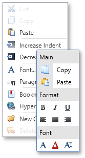
A popup menu is an instance of the PopupMenu class. This menu displays bar items and links, added to its PopupMenu.Items collection.
By default, all links within a popup are arranged in a single column. You can split them in multiple columns by doing one of the following:
- Use the PopupMenuBase.MaxRowCount property to limit the number of rows.
- Set the PopupMenuBase.MultiColumn property to true. Then you can limit the height of each link column by using the PopupMenuBase.MaxColumnHeight property.
To visually separate neighboring links, add BarItemSeparators between them. Another option is grouping your links into BarItemMenuHeader containers. These containers display their captions, so you can create named groups for your links. Moreover, you can apply different layout for each menu header by using the BarItemMenuHeader.MinColCount property.
Tip
Radial Menu
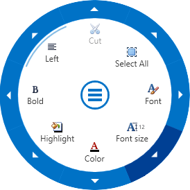
Radial menu is a popup menu inspired by Microsoft Note 2013. These menus are represented by objects of the RadialContextMenu class.
Same as for regular popup menus, radial menus display bar items and links. To populate a radial menu in XAML mark-up, define required items and links between the menu’s opening and closing tags. To do the same in code, use the PopupMenu.Items and PopupMenu.ItemLinks collections.
By default, first radial menu item is displayed within the first sector. Sectors are indexed clockwise starting from zero at midnight. Use the RadialContextMenu.FirstSectorIndex property to specify which sector should display the first menu item. You can also leave one or multiple sectors empty. To do so, set the RadialContextMenu.MinSectorCount property to a number greater than the amount of items, displayed by this menu.
In the middle of a radial menu sits the button that expands or collapses this menu. When a menu is collapsed, this button is the only visual element that remains visible to end-users. By default, when end-users invoke a radial menu, it expands automatically. You can toggle the RadialContextMenu.AutoExpand property value in order to change this behavior.
To create a multi-level radial menu, add BarSplitButtonItem objects to the menu’s item collection. When end-users click these sub-menus at runtime, the radial menu replaces its initially visible items with child items, owned by the clicked button. At the same time, the central expand\collapse button becomes replaced by the back button. End-users can click this button to navigate back from sub-menus to their parent containers.
Tip
Popup Control Container
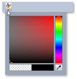
A container that can host other controls and supports the popup functionality. Represented by the PopupControlContainer class instance in code.
To specify a content for a popup control container, use the PopupControlContainer.Content property. In this example a popup control container hosts a color picker dialog and serves as a drop-down control for a BarSplitButtonItem object.
Note
Visual Studio has a design-time issue that may cause an exception in an XAML file when you initialize a property with a PopupControlContainer object. If this is the case, initialize this property with the PopupControlContainerInfo object instead. The PopupControlContainerInfo creates a corresponding PopupControlContainer internally and has the same settings as the PopupControlContainer.
Tip
Example: How to: Create a BarSplitButtonItem