DropDownButton
Overview
The DropDownButton control is a button that displays a dropdown window on click.
The DropDownButton control offers the following features.
Custom dropdown content
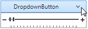
You can embed any custom content in the DropDownButton‘s dropdown. The following example demonstrates a TrackBarEdit control embedded in a DropDownButton‘s dropdown.
<dx:DropDownButton Height="25" Width="175" Content="DropdownButton">
    <dxe:TrackBarEdit Height="30">
        <dxe:TrackBarEdit.StyleSettings>
            <dxe:TrackBarZoomRangeStyleSettings />
        </dxe:TrackBarEdit.StyleSettings>
    </dxe:TrackBarEdit>
</dx:DropDownButton>
Customizable button appearance
By default, the DropDownButton control displays a small arrow indicator. The following properties affect the indicator appearance.
- DropDownButtonBase.ArrowGlyph property allows you to replace the arrow with a custom glyph.
- DropDownButtonBase.ArrowAlignment property controls the alignment of the indicator.
- DropDownButtonBase.ArrowPadding property specifies the amount of padding space around the indicator.
See Also