Common Selection Features
- 2 minutes to read
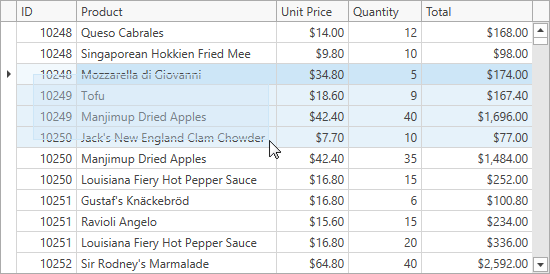
Selection Rectangle
The selection rectangle allows end users to drag the mouse pointer over the rows, cells, or cards to select a range of these items.
To use this behavior, check that the DataControlBase.SelectionMode and DataViewBase.NavigationStyle properties are set to Row or Cell.
To enable the selection rectangle, set the DataViewBase.ShowSelectionRectangle property to true.
You cannot use the selection rectangle when:
- the Drag-and-Drop feature is enabled;
- the DataControlBase.SelectionMode property is set to MultiSelectMode.MultipleRow;
- the TableView.ShowCheckBoxSelectorColumn and TableView.RetainSelectionOnClickOutsideCheckBoxSelector properties are set to true.
To modify the appearance of the selection rectangle, use the DataViewBase.SelectionRectangleStyle property:
<dxg:TableView.SelectionRectangleStyle>
    <Style TargetType="Border">
        <Setter Property="Opacity" Value="0.37" />
        <Setter Property="Background" Value="Green" />
    </Style>
</dxg:TableView.SelectionRectangleStyle>
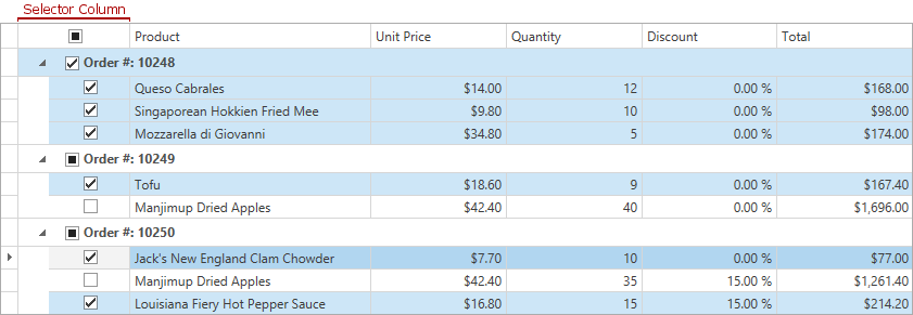
Selector Column
The GridControl allows end users to select rows with the Selector Column (the “Web Style Row Selection” mode).
You can use this behavior if the DataControlBase.SelectionMode property is not set to MultiSelectMode.None.
To show a Selector Column, set the TableView.ShowCheckBoxSelectorColumn property to true. To allow a row selection only in the Selector Column, set the TableView.RetainSelectionOnClickOutsideCheckBoxSelector property to true.
The Selector Column’s FieldName is set to the CheckBoxSelectorColumnName field value. You can use this field to access the Selector Column in code.
Note
- You cannot sort, filter, and group data by the Selector Column.
- The Selector Column does not work with InfiniteAsyncSource and InfiniteSource.
- When you set the TableView.RetainSelectionOnClickOutsideCheckBoxSelector property to true, the Selection Rectangle feature is disabled.
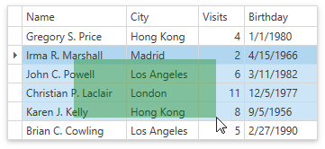
Row and Cell Hover Effects
Set the TableView.HighlightItemOnHover / TreeListView.HighlightItemOnHover property to true to enable hover effects:
 = **Row** / **MultipleRow**](/WPF/images/highlight-rows.gif?v=21.2)
DataControlBase.SelectionMode = Row / MultipleRow
 = **Cell**](/WPF/images/highlight-cells.gif?v=21.2)
Selection Fade
The GridControl fades selected rows when it loses focus.
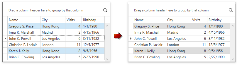
To disable this behavior, set the DataViewBase.FadeSelectionOnLostFocus to false. This property does not affect the GridControl when it is in the multiple cell selection mode.