Lesson 1 - Create a Tree Map Manually
- 5 minutes to read
This lesson details the steps required to build a simple unbound TreeMap diagram.
To create a simple unbound chart, do the following.
- Step 1. Create a New Project
- Step 2. Populate a TreeMap with Data
- Step 3. Customize an Appearance of the TreeMap
- Result
Step 1. Create a New Project
In this step, a new WPF application will be created and a TreeMap Control will be added to the application’s MainWindow.
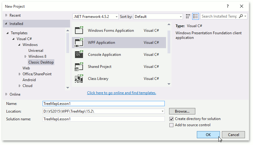
- Run MS Visual Studio 2012, 2013, 2015 or 2017.
Create a new WPF Application project.
To do this, select the File | New | Project… menu item. In the invoked dialog, select the Windows | Classic Desktop template group, then select the WPF Application item. Specify the name of the project as TreeMapLesson1 and click OK.
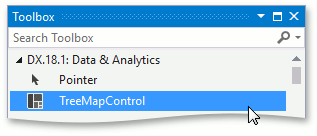
Add the TreeMapControl to the application’s MainWindow.
To do this, open the MainWindow.xaml designer. Then, drag the TreeMapControl item from the Toolbox’s DX.18.2: Data & Analytics tab to the window.
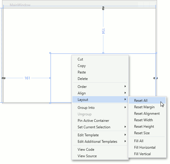
Reset the control’s layout to fill the whole window.
To do this, right-click the TreeMap object and choose the Layout | Reset All item in the invoked menu.
All the preparatory work is complete. In the next step, the TreeMap will be populated with data.
Step 2. Populate a TreeMap with Data
In this step, the following data table will be visualized using the TreeMap Control.
| Country | Region | GDP (million of USD) |
|---|---|---|
| United States | Americas | 17.418 |
| Brazil | Americas | 2.353 |
| China | Asia | 10.380 |
| Japan | Asia | 4.616 |
| India | Asia | 2.049 |
| Germany | Europe | 3.859 |
| United Kingdom | Europe | 2.945 |
| France | Europe | 2.846 |
| Italy | Europe | 2.147 |
| Russia | Europe | 1.857 |
To do this, perform the following steps.
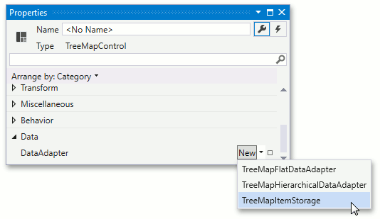
Assign the TreeMapItemStorage object to the TreeMapControl.DataAdapter property.
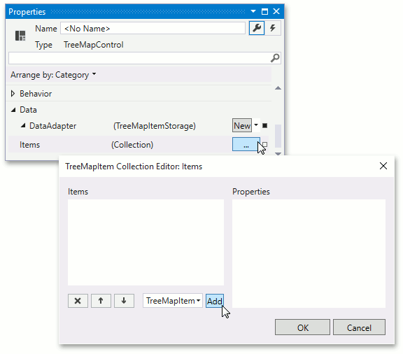
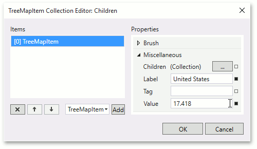
Then, click the ellipsis button opposite the TreeMapItemStorage.Items property. In the invoked TreeMapItem Collection Editor: Items click Add to add a group item.
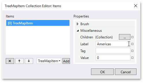
For the newly created item, set the TreeMapItem.Label to Americas. This value will be used as the group label.
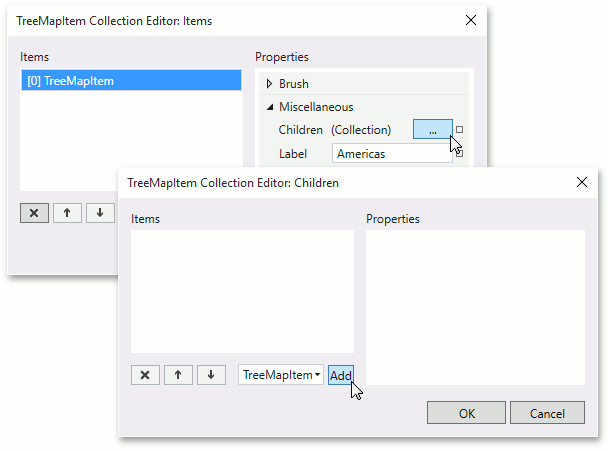
Add children elements. To do this, click the ellipsis button opposite the TreeMapItem.Children property. In the invoked TreeMapItem Collection Editor: Children dialog click Add to add leaf item.
For the added leaf item, set the TreeMapItem.Label to United States and the TreeMapItem.Value to 17.418.
- Repeat previous steps to add table rows to the TreeMap.
After this step, the XAML should look like this:
<dxtm:TreeMapControl>
    <dxtm:TreeMapItemStorage>
        <dxtm:TreeMapItem Label="Americas">
            <dxtm:TreeMapItem Label="United States" Value="17.418"/>
            <dxtm:TreeMapItem Label="Brazil" Value="2.353"/>
        </dxtm:TreeMapItem>
        <dxtm:TreeMapItem Label="Europe">
            <dxtm:TreeMapItem Label="Germany" Value="3.859"/>
            <dxtm:TreeMapItem Label="United Kingdom" Value="2.945"/>
            <dxtm:TreeMapItem Label="France" Value="2.846"/>
            <dxtm:TreeMapItem Label="Italy" Value="2.147"/>
            <dxtm:TreeMapItem Label="Russia" Value="1.857"/>
        </dxtm:TreeMapItem>
        <dxtm:TreeMapItem Label="Asia">
            <dxtm:TreeMapItem Label="China" Value="10.380"/>
            <dxtm:TreeMapItem Label="Japan" Value="4.616"/>
            <dxtm:TreeMapItem Label="India" Value="2.049"/>
        </dxtm:TreeMapItem>
    </dxtm:TreeMapItemStorage>
</dxtm:TreeMapControl>
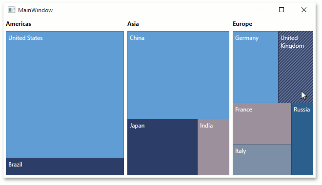
The image below represents the application when currently launched.
Data was provided to the TreeMap. In the next step, the appearance of the TreeMap will be improved.
Step 3. Customize the Appearance of the TreeMap
In this step, data templates for the group header and leaf content will be configured. Also, the colorizer providing colors to tree map items will be customized.
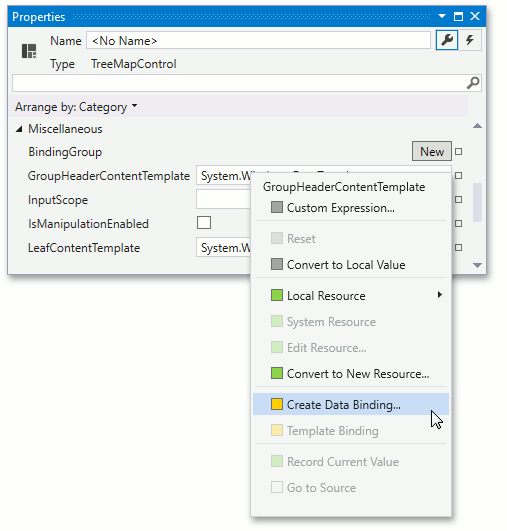
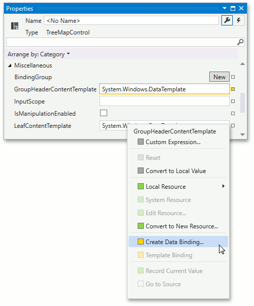
Assign the custom DataTempate to the TreeMapControl.GroupHeaderContentTemplate property. To do this, add the following data template to Window.Resources. Using this template, the group’s label text will be displayed on a gray background using a white text color.
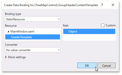
<Window.Resources>
    <DataTemplate x:Key="headerTemplate">
        <TextBlock Text="{Binding Label}"
                   Margin="4,4,4,0"
                   Padding="4"
                   Foreground="White"
                   Background="Gray"/>
    </DataTemplate>
</Window.Resources>
Then, bind the template to the TreeMapControl.GroupHeaderContentTemplate. To do this, locate the GroupHeaderContentTemplate and click the property marker. In the invoked dropdown list, select the Create Data Binding… item.
In the invoked Create Data Binding dialog, set the binding type to StaticResource and resource to the headerTemplate data template created previously.
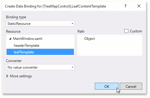
Assign the custom DataTempate to the TreeMapControl.LeafContentTemplate property. To do this, add the following data template to Window.Resources. Using this template, leaf’s label text will be displayed using a white text color, and the value will be shown under the label, using a light gray color.
<Window.Resources>
    <!-- ... -->
    <DataTemplate x:Key="leafTemplate">
        <StackPanel>
            <TextBlock Text="{Binding Label}"
                       Margin="4,4,4,2"
                       Foreground="White"
                       TextWrapping="WrapWithOverflow"/>
            <TextBlock Text="{Binding Value, StringFormat=({0} billions)}"
                       Foreground="LightGray"
                       Margin="4,2,4,4"
                       TextWrapping="WrapWithOverflow"/>
        </StackPanel>
    </DataTemplate>
</Window.Resources>
Then, bind the template to the TreeMapControl.LeafTemplate property. To do this, locate the GroupHeaderTemplate and click the property marker. In the invoked dropdown list, select the Create Data Binding… item.
In the invoked Create Data Binding dialog, set the binding type to StaticResource and the resource to the leafTemplate data template created previously.
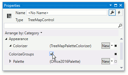
The Tree Map control uses the Palette Colorizer by default. Set the TreeMapPaletteColorizer.ColorizeGroups property to true to assign a new color to items by groups.
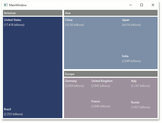
Now, the application is finished.
Result
The MainWindow’s XAML is represented below.
<Window xmlns="http://schemas.microsoft.com/winfx/2006/xaml/presentation"
        xmlns:x="http://schemas.microsoft.com/winfx/2006/xaml"
        xmlns:local="clr-namespace:TreeMapLesson1"
        xmlns:dxtm="http://schemas.devexpress.com/winfx/2008/xaml/treemap"
        x:Class="TreeMapLesson1.MainWindow"
        Title="MainWindow" Height="487" Width="654">
    <Window.Resources>
        <DataTemplate x:Key="headerTemplate">
            <TextBlock Text="{Binding Label}"
                   Margin="4,4,4,0"
                   Padding="4"
                   Foreground="White"
                   Background="Gray"/>
        </DataTemplate>
        <DataTemplate x:Key="leafTemplate">
            <StackPanel>
                <TextBlock Text="{Binding Label}"
                       Margin="4,4,4,2"
                       Foreground="White"
                       TextWrapping="WrapWithOverflow"/>
                <TextBlock Text="{Binding Value, StringFormat=({0} billions)}"
                       Foreground="LightGray"
                       Margin="4,2,4,4"
                       TextWrapping="WrapWithOverflow"/>
            </StackPanel>
        </DataTemplate>
    </Window.Resources>
    <Grid>

        <dxtm:TreeMapControl GroupHeaderContentTemplate="{Binding Source={StaticResource headerTemplate}}"
                             LeafContentTemplate="{Binding Source={StaticResource leafTemplate}}">
            <dxtm:TreeMapControl.Colorizer>
                <dxtm:TreeMapPaletteColorizer ColorizeGroups="True"/>
            </dxtm:TreeMapControl.Colorizer>
            <dxtm:TreeMapItemStorage>
                <dxtm:TreeMapItem Label="Americas">
                    <dxtm:TreeMapItem Label="United States" Value="17.418"/>
                    <dxtm:TreeMapItem Label="Brazil" Value="2.353"/>
                </dxtm:TreeMapItem>
                <dxtm:TreeMapItem Label="Europe">
                    <dxtm:TreeMapItem Label="Germany" Value="3.859"/>
                    <dxtm:TreeMapItem Label="United Kingdom" Value="2.945"/>
                    <dxtm:TreeMapItem Label="France" Value="2.846"/>
                    <dxtm:TreeMapItem Label="Italy" Value="2.147"/>
                    <dxtm:TreeMapItem Label="Russia" Value="1.857"/>
                </dxtm:TreeMapItem>
                <dxtm:TreeMapItem Label="Asia">
                    <dxtm:TreeMapItem Label="China" Value="10.380"/>
                    <dxtm:TreeMapItem Label="Japan" Value="4.616"/>
                    <dxtm:TreeMapItem Label="India" Value="2.049"/>
                </dxtm:TreeMapItem>
            </dxtm:TreeMapItemStorage>
        </dxtm:TreeMapControl>

    </Grid>
</Window>
Run the application. The following image represents the launched application.