Getting Started
- 6 minutes to read
This document shows how to customize a RibbonControl at design time; as well as how to add and customize ribbon categories, pages, page groups and buttons.
- Dropping Ribbon Control onto Window, Selecting Window Theme and Ribbon Style
- Creating Ribbon Page Categories
- Creating Pages
- Creating Page Groups
- Creating Buttons
- Selecting and Customizing Ribbon Elements
- Adding Buttons to Application Menu, Quick Access Toolbar and Page Header Region
- Bar Item Actions
Dropping Ribbon Control onto Window, Selecting Window Theme and Ribbon Style
Locate the RibbonControl component in the Visual Studio Toolbox and drop it onto the window.
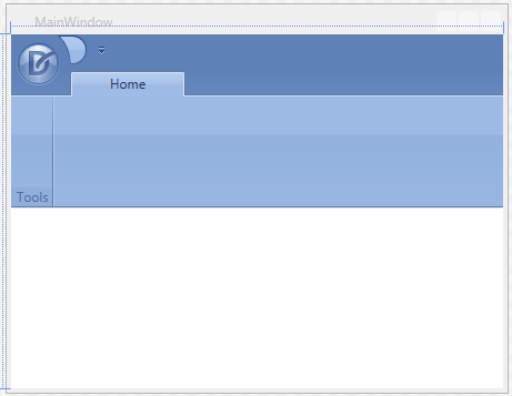
The new Ribbon Control contains an empty “Home” page and a “Tools” page group. The “Home” page belongs to the default page category. Unlike a custom category, which is added in this tutorial, the default category’s caption is never visible.
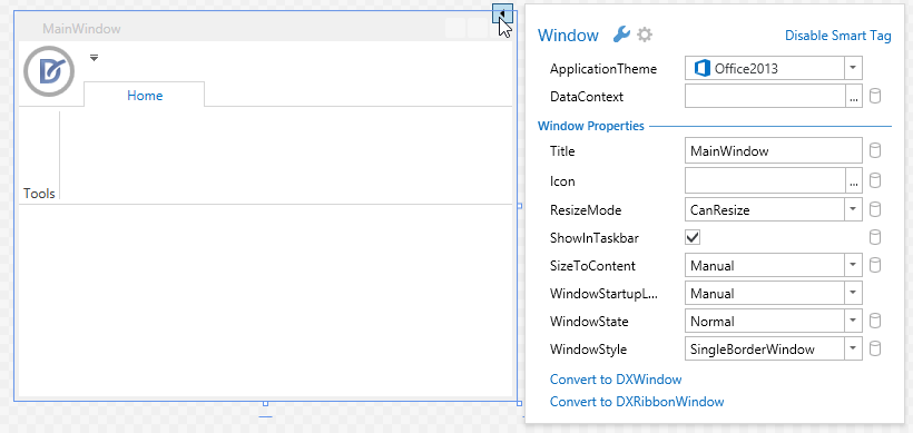
Select the Window. It will display a smart tag providing access to window and application common settings. For instance, you can specify the application paint theme, set a data context for the window, etc. The following image shows the Ribbon Control after the ApplicationTheme property has been set to Office2013.
Select the Ribbon Control and then click its smart tag to show the ribbon main settings in the popup window.
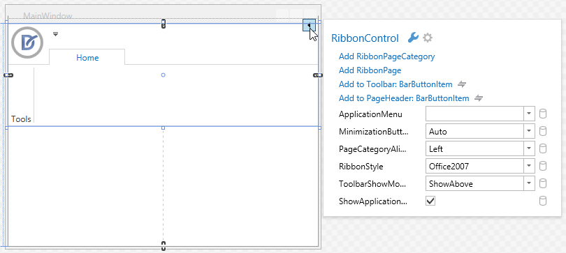
The smart tag popup window allows you to add ribbon elements, specify the application menu, set the ribbon style, etc. Set the RibbonStyle property to Office2010 to apply the MS Office 2010 inspired ribbon style.
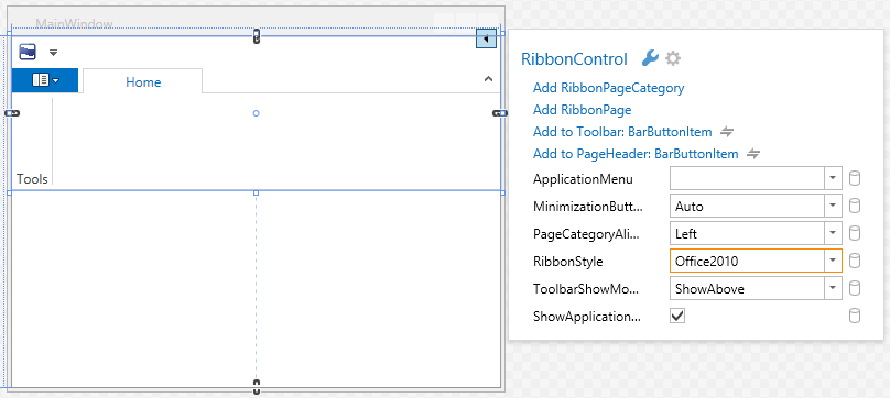
A setter of the RibbonControl.RibbonStyle property will be added to the XAML code.
<dxr:RibbonControl RibbonStyle="Office2010" >
. . .
Creating Ribbon Page Categories
Initially, the Ribbon Control contains a single default page category (RibbonDefaultPageCategory) (the default category’s caption is never visible). Pages displayed within the default category can be considered as main, context-independent pages. If needed, you can add custom page categories to the Ribbon. This can be accomplished using:
- the Add RibbonPageCategory command in the Ribbon Control’s smart tag popup menu (see the image above);
the Add RibbonPageCategory command in the Ribbon Control’s context menu.
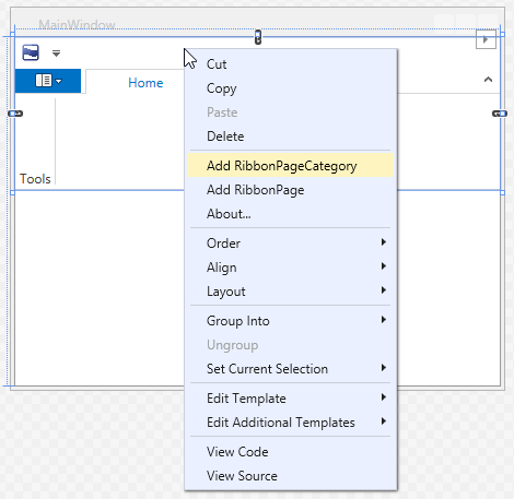
This command adds a new Page Category containing a single page.
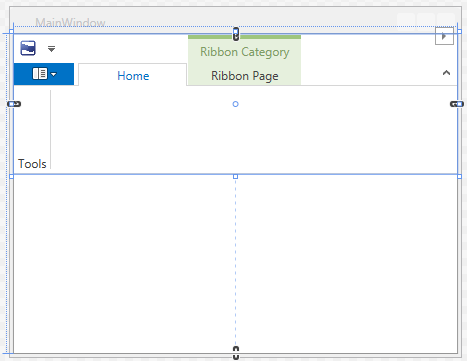
You will notice that corresponding code has been added to the XAML to create a new Page Category.
<dxr:RibbonControl RibbonStyle="Office2010" >
. . .
    <dxr:RibbonPageCategory Caption="Ribbon Category">
        <dxr:RibbonPage Caption="Ribbon Page"/>
    </dxr:RibbonPageCategory>
</dxr:RibbonControl>
The visibility of page categories (and therefore the visibility of pages belonging to this category) can be changed using the RibbonPageCategoryBase.IsVisible property.
To specify the background color for custom categories and pages, use the RibbonPageCategoryBase.Color property. This color is mixed with the control’s background when captions of page categories and pages are rendered.
See Ribbon Page Categories and Contextual Pages, to learn more about page categories.
Creating Pages
To add tabs to the default category, right-click on any point within the empty bar above the tab region (to add a page to a custom category, right-click within the custom category caption). The right-click action invokes a popup menu that contains the Add RibbonPage menu command.
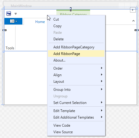
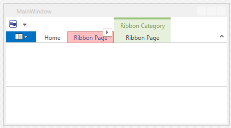
The Add RibbonPage command adds a new RibbonPage object to the RibbonPageCategoryBase.Pages collection, as follows.
<dxr:RibbonControl RibbonStyle="Office2010" >
    <dxr:RibbonDefaultPageCategory Caption="defaultCategory">
        <dxr:RibbonPage Caption="Home">
            <dxr:RibbonPageGroup Caption="Tools"/>
        </dxr:RibbonPage>
        <dxr:RibbonPage Caption="Ribbon Page"/>
    </dxr:RibbonDefaultPageCategory>
. . .
Creating Page Groups
Page groups divide the contents of pages into sections. Like pages, page groups can also be created using context menus. Click any point within a page to open the context menu and select Add RibbonPageGroup.
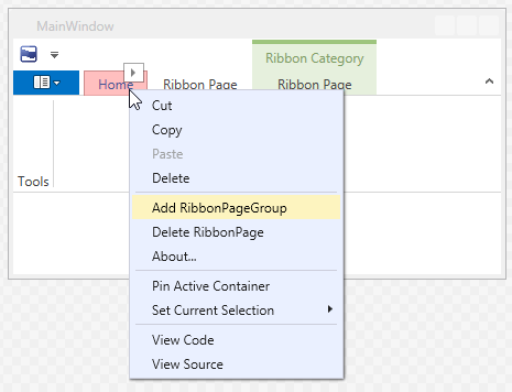
This command adds a new RibbonPageGroup to the clicked page (to the RibbonPage.Groups collection) by generating the following XAML code.
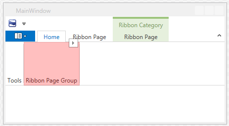
<dxr:RibbonPage Caption="Home">
    <dxr:RibbonPageGroup Caption="Tools"/>
    <dxr:RibbonPageGroup Caption="Ribbon Page Group"/>
</dxr:RibbonPage>
Creating Buttons
Commands (buttons), check buttons, submenus, static text, various editors from the DXEditors library, string lists, etc., are encapsulated in the Ribbon Control by corresponding bar item objects. For instance, the BarButtonItem object encapsulates a regular button.
You can add new bar items by using a context menu invoked for ribbon page groups. This context menu contains the Add BarItem sub-menu, which provides access to a list of available bar items.
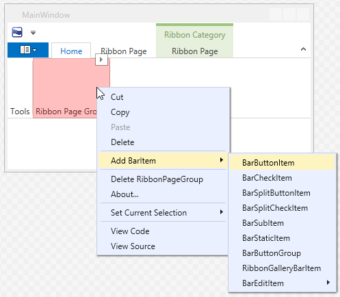
Select the Add BarItem->BarButtonItem command to add a button.
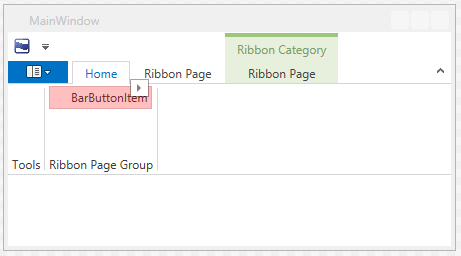
A statement that adds a BarButtonItem object to a page group is added to XAML.
<dxr:RibbonPageGroup Caption="Ribbon Page Group">
    <dxb:BarButtonItem Name="barButtonItem1" Content="BarButtonItem"/>
</dxr:RibbonPageGroup>
Selecting and Customizing Ribbon Elements
At design time, you can click any visual ribbon element (custom ribbon page category, page, page group and bar item) to highlight this element in XAML and list the element’s settings in the Properties window.
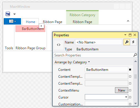
In addition, once a ribbon element has been selected, it displays a smart tag that provides access to the element’s main settings.
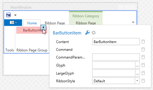
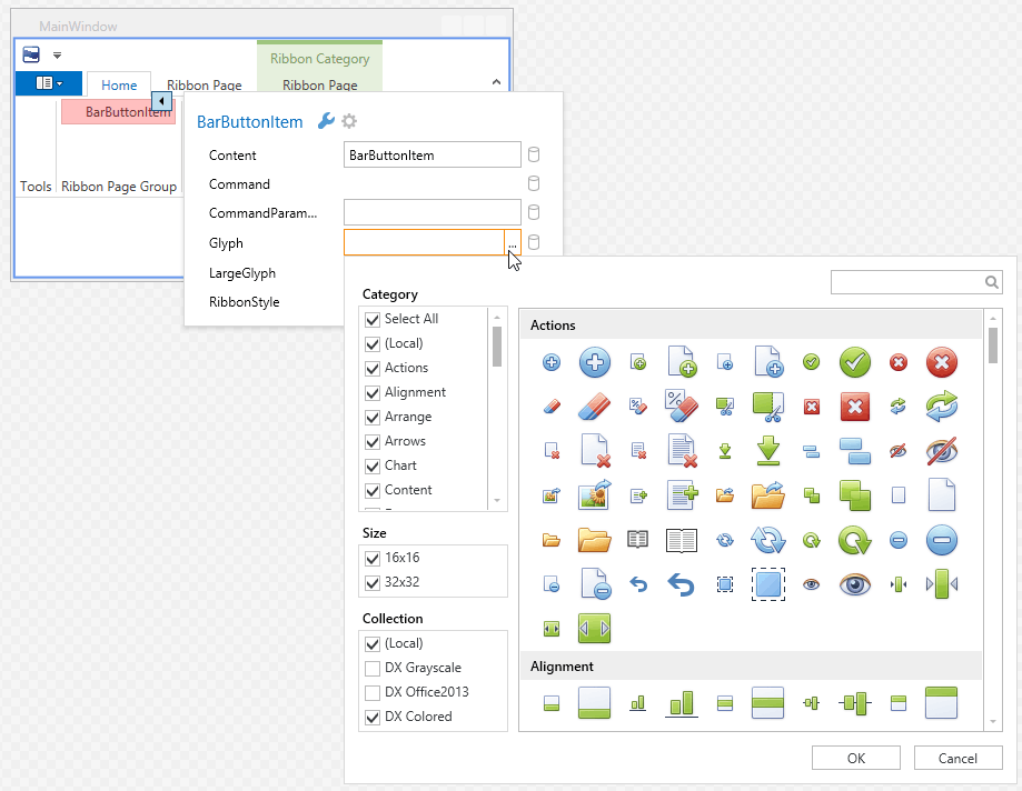
For instance, you can set a button’s BarItem.Glyph or BarItem.LargeGlyph property. Click the ellipsis button for one of these properties (or for both) to invoke the DX Image Gallery and select an appropriate image.
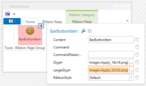
If small and large images are specified, the button will display one of these images according to the BarItem.RibbonStyle property and the current Ribbon Control’s width (the Ribbon Control automatically swaps large images with small ones when its width is reduced, and vice versa).
Adding Buttons to Application Menu, Quick Access Toolbar and Page Header Region
Existing bar items can be copied to the Ribbon Quick Access Toolbar and Page Header region (the region at the right edge of the Ribbon Control in line with ribbon tab headers). To copy a bar item to these regions, right-click the bar item and select one of the menu commands: Show in Quick Access Toolbar or Show in Page Header.
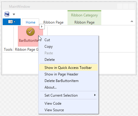
Tip
If an application menu is assigned to the Ribbon Control (for instance, by using the Ribbon Control’s smart tag), the bar item’s context menu will also contain the Show in Application Menu command. This command will copy the bar item to the Application Menu.
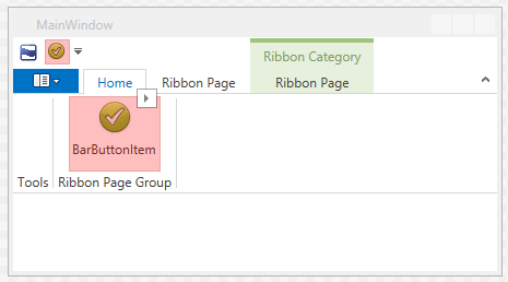
When copying a bar item to the Quick Access Toolbar, a name is assigned to the bar item (if it hasn’t already been assigned). Then, a link to the clicked bar item is created and added to the RibbonControl.ToolbarItems collection.
<dxr:RibbonControl RibbonStyle="Office2010" >
    <dxb:BarButtonItem x:Name="barButtonItem1" Content="BarButtonItem" Glyph="{dxc:DXImage Image=Apply_16x16.png}" LargeGlyph="{dxc:DXImage Image=Apply_32x32.png}"/>
. . .
    <dxr:RibbonControl.ToolbarItems>
        <dxb:BarButtonItemLink BarItemName="barButtonItem1"/>
    </dxr:RibbonControl.ToolbarItems>
Note, the setter of the BarItemLinkBase.BarItemName property used to refer to the source bar item.
Copying bar items to the Page Header region adds links to these bar items to the RibbonControl.PageHeaderItems collection.
Bar Item Actions
To implement actions for bar items you can handle the BarItem.ItemClick event or specify commands with the BarItem.Command property.