Backstage View
- 2 minutes to read
The Backstage View, presented by the BackstageViewControl, is the Microsoft Office 2010-like application menu. The following figure illustrates how the Backstage View looks like.
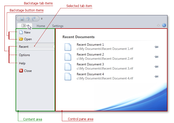
The figure covers Backstage View’s general structure that includes two areas. The left one - the Content Area - holds all backstage items. The right area - Control Pane - displays a currently selected tab item’s content.
You can use the following item types within a Backstage View: a regular button, tab item and separator item.
- A BackstageButtonItem is a regular clickable item, which acts as a simple button. There are two ways of specifying which actions a button item will perform - using the BackstageItemBase.Click event or attaching an ICommand object to a button via the BackstageButtonItem.Command property.
- A BackstageTabItem acts as a tab item in a tab control: as you click its caption (displayed in the Content Area), its contents are displayed in the Control Pane area. In the figure above, the Control Pane area displays the selected ‘Recent’ tab item contents - the recently opened documents list.
- A BackstageSeparatorItem is a line that visually separates two neighboring elements. Use it to create visually detached item groups to improve a menu’s visual perception and readability.
To attach a Backstage View to a RibbonControl, assign a BackstageViewControl to the RibbonControl.ApplicationMenu property. Consider the XAML mark-up example below.
<dxr:RibbonControl Name ="myRibbonControl">
    <dxr:RibbonControl.ApplicationMenu>
        <dxr:BackstageViewControl Name ="myViewControl">
            <dxr:BackstageViewControl.Items>
                <dxr:BackstageButtonItem  . . ./>
                <dxr:BackstageButtonItem  . . ./>
                <dxr:BackstageSeparatorItem  . . ./>
                <dxr:BackstageTabItem  . . .>
                     <dxr:BackstageTabItem.ControlPane>
                                    . . .
                     </dxr:BackstageTabItem.ControlPane>
                </dxr:BackstageTabItem>
            </dxr:BackstageViewControl.Items>
        </dxr:BackstageViewControl>
    </dxr:RibbonControl.ApplicationMenu>
. . .
</dxr:RibbonControl>
A Backstage View attached to the RibbonControl will be shown after a user clicks an Application Button.
The Backstage View supports keyboard navigation via key tips. Refer to this link to learn more.
Check out the Ribbon Simple Pad demo in the Demo Center to see an example of creating a Backstage View.