Working with Vector Skins
- 4 minutes to read
This article explains how to modify Vector skins. To test Skin Editor features mentioned below, you can create a custom version of the SVG Icon Builder‘s internal skin.
Overview
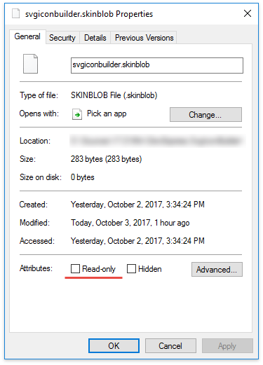
The SVG Icon Builder is a tool that allows you to draw SVG icons by combining templates the DevExpress designers team created. This tool uses its own skin from the “%your_source_folder%\Win\DevExpress.SvgIconBuilder\Skin\svgiconbuilder” folder. Select all the files in this folder, then right-click and choose “Properties”. Uncheck the “Read-only” option to modify these files in the Skin Editor.
SVG Workshop
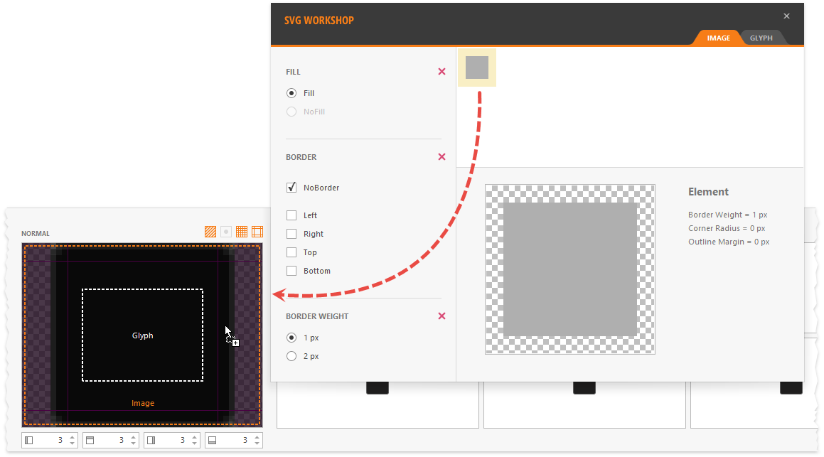
Like raster skins, UI elements in vector skins can have a maximum of three images:
- a background image (defines the element’s shape and borders);
- a glyph (a built-in image, for example, a cross on the window’s “Close” button);
- an icon (a custom icon developers assign to controls’ image-related properties).
The SVG Workshop allows you to replace background and glyph images with the DevExpress designers’ counterparts. To do this, drag-and-drop an image onto the state preview area. For example, in the figure below the SimpleButton background is changed to remove button borders.
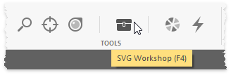
To invoke this tool, press F4 or click the “SVG Workshop” button on the Skin Editor ribbon.
Change Color Palettes
To repaint a vector skin, you need to change the common and element palettes.
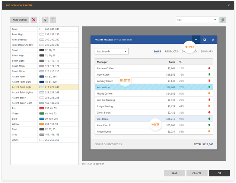
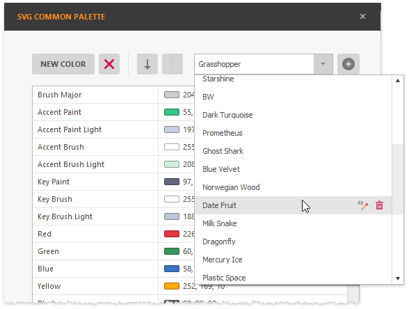
The common SVG palette stores the colors applied to individual skin element parts. To edit this palette, press F7 in the Skin Editor. Here you can assign new color values to the default palette color names and add your own colors. The Live Preview panel allows you to click elements, borders, and text strings - a color that paints a clicked element will be selected in the list to your left. This feature allows you to quickly identify which colors you need to change.
You can select which of these palette colors paint specific UI elements, that is, specify element palettes. For example, a default SimpleButton background image contains two shapes: a rectangle and a border. To select what colors fill these shapes, double-click an element to invoke the Edit SVG Palette dialog. You can either choose a color from the skin palette or use a unique RGB value. In the figure below, the button border is painted using the “Brush Light” color.
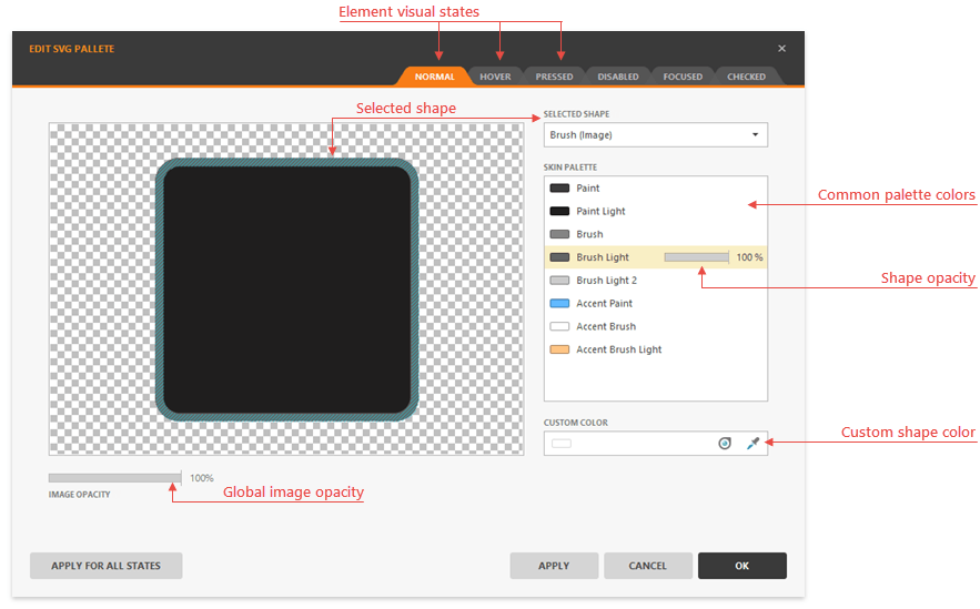
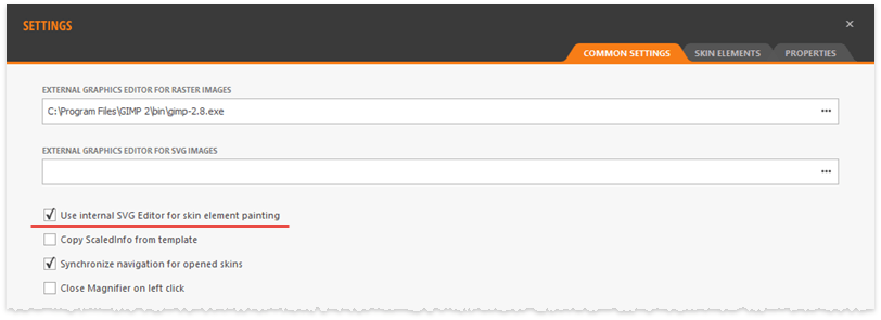
To invoke this dialog, go to the Skin Editor settings and check the “Use internal SVG Editor for skin element painting” option, then double-click a button’s background image.
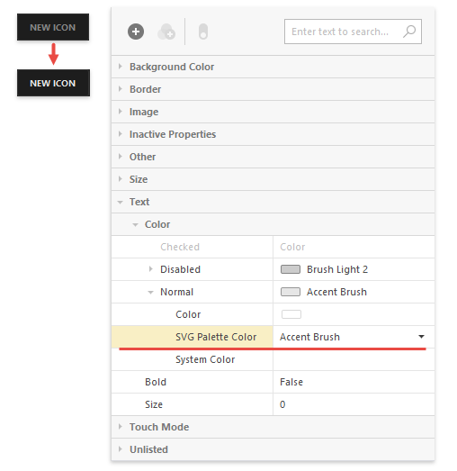
You can also use these common palette colors to set property values. In the figure below, the “Accent Brush” color is assigned to the SimpleButton’s “Text | Color | Normal | SVG Palette Color” property. This lightens the button’s text color, which makes it stand out against the dark background.
Instead of going through every palette color and specifying it manually, browse swatches (color presets) first. You can change the colors in these color schemes according to your needs.
You can press the “Add” button next to the swatch selector to copy the current swatch under a different name. All these swatches are available for your end-users directly at runtime.
Change Icon Palettes
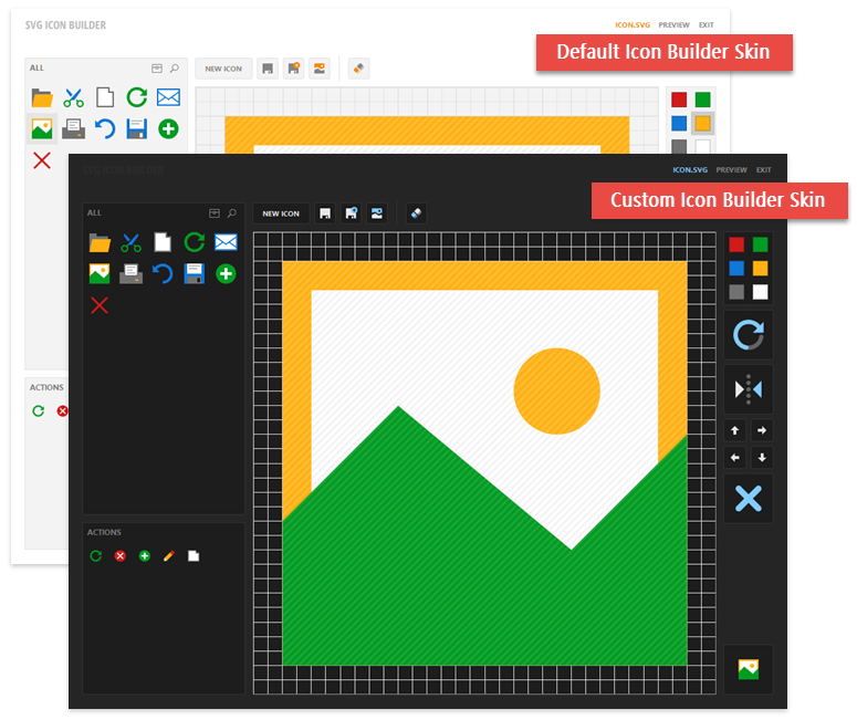
DevExpress controls colorize their SVG icons to match the currently applied skin. Colorization rules (icon palettes) are different for each skin, and you need to modify these rules after re-painting the skin. The figures below show a comparison between the default and a custom icon palette.
In the Skin Editor, right-click the “Common” element group and select “Icon Palette | Set” (or press F6) to modify the icon palette.
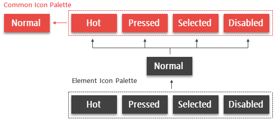
Other groups and individual elements inherit colors from this palette by default. The diagram below illustrates this inheritance hierarchy.
Repeat the same steps above to specify custom icon palettes and override this inheritance for other groups and elements.