Workspace
- 4 minutes to read
Use this section to learn how to navigate and use the Skin Editor workspace.
- Projects and Skins
- Main Window Layout
- Ribbon Commands
- Working in Skin Editor
- Dialogs
- Tools
- Shortcuts
Projects and Skins
In the Skin Editor, you need to create a project first, and then populate it with as many skins as you need. A skin is a set of bitmaps that determine how control elements look. A project is a set of skins, distributed as a separate .dll library.
You do not have to create new skins from scratch. Instead, add standard DevExpress skins to your project as templates and modify them.
Main Window Layout
The figure below illustrates the layout of a Skin Editor’s main window.
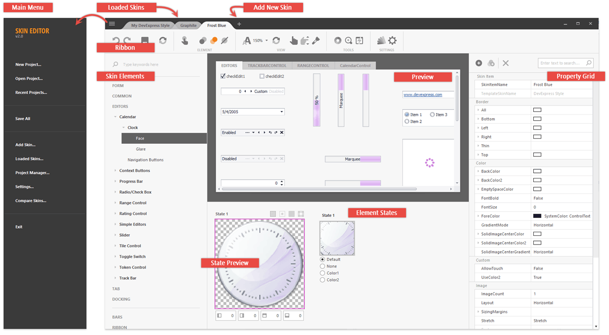
Each Skin Editor tab contains a project skin. The “+” button allows you to add a new skin to a project. If you only want to have tabs for the skins you are currently working on, use the “Loaded Skins” dialog.
Ribbon Commands
 Undo
Undo
Discards the previously applied change.
 Redo
Redo
Re-applies the previously discarded modification.
 Save
Save
Saves the current skin.
 Refresh
Refreshes the Skin Editor preview area.
 Allow Touch
Specifies whether or not a selected skin element should be drawn differently on touch-input devices.


 Color Selectors
Allows you to choose whether to colorize a selected element with “Color 1” or “Color 2”. You can use the Color Mixer dialog to modify these colors. No custom colorization applies if “None” is selected.
 DPI Scale Selector
Use this selector to load different element bitmaps for different DPI modes.
 Icon SVG Palette
Allows you to change colorization rules for vector icons.
 Touch Mode
Allows you to switch the Skin Editor to the tablet mode for a better usability on touch input devices.
 Touch Scrolling
Allows you to change classic scroll bars to TouchUI scroll bars in the Skin Editor preview.
 Search
Searches for skin elements by their names.
 Highlight Element
Selecting this option highlights an element you select from the skin element list in the Skin Editor preview area.
 Skin Settings
Invokes the “Skin Settings” dialog.
 Color Mixer
Allows you to modify the main and accent skin colors.
 Magnifier
Displays the Magnifier tool. Hover over the desired element and left click it to copy its color to the clipboard.
 SVG Workshop
Provides access to a collection of shapes and icons drawn by DevExpress designers team. Use them to replace background and glyph images in vector skins.
 SVG Palette
Allows you to modify the vector skins‘s color palette.
 External Application Preview
Displays a sample form with DevExpress controls where you can preview your skin. See the WindowsFormsSettings.AllowSkinEditorAttach setting to learn more.
Working in Skin Editor
To create a custom skin, modify skin elements. If you Ctrl+click the Preview area, the Skin Editor will tell you what skin elements lie underneath your pointer. You can also press the highlight button in the Ribbon. Then, when you toggle through skin elements, the selected element blinks in the Preview area.
Tip
If you prefer to search for skin elements by their real names (the names control painters use in code), go to “Main Menu | Settings | Skin Elements” and uncheck the “Use Element Aliases” option.
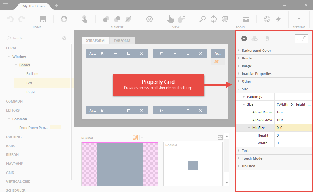
In applications, control painters first draw a framework of an element according to its settings (size, content margins, back color, etc.). You can modify these properties in the Property Grid.
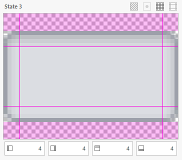
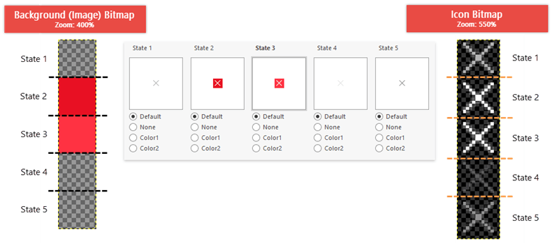
When an element framework is ready, a background bitmap is painted above it, followed by an icon bitmap. Bitmaps are sliced horizontally into multiple pieces, one piece for each supported element’s visual state (normal, hovered, pressed, etc.). The figure below illustrates background and glyph bitmaps for the form’s “Close” button, which supports five visual states.
Click an element state to preview it and modify sizing margins. You can also open and modify a bitmap in an external graphics editor.
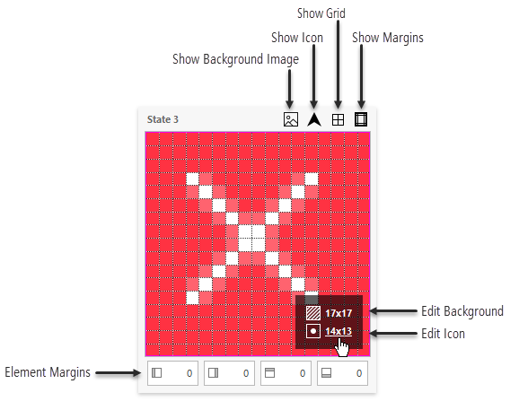
Sizing margins break a bitmap for this visual state down into nine regions. Corners are drawn above the corners of a UI element as is. Other parts are scaled according to the element’s Stretch property. The figure below illustrates the SimpleButton background bitmap. Four pixel margins from each bitmap side ensure that rounded button corners are not distorted regardless of the button’s size.