Spreadsheet Charts
- 11 minutes to read
The Spreadsheet Document API allows you to create charts. Charts help you analyze large amounts of data and show the relationship between different data sets.
This topic consists of the following sections:
- Supported Chart Types
- Chart Elements
- Arrange Worksheet Data to Create a Chart
- Create a Chart
- Modify a Chart and Adjust Its Settings
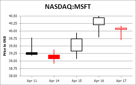
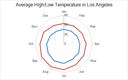
Supported Chart Types
The Spreadsheet Document API supports the following chart types:
Chart Type | Chart Subtypes |
|---|---|
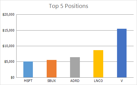
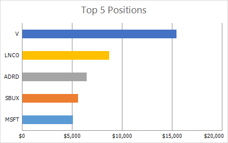
Column Charts
| 2-D Column Charts:
3-D Column Charts:
Cylinder Charts:
Cone Charts:
Pyramid Charts:
|
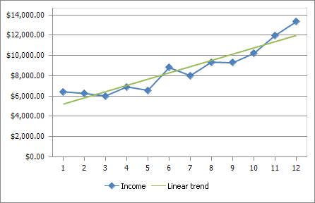
Line Charts
| 2-D Line Charts:
3-D Line Charts:
|
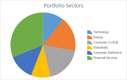
Pie Charts
| 2-D Pie Charts:
3-D Pie Charts:
|
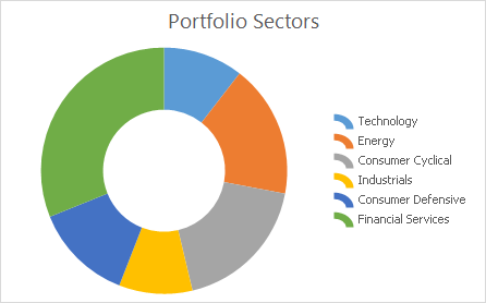
Doughnut Charts
|
|
Bar Charts
| 2-D Bar Charts:
3-D Bar Charts:
Cylinder Charts:
Cone Charts:
Pyramid Charts:
|
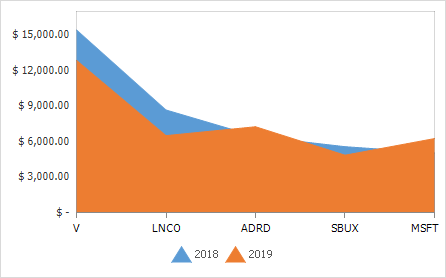
Area Charts
| 2-D Area Charts:
3-D Area Charts:
|
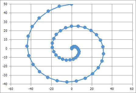
Scatter Charts
|
|
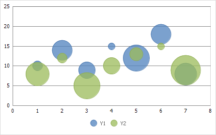
Bubble Charts
|
|
Stock Charts
|
|
Radar Charts
|
|
Excel 2016 Charts
|
|
The Spreadsheet Document API also provides limited support for the charts listed below. You can load/save these charts, create and modify them in the API, but you cannot print or export these charts to PDF.
- Pie Charts: Pie of Pie, Bar of Pie.
- Surface Charts: Contour, Wireframe Contour, 3-D Surface, Wireframe 3-D Surface.
- Excel 2016 Charts: Sunburst, Treemap.
Chart Elements
The image below shows a chart’s basic elements. You can add or remove these elements to customize the chart’s layout.
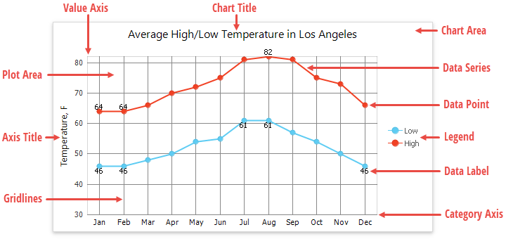
- Chart Area - represents the entire chart and all its elements.
- Plot Area - the chart’s area that displays data series, axes, gridlines and data labels.
- Data Point - a single value plotted on a chart.
- Data Series - a group of related data points. Each data series has a unique color to distinguish between individual series on a chart with multiple series.
- Horizontal and Vertical Axes - two perpendicular lines that run along the chart edges. Axes display category labels and measurement units. Most charts have two axes: the category axis (X-axis), usually running horizontally along the bottom of the plot area, and the value axis (Y-axis), usually running vertically on the plot area’s left side. 3-D charts also have the depth (series) axis that displays series names. The bubble and scatter charts have two value axis. The pie and doughnut charts have no axes at all.
- Legend - identifies each data series with a color or fill pattern. A chart can have only one legend.
- Chart Title - a text header that explains a chart’s purpose.
- Axis Title - explanatory text used to label an axis.
- Data Label - identifies a data point with its actual value.
- Gridlines - a series of horizontal and vertical lines running across the plot area. You can add gridlines to a chart to improve its readability.
Arrange Worksheet Data to Create a Chart
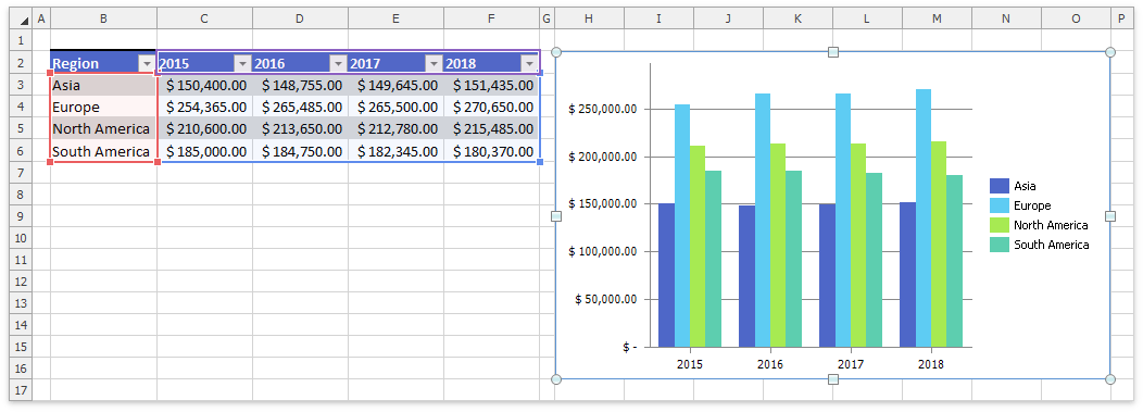
When you create a chart, the Spreadsheet plots data on the chart based on the number of rows and columns in the source range:
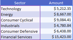
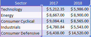
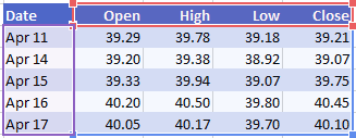
If the source range has more rows than columns, the first column provides labels for the category axis (X-axis), and the first row contains series names. Series values are arranged in columns.
If you do not include labels and/or series names in the source range, a chart displays sequential numbers for data points on the category axis and uses the default series names (Series 1, Series 2, …, Series N).
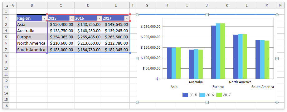
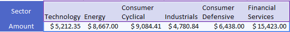
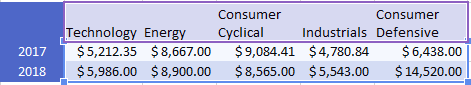
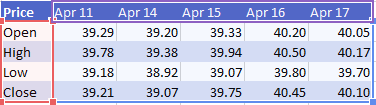
If the source range has more columns than rows or the number of rows and columns is the same, the first row provides labels for the category axis (X-axis), and the first column contains series names. Series values are arranged in rows.
If you do not include labels and/or series names in the source range, a chart displays sequential numbers for data points on the category axis and uses the default series names (Series 1, Series 2, …, Series N).
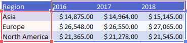
You can use the ChartObject.SwitchRowColumn method to change the default direction used to plot data series on a chart (whether the series values are obtained from columns or rows), or call the ChartObject.SelectData method with the direction parameter to specify how to retrieve series values.
The table below lists how to arrange data on a worksheet to create a specific chart.
Chart type | Data arrangement |
|---|---|
Line, column, bar, area, surface, or radar chart | In columns or rows:
|
Pie chart | Uses a single series of values arranged in one column or row. Another column or row contains data labels.
|
Doughnut chart | In one or multiple columns or rows, and one column or row contains data labels.
|
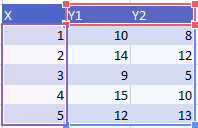
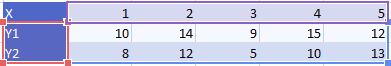
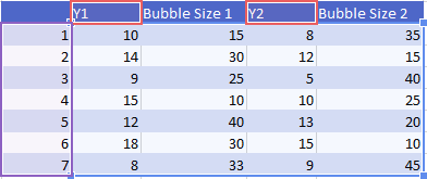
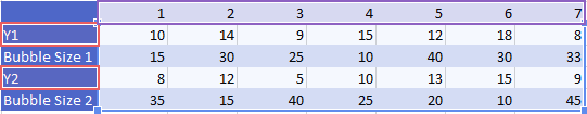
Scatter or bubble chart | In columns or rows. Place x values in the first column or row, and the corresponding y values in the adjacent columns or rows.
For a bubble chart, add columns or rows specifying the bubble size.
|
Stock chart | In columns or rows in the same order as the stock chart name.
|
Create a Chart
The chart collection (ChartCollection) stores charts in a worksheet. You can use the Worksheet.Charts property to access a worksheet’s chart collection, and the collection’s ChartCollection.Add method to create a chart. The ChartType enumeration value specifies the chart type.
Use one of the following approaches to specify the chart’s data:
Pass a cell range containing chart data to the ChartCollection.Add method. Refer to the Arrange Worksheet Data to Create a Chart section for information on how to organize data in the source range to create a specific chart.
Pass a cell range containing chart data to the ChartObject.SelectData method. This method also allows you to specify the data direction: whether the series values are arranged in columns (ChartDataDirection.Column) or rows (ChartDataDirection.Row).
Use the SeriesCollection.Add method overloads to add data series to the chart’s series collection (ChartObject.Series). These methods enable you to plot data contained in the noncontiguous cell ranges. You can explicitly specify a name, arguments, and values for each series.
The ChartData object specifies data plotted on a chart. You can also use an array of numeric, string or boolean literals as the chart’s data source. ChartData supports implicit conversion from an array of CellValue objects. You can use these objects to specify numeric, string or boolean values without casting. Use the ChartData.FromArray method to convert the CellValue type arrays to chart data, or assign these arrays to the series’s arguments and values directly.
// Create a column chart.
Chart chart = worksheet.Charts.Add(ChartType.ColumnClustered);
// Add a series bound to a set of literal data.
Series literalSeries = chart.Series.Add(
    new CellValue[] { "Jan", "Feb", "Mar", "Apr", "May", "Jun" },
    new CellValue[] { 50, 100, 30, 104, 87, 150 });
Refer to the How to: Create and Modify a Chart topic for more examples on how to create charts in code.
Each chart has an associated ChartView. This object is created automatically when you create a chart. It consolidates data series of the same type (ChartView.Series) and provides customization options. A ChartView object is a member of the ChartViewCollection collection you can access using the ChartObject.Views property. A chart can have several ChartView objects (a combination chart). To create a combination chart, use the Series.ChangeType method to change an existing series’s type. If the specified type is incompatible with the other series types, the Spreadsheet clears the ChartViewCollection collection and creates a new ChartView object to display all chart series. This object has the same type as the modified data series. The How to: Create and Modify a Chart topic contains a list of compatible chart types and provides an example on how to create a combination chart.
Modify a Chart and Adjust Its Settings
After you create a chart, you can use the Spreadsheet Chart API members to change the chart’s layout and appearance.
The table below lists the actions you can perform on a chart.
To perform this task | Use these API members | Example |
|---|---|---|
Change the source data for a chart | Chart.SelectData | |
Add or remove data series | ||
Change the data direction on a chart | Chart.SwitchRowColumn | |
Change the data series’ order | ||
Change a chart type | Chart.ChangeType | |
Change a series type | ||
Create a chart on a separate sheet (chart sheet), or move an existing chart to a new chart sheet |
Chart.MoveToNewChartSheet | |
Display or hide primary axes, adjust their position and orientation | Chart.PrimaryAxes Axis.Scaling.Orientation | |
Add axis titles |
Axis.Title.Visible Axis.Title.SetValue Axis.Title.SetReference | |
Change the axis scaling, and format numbers on the axis | ||
Display secondary axes |
Chart.SecondaryAxes | |
Display or hide gridlines | ||
Add a chart title | Chart.Title ChartTitle.Visible ChartTitle.SetValue ChartTitle.SetReference | |
Display or hide a chart legend, specify its position, customize a legend entry | Chart.Legend | |
Display data labels for the entire chart or individual series/data points | ||
Apply a number format to data labels | ChartView.DataLabels.NumberFormat | |
Apply a chart style | Chart.Style | |
Fill a chart element | ||
Format a chart element’s outline | ||
Format a chart element’s text | Chart.Font | |
Apply protection to a chart | Chart.Options.Protection |