How to: Change the Display of Chart Axes
- 11 minutes to read
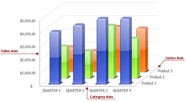
When you create a chart, its primary axes are generated automatically depending on the chart type. Most charts have two primary axes: the category axis (X-axis), usually running horizontally at the bottom of the plot area, and the value axis (Y-axis), usually running vertically on the left side of the plot area. 3-D charts also have the depth (or series) axis along which the series names are displayed. But some charts, like a pie or doughnut chart, have no axes at all.
If the chart type you selected supports axes, you can modify them by displaying axis tick marks and gridlines, changing the axis position, specifying the axis scaling, adding secondary axes, etc. You can also set the axis line settings and apply formatting options to the axis tick-mark labels as described in the How to: Format Chart Elements example.
Select the action you wish to perform.
- Display or Hide Primary Axes
- Add Axis Titles
- Specify Scaling Options
- Format Numbers on the Axis
- Display Secondary Axes
- Display or Hide Axis Tick Marks and Gridlines
Display or Hide Primary Axes
All primary axes are stored in the primary axis collection (AxisCollection), accessible using the ChartObject.PrimaryAxes property. An individual axis defined by the Axis object can be accessed using the indexer notation (0 for the category axis, 1 for the value axis and 2 for the depth axis if it is present). To display or hide a primary axis, utilize the Axis.Visible property. To position an axis on the chart, use the Axis.Position property.
The example below demonstrates how to create a chart and specify its y-axis position using the Axis.Position property.
Worksheet worksheet = workbook.Worksheets["chartTask3"];
workbook.Worksheets.ActiveWorksheet = worksheet;

// Create a chart and specify its location.
Chart chart = worksheet.Charts.Add(ChartType.ColumnClustered, worksheet["B3:C5"]);
chart.TopLeftCell = worksheet.Cells["H2"];
chart.BottomRightCell = worksheet.Cells["N14"];

// Set the position of the value axis.
chart.PrimaryAxes[1].Position = AxisPosition.Right;

// Hide the legend.
chart.Legend.Visible = false;
Add Axis Titles
For both primary and secondary axes in the chart, it’s possible to add and customize their text titles, which can be used to clarify data displayed along the axes.
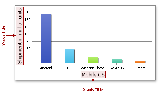
The axis titles are not shown by default. However, you can add a title to any horizontal, vertical, or depth axes by utilizing the Axis.Title property, which accesses the ChartTitleOptions object containing display settings for axis titles. This object inherits the ChartText interface which provides methods used to specify the title text. Thus, to add the axis title, set the ChartTitleOptions.Visible property to true, and then do one of the following.
- To specify the title text manually, use the ChartText.SetValue method.
- To extract the text for the title from the cell range, use the ChartText.SetReference method.
The following example demonstrates how to create a clustered bar chart and add the title to the value axis using the Axis.Title property, which returns the ChartTitleOptions object containing basic title options. Set the ChartTitleOptions.Visible property to true to display the axis title. To explicitly specify the text for the title, utilize the ChartText.SetValue method.
Worksheet worksheet = workbook.Worksheets["chartTask2"];
workbook.Worksheets.ActiveWorksheet = worksheet;

// Create a chart and specify its location.
Chart chart = worksheet.Charts.Add(ChartType.BarClustered, worksheet["B4:C7"]);
chart.TopLeftCell = worksheet.Cells["E3"];
chart.BottomRightCell = worksheet.Cells["K14"];

// Specify the axis title text.
chart.PrimaryAxes[1].Title.Visible = true;
chart.PrimaryAxes[1].Title.SetValue("Shipment in millions of units");
// Hide the legend.
chart.Legend.Visible = false;
// Specify that each data point in the series has a different color.
chart.Views[0].VaryColors = true;
Specify Scaling Options
By default, the minimum and maximum scale values for the numerical axis are evaluated automatically based on the data used by the chart. However, you can control the axis scaling by using the Axis.Scaling property, which gets the AxisScaling object. The object’s properties allow you to control the minimum (AxisScaling.Min) and maximum (AxisScaling.Max) values of the axis, change the numerical axis to logarithmic (AxisScaling.LogScale and AxisScaling.LogBase) and specify the axis orientation (AxisScaling.Orientation).
The example below demonstrates how to create a clustered column chart and specify the value axis scale. Set the AxisScaling.AutoMax and AxisScaling.AutoMin properties to false to indicate that maximum and minimum values of the axis will be set manually by using the AxisScaling.Max and AxisScaling.Min properties
Worksheet worksheet = workbook.Worksheets["chartTask3"];
workbook.Worksheets.ActiveWorksheet = worksheet;

// Create a chart and specify its location.
Chart chart = worksheet.Charts.Add(ChartType.ColumnClustered, worksheet["B3:C5"]);
chart.TopLeftCell = worksheet.Cells["H2"];
chart.BottomRightCell = worksheet.Cells["N14"];

// Set the minimum and maximum values for the chart value axis.
Axis axis = chart.PrimaryAxes[1];
axis.Scaling.AutoMax = false;
axis.Scaling.Max = 1;
axis.Scaling.AutoMin = false;
axis.Scaling.Min = 0;

// Hide the legend.
chart.Legend.Visible = false;
Format Numbers on the Axis
You can specify how to display numeric values on the axis by applying number formats. Numbers in the axis labels can appear as percentage, decimal, currency, scientific, fraction, text, accounting, date, time, or custom values. To apply a number format to tick-mark labels, utilize the Axis.NumberFormat property. This property provides access to the NumberFormatOptions object that contains format options for displaying numbers in chart elements. Assign the corresponding number format code to the NumberFormatOptions.FormatCode property, and set the NumberFormatOptions.IsSourceLinked property to false to indicate that the applied format differs from the number format of the worksheet cell.
The following example demonstrates how to create a clustered column chart and display numbers on the value axis as percentage values. To apply a number format, set the NumberFormatOptions.IsSourceLinked property to false and assign the required format code to the NumberFormatOptions.FormatCode property.
Worksheet worksheet = workbook.Worksheets["chartTask3"];
workbook.Worksheets.ActiveWorksheet = worksheet;

// Create a chart and specify its location.
Chart chart = worksheet.Charts.Add(ChartType.ColumnClustered, worksheet["B3:C5"]);
chart.TopLeftCell = worksheet.Cells["H2"];
chart.BottomRightCell = worksheet.Cells["N14"];

// Apply a number format to axis labels.
Axis axis = chart.PrimaryAxes[1];
axis.NumberFormat.FormatCode = "0%";
axis.NumberFormat.IsSourceLinked = false;

// Hide the legend.
chart.Legend.Visible = false;
Display Secondary Axes
When data on a chart vary widely and the scale difference is huge, or when you combine different types of data on a combination chart, you can plot one or more data series along secondary axes.
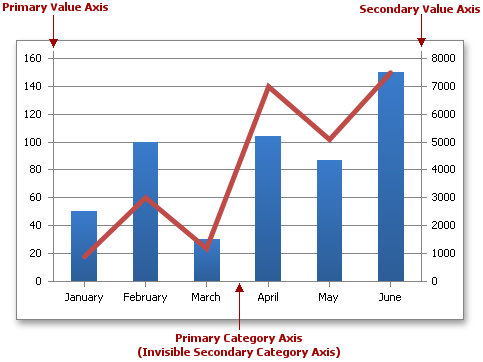
To display secondary axes for a specific series, assign the AxisGroup.Secondary value to the Series.AxisGroup property. Note that you cannot make all the series on the chart secondary. An exception occurs when you try to change the axis group for the only primary series on a chart or for a series whose chart type does not allow secondary axes.
If the secondary axes were created successfully, they are added to the secondary axis collection (accessible using the ChartObject.SecondaryAxes property) and treated separately from the primary axes. You can get an individual secondary axis defined by the Axis object by its index in the collection (0 for the secondary category axis and 1 for the secondary value axis). For the secondary axes, you can specify the same set of axis options that the primary axes have: for example, you can set the secondary axis position, adjust scaling options, add the axis title, etc.
The example below demonstrates how to display a secondary axis on a chart. The secondary axis group is used to plot data of a specific series, for which the Series.AxisGroup property is set to AxisGroup.Secondary value.
Worksheet worksheet = workbook.Worksheets["chartTask5"];
workbook.Worksheets.ActiveWorksheet = worksheet;

// Create a chart and specify its location.
Chart chart = worksheet.Charts.Add(ChartType.LineMarker, worksheet["B2:D8"]);
chart.TopLeftCell = worksheet.Cells["F2"];
chart.BottomRightCell = worksheet.Cells["L15"];

// Use the secondary axis.
chart.Series[1].AxisGroup = AxisGroup.Secondary;

// Specify the position of the legend.
chart.Legend.Position = LegendPosition.Top;
Display or Hide Axis Tick Marks and Gridlines
When you create a chart, it adds major tick marks to each axis by default. Tick marks are tiny lines used to indicate the demarcation of the axis. You can hide major tick marks or adjust their placement by using the Axis.MajorTickMarks property. To display and position minor tick marks, use the Axis.MinorTickMarks property. You can also specify how many tick marks should appear on the axis by changing the distance between the major and minor tick marks via the Axis.MajorUnit and Axis.MinorUnit properties.
Each major tick mark on the axis is accompanied by a tick-mark label - a textual identifier that explains the meaning of the axis units. Tick-mark labels are generated automatically based on the data displayed along the axis. However, you can remove axis labels from the chart by setting the Axis.TickLabelPosition property to AxisTickLabelPosition.None. You can also apply number format to the numerical values displayed in the labels.
The example below demonstrates how to create the clustered column chart and hide the axis major tick marks by setting the Axis.MajorTickMarks property to the AxisTickMarks.None value.
Worksheet worksheet = workbook.Worksheets["chartTask3"];
workbook.Worksheets.ActiveWorksheet = worksheet;

// Create a chart and specify its location.
Chart chart = worksheet.Charts.Add(ChartType.ColumnClustered, worksheet["B3:C5"]);
chart.TopLeftCell = worksheet.Cells["H2"];
chart.BottomRightCell = worksheet.Cells["N14"];

// Set the axis tick marks.
Axis axis = chart.PrimaryAxes[0];
axis.MajorTickMarks = AxisTickMarks.None;
axis = chart.PrimaryAxes[1];
axis.MajorTickMarks = AxisTickMarks.None;

// Hide the legend.
chart.Legend.Visible = false;
To improve the readability of a chart, you can display gridlines - a series of horizontal and vertical lines running across the plot area. By default, the chart displays major gridlines for the primary value axis to help you to determine the value of each data point. However, you can hide major gridlines for the value axis or add gridlines to the category axis by using the Axis.MajorGridlines property. You can also display minor gridlines by utilizing the Axis.MinorGridlines property.
The example below demonstrates how to create a simple line chart and display major gridlines for the category axis and the minor gridlines for the value axis by setting the ChartLineOptions.Visible property to true.
Worksheet worksheet = workbook.Worksheets["chartTask5"];
workbook.Worksheets.ActiveWorksheet = worksheet;

// Create a chart and specify its location.
Chart chart = worksheet.Charts.Add(ChartType.Line, worksheet["B2:C8"]);
chart.TopLeftCell = worksheet.Cells["F2"];
chart.BottomRightCell = worksheet.Cells["L15"];

// Display the major gridlines of the category axis.
chart.PrimaryAxes[0].MajorGridlines.Visible = true;
// Display the minor gridlines of the value axis.
chart.PrimaryAxes[1].MinorGridlines.Visible = true;

// Hide the legend.
chart.Legend.Visible = false;