SchedulerView Class
A scheduler view.
Namespace: DevExpress.XamarinForms.Scheduler
Assembly: DevExpress.XamarinForms.Scheduler.dll
Declaration
[ContentProperty("Views")]
public class SchedulerView :
    View,
    IBindingContextParent
Related API Members
The following members return SchedulerView objects:
Remarks
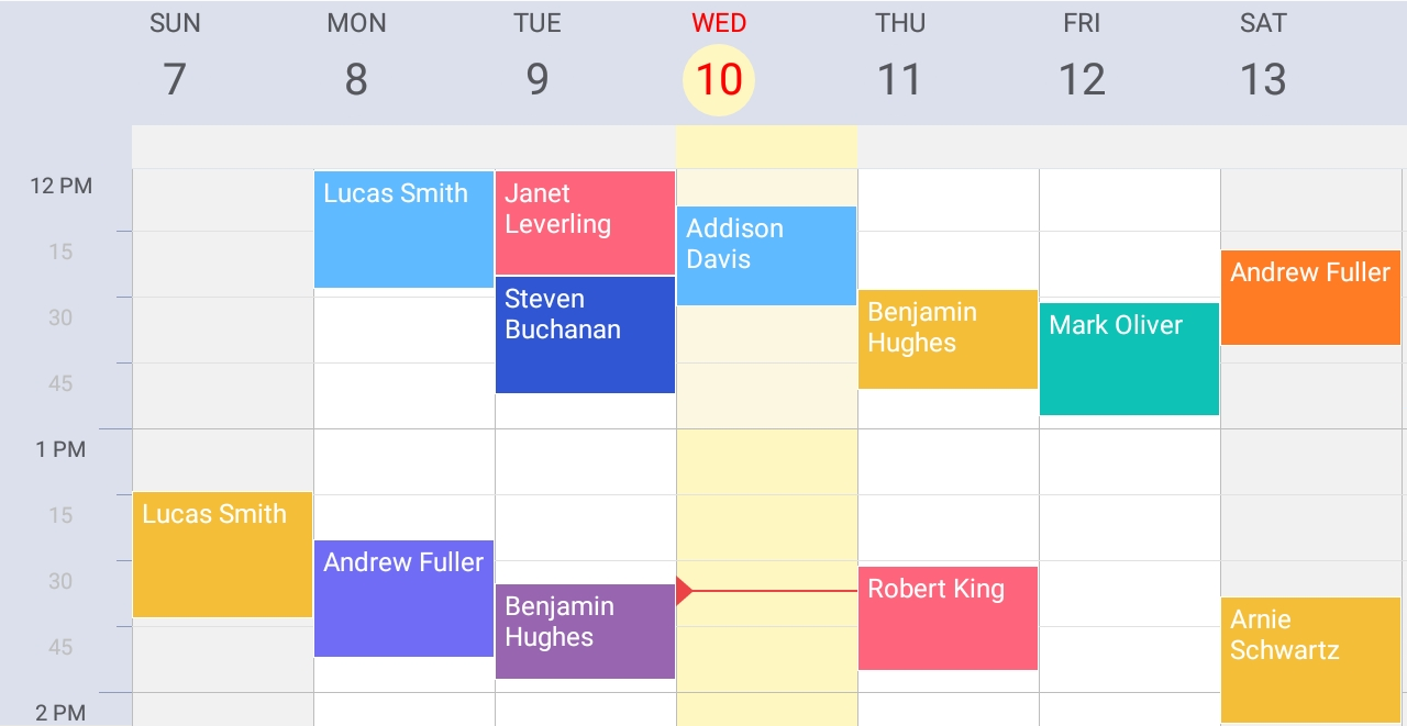
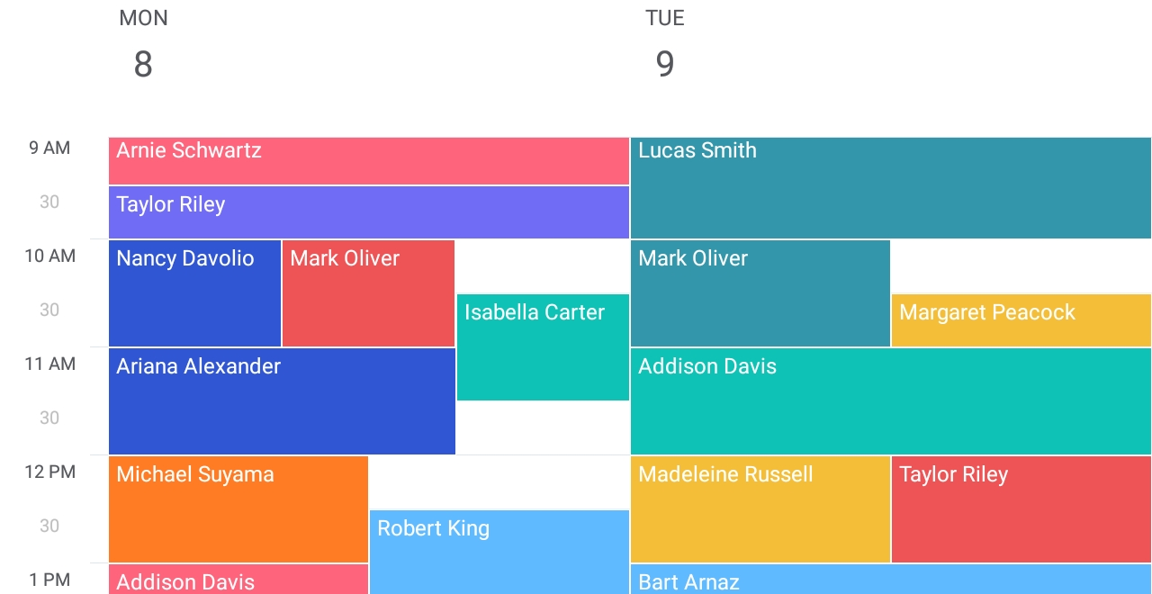
SchedulerView displays appointments (scheduled events) and allows users to manage them in a predefined view: Day, Work Week and Week.
Day View displays appointments for one or several days.
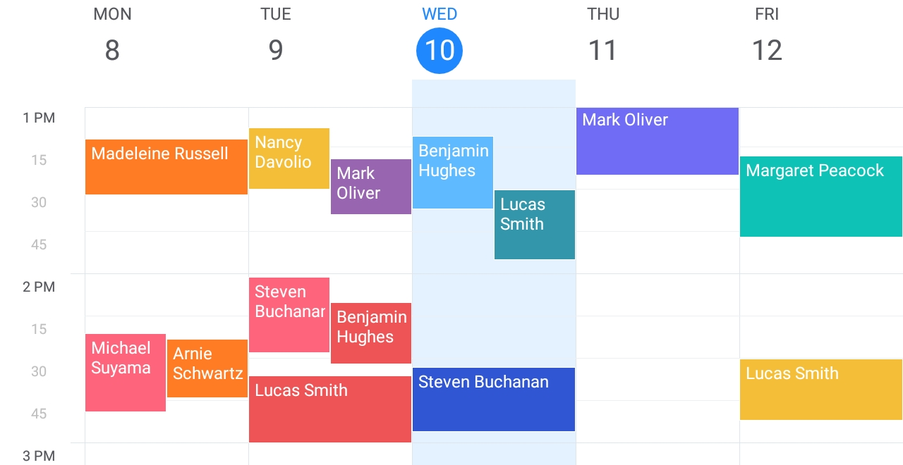
Work Week View displays appointments for working days in a week.
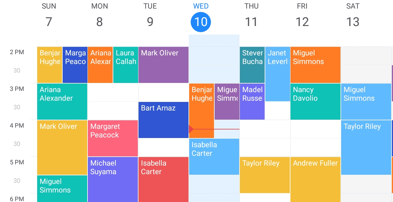
Week View displays appointments for an entire week.
The scheduler stores views in the Views collection. To specify the active view, use the SchedulerView.ActiveViewIndex property.
All standard views with default settings are available out-of-the-box. To overwrite the collection of default views, declare your views in XAML or code. Each view object (DayView, WorkWeekView or WorkWeekView) provides a set of properties to configure the view. For example, you can adjust the time scale (TimeScaleInterval, TimeScaleSlotCount), specify the visible time interval (VisibleTime, ShowWorkTimeOnly), and customize the appearance of view elements.
<ContentPage xmlns="http://xamarin.com/schemas/2014/forms"
            xmlns:x="http://schemas.microsoft.com/winfx/2009/xaml"
            xmlns:dxsch="clr-namespace:DevExpress.XamarinForms.Scheduler;assembly=DevExpress.XamarinForms.Scheduler"
            xmlns:sys="clr-namespace:System;assembly=mscorlib"
            xmlns:local="clr-namespace:SchedulerExample"
            x:Class="SchedulerExample.MainPage">
  <dxsch:SchedulerView x:Name="scheduler"
                       Start="{Binding Source={x:Static sys:DateTime.Now}}"
                       WorkTime="7:00:00-19:00:00"
                       WorkDays="Monday,Tuesday,Wednesday,Friday"
                       FirstDayOfWeek="Monday"
                       ActiveViewIndex="1">
    <dxsch:DayView DayCount="2" VisibleTime="6:00:00-21:00:00" />
    <dxsch:WorkWeekView TimeScaleInterval="01:00:00"
                        TimeScaleSlotCount="4"
                        ShowWorkTimeOnly="True"
                        SnapToCellsMode="Never">
        <dxsch:WorkWeekView.CellStyle>
            <dxsch:DayViewCellStyle WorkTimeBackgroundColor="LightYellow"/>
        </dxsch:WorkWeekView.CellStyle>
    </dxsch:WorkWeekView>
  </dxsch:SchedulerView>
</ContentPage>
Appointments
An appointment (AppointmentItem) is an activity scheduled for a specific time interval. An activity is characterized by its subject, location, category (Label), and description. An appointment can also contain other properties. An appointment’s appearance depends on the active view.
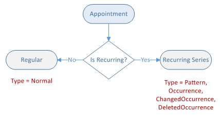
An appointment can occur only once in the specified time interval, or be recurring (occurs many times at the same time interval). To identify whether an appointment is recurring, use the AppointmentItem.IsRecurring property.
A recurring appointment can be a base (Pattern) or occurrence. A Pattern appointment contains information about a recurrence. Occurring appointments can be an Occurrence or exception (ChangedOccurrence or DeletedOccurrence). Use the AppointmentItem.Type property to determine the appointment type.
The scheduler provides the following properties and methods to manage appointments:
Member | Description |
|---|---|
The planned event the SchedulerView displays. | |
Provides access to appointments in the scheduler. | |
Bind the scheduler to an external data source. | |
Creates a new AppointmentItem instance and adds it to the AppointmentItems collection. | |
Creates a copy of the specified appointment object. | |
Returns appointments within the specified date-time range. | |
Returns an appointment with the specified identifier from the AppointmentItems collection. | |
Returns all exceptions to the specified pattern. | |
Returns an occurrence or exception under the specified recurrence index from the recurring chain the given pattern specifies. | |
Returns all occurrences and exceptions to the specified pattern that are within the given date-time interval. | |
Removes the specified appointment from the AppointmentItems collection. |
Labels
A label specifies the background color of an appointment’s rectangle. Users can assign labels to appointments to categorize and identify them.
To assign a label to an appointment, use the AppointmentItem.LabelId property.
A label is an AppointmentLabelItem object. It provides the Caption and Color properties that you can use to specify a label’s caption and color.
The scheduler stores labels in the SchedulerView.LabelItems collection. It includes a set of predefined labels, but you can replace them with custom labels.
Color | Color Value | Display Name | Label Id (Int32 Value) |
|---|---|---|---|
| #949494 | None | 0 |
| #F15558 | Important | 1 |
| #FF7C11 | Business | 2 |
| #FFBF22 | Personal | 3 |
| #FF6E86 | Vacation | 4 |
| #9865b0 | Must Attend | 5 |
| #756CFD | Travel Required | 6 |
| #0055D8 | Needs Preparation | 7 |
| #01B0EE | Birthday | 8 |
| #0097AD | Anniversary | 9 |
| #00C831 | Phone Call | 10 |


You can bind the scheduler’s collection of labels to an external data source. To do this, set the SchedulerView.DataSource property to a DataSource object and use its AppointmentLabelsSource and AppointmentLabelMappings properties to specify the source of custom label objects and map the scheduler’s appointment label properties to data source fields. See the Create Custom Labels example.
Customization
You can use the following properties of view objects to customize view elements‘s appearance :
View Element | Property |
|---|---|
AllDayCellStyle, AllDayCellTemplate | |
TimeRulerHeaderStyle, TimeRulerHeaderTemplate |
<ContentPage xmlns="http://xamarin.com/schemas/2014/forms"
             xmlns:x="http://schemas.microsoft.com/winfx/2009/xaml"
             xmlns:local="clr-namespace:SchedulerExample"
             xmlns:dxsch="clr-namespace:DevExpress.XamarinForms.Scheduler;assembly=DevExpress.XamarinForms.Scheduler"
             x:Class="SchedulerExample.MainPage">
    <ContentPage.Resources>
        <ResourceDictionary>
            <dxsch:TextStyle x:Key="redText" Color="red"/>
        </ResourceDictionary>
    </ContentPage.Resources>
    <dxsch:SchedulerView>
        <dxsch:WeekView>
            <!--Customize the date header appearance.-->
            <dxsch:WeekView.HeaderItemStyle>
                <dxsch:DayViewHeaderItemStyle BackgroundColor="#dce0ec"
                                              TodayDayNumberBackgroundColor="#fff7c2"
                                              TodayDayNumberTextStyle="{StaticResource redText}"
                                              TodayWeekDayTextStyle="{StaticResource redText}"/>
            </dxsch:WeekView.HeaderItemStyle>

            <!--Customize the time ruler appearance.-->
            <dxsch:WeekView.TimeRulerCellStyle>
                <dxsch:TimeRulerCellStyle BackgroundColor="#dce0ec"
                                          IntervalTickColor="#8e9bbc" IntervalTickLength="15"
                                          SlotTickColor="#8e9bbc" SlotTickLength="7"/>
            </dxsch:WeekView.TimeRulerCellStyle>
            <dxsch:WeekView.TimeRulerHeaderStyle>
                <dxsch:TimeRulerHeaderStyle BackgroundColor="#dce0ec"/>
            </dxsch:WeekView.TimeRulerHeaderStyle>

            <!--Customize the all-day area appearance.-->
            <dxsch:WeekView.AllDayCellStyle>
                <dxsch:AllDayAreaCellStyle BackgroundColor="#f1f1f1"
                                            TodayBackgroundColor="#fff7c2"/>
            </dxsch:WeekView.AllDayCellStyle>

            <!--Customize the cell appearance.-->
            <dxsch:WeekView.CellStyle>
                <dxsch:DayViewCellStyle WorkTimeBackgroundColor="White"
                                        BackgroundColor="#f1f1f1"
                                        TodayBackgroundColor="#fff7c2"
                                        BorderColor="#bdbdbd"
                                        SlotBorderColor="#e1e1e1">
                    <dxsch:DayViewCellStyle.Customizer>
                        <local:DayViewCellCustomizer/>
                    </dxsch:DayViewCellStyle.Customizer>
                </dxsch:DayViewCellStyle>
            </dxsch:WeekView.CellStyle>
        </dxsch:WeekView>
    </dxsch:SchedulerView>
</ContentPage>