TabItem.HeaderIconPosition Property
Gets or sets the position of the header icon relative to the header’s text.
Namespace: DevExpress.XamarinForms.Navigation
Assembly: DevExpress.XamarinForms.Navigation.dll
Declaration
public Position HeaderIconPosition { get; set; }Property Value
| Type | Description |
|---|---|
| Position | The position of the header icon relative to the header’s text. |
Available values:
| Name | Description |
|---|---|
| Default | Identifies the default element position. |
| Top | An element is at the top edge of the container. |
| Bottom | An element is at the bottom edge of the container. |
| Left | An element is at the left edge of the container. |
| Right | An element is at the right edge of the container. |
Remarks
The following positions are available:
Position | Sample image | Description |
|---|---|---|
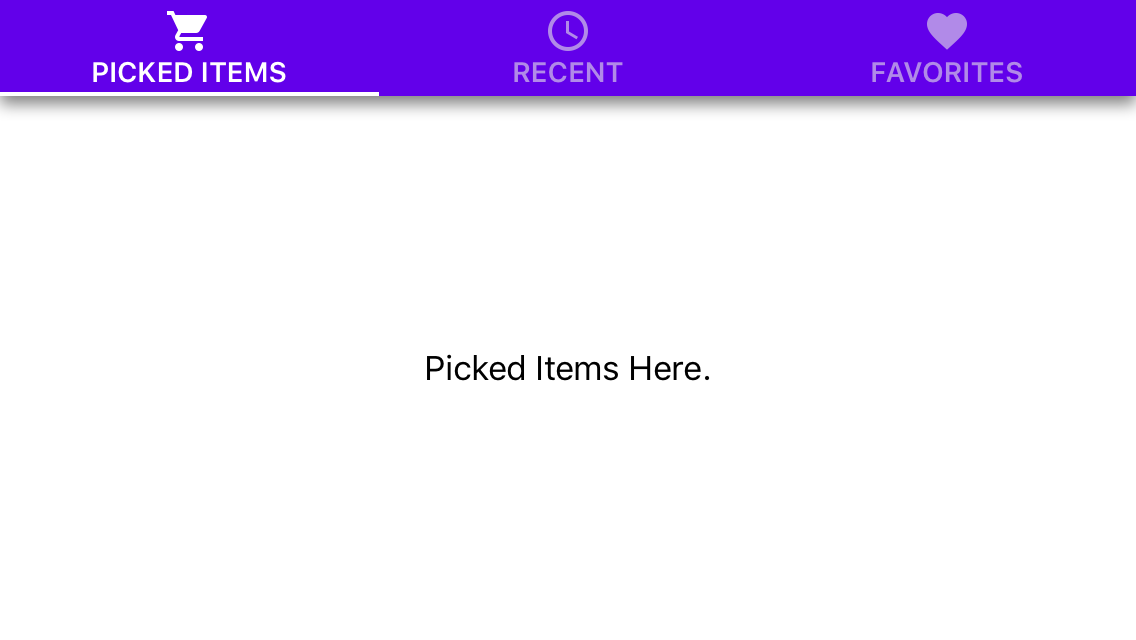
Top |
| The icon is above text. |
Left |
| The icon is before text. |
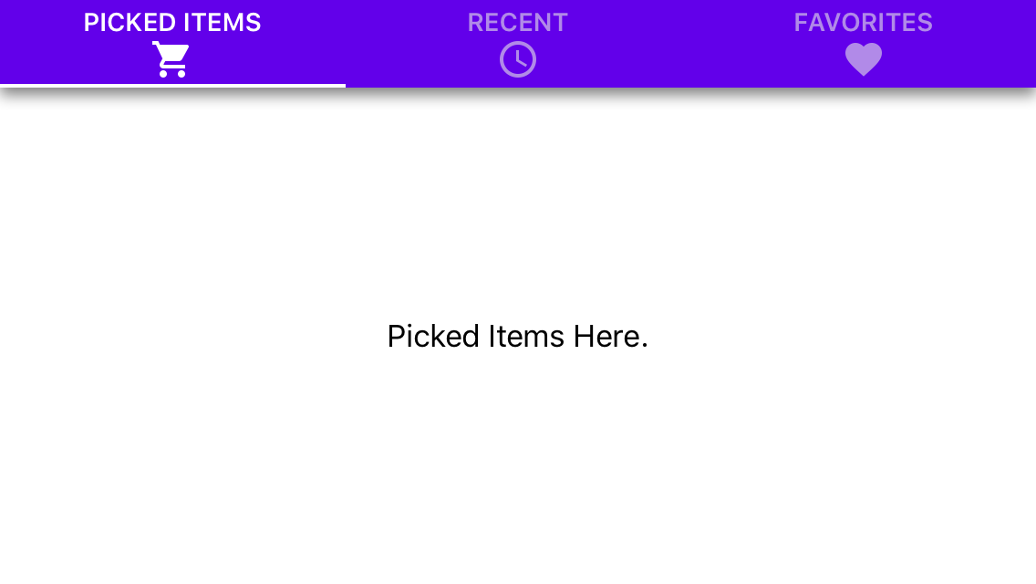
Bottom |
| The icon is below text. |
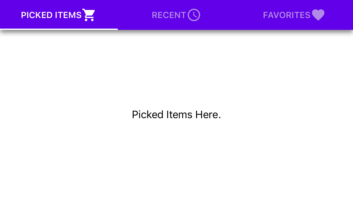
Right |
| The icon is after text. |
Example
The following code configures a tab item according to Material Design guidelines.
<dxn:TabItem HeaderText="CALENDAR"
             HeaderFont="14, Bold"
             HeaderIconColor="#99191919"
             HeaderTextColor="#99191919"
             HeaderWidth="*"
             HeaderMinWidth="90"
             HeaderMaxWidth="360"
             HeaderPadding="16,0,16,0"
             HeaderIconPosition="Top"
             HeaderIconSpacing="4"
             HeaderVisibleElements="TextAndIcon"
             SelectedHeaderIconColor="#1e88e5"
             SelectedHeaderTextColor="#1e88e5"
             SelectedHeaderBackgroundColor="Transparent">
    <dxn:TabItem.HeaderIcon>
        <OnPlatform x:TypeArguments="FileImageSource">
            <On Platform="iOS" Value="calendar"/>
            <On Platform="Android" Value="ic_calendar.png"/>
        </OnPlatform>
    </dxn:TabItem.HeaderIcon>
    <dxn:TabView.Content>
        <StackLayout>
            <Label Text="Calendar Here"
                   HorizontalOptions="Center"
                   VerticalOptions="CenterAndExpand"/>
        </StackLayout>
    </dxn:TabView.Content>
</dxn:TabItem>
The markup above uses the following properties:
Note
TabView contains the majority of the visual settings TabItem provides. Tab View’s properties simultaneously configures appearance of all tab items the view displays.
Property | Description |
|---|---|
Gets or sets a view the Tab View displays in the content area when the item is selected. | |
Gets or sets an icon the item header displays. | |
Gets or sets the text of the item header title. | |
Gets or sets the item header width when TabView.HeaderPanelPosition is set to Top or Bottom. | |
Gets or sets the minimum width of the item header when TabView.HeaderPanelPosition is set to Top or Bottom. | |
Gets or sets the maximum width of the item header when TabView.HeaderPanelPosition is set to Top or Bottom. | |
Gets or sets the inner padding of the header item. | |
Gets or sets the color the tab item uses in the default state to paint its icon. | |
| Gets or sets the position of the header icon relative to the header’s text. |
Gets or sets spacing between the icon and the text of a header item. | |
Gets or sets the font family to which the font for the item header’s text belongs. | |
Gets or sets the size of the font for the item header’s text. | |
Gets or sets a value that indicates whether the font for the item header’s text is bold, italic, or neither. | |
Gets or sets the color the tab item uses in the default state to paint its text. | |
Gets or sets a value that specifies elements the item header shows. | |
Gets or sets the background color of the tab item header in the selected state. | |
Gets or sets the color the tab item uses in the selected state to paint its icon. | |
Gets or sets the color the tab item uses in the selected state to paint its text. |