TimeEdit Class
An editor that allows users to specify a time. Supports the 12- and 24-hour formats.
Namespace: DevExpress.XamarinForms.Editors
Assembly: DevExpress.XamarinForms.Editors.dll
NuGet Package: DevExpress.XamarinForms.Editors
Declaration
public class TimeEdit :
    EditBase,
    ITimeEditController,
    IEditController,
    IElementController
Remarks
Use the TimeEdit to display and edit a DateTime value.
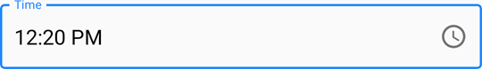
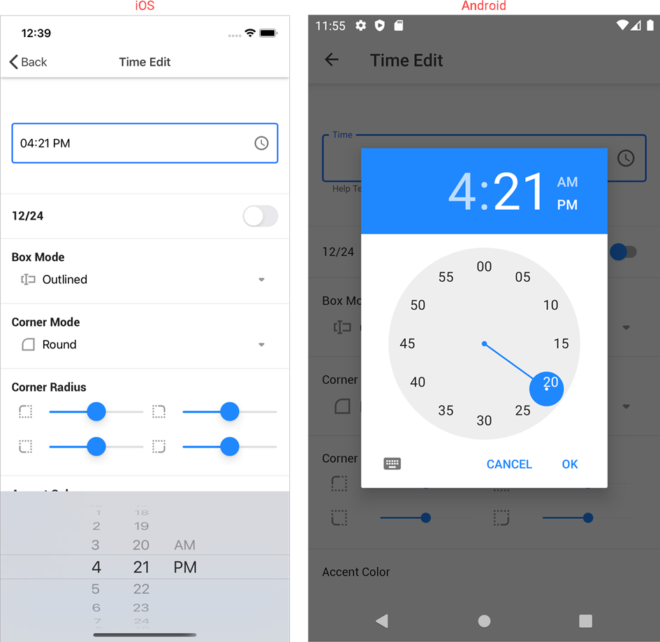
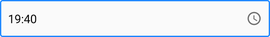
When a user taps the editor, it invokes the standard iOS or Android time picker that allows the user to select the time.
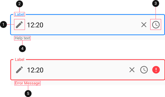
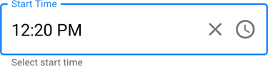
The editor initially displays a time icon on the right in the edit box. You can also add the following elements:
Time
Use the Time or TimeSpan property to specify the time in the editor. These properties are synchronized — the time span specifies the amount of time elapsed since midnight.
The following properties allow you to change the appearance and alignment of the time in the edit box:
Property | Description |
|---|---|
Specify the text color for each state of the editor. | |
Specify the font settings of a time displayed in the editor. | |
Specifies the horizontal alignment of a time displayed in the editor. |
Use the following event and properties to specify the action executed when the time changes:
Property/Event | Description |
|---|---|
Fires when the time displayed in the editor changes. | |
Specifies the command executed when the time displayed in the editor changes. | |
Specifies the parameter passed to the TimeChangedCommand. |
Time Format
The editor can display the time in 12- and 24-hour formats.
The default format depends on the current culture. Use the TimeFormatMode property to specify the time format explicitly.
<dxe:TimeEdit TimeFormatMode="HourFormat12"/>
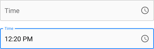
Label
The LabelText property specifies the editor’s input prompt string. The label is displayed inside the editor while the editor is not focused. When the editor gets focus, the label moves to the top. If a value is assigned to the editor, the label is always displayed at the top.
Set the IsLabelFloating property to false to pin the label to the top of the editor. To customize the label’s appearance, use the following properties:
Property | Description |
|---|---|
LabelColor / FocusedLabelColor | Specify the label’s color for each state of the editor. |
Specify the label’s font settings. |
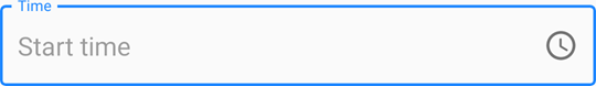
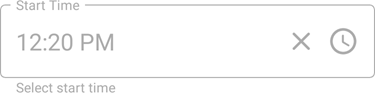
Placeholder
A placeholder (PlaceholderText) is the input prompt string displayed within the edit box when the editor is empty and focused.
Use the PlaceholderColor property to specify the color of the placeholder text.
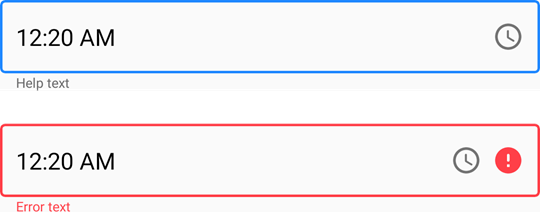
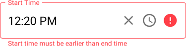
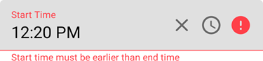
Help Text and Error Message
You can display the following labels below an editor:
- HelpText - A brief editor description.
- ErrorText - A message shown when an error occurs (HasError is true).
The BottomTextTopIndent property specifies the indent between the editor’s bottom border and the help or error text.
To specify the color and font attributes for the help/error text, use the following properties:
Property | Description |
|---|---|
Specify the help text color for different states of an editor. | |
Specifies the error message text color. | |
BottomTextFontSize | Specify font settings. |
If HelpText is not set, ErrorText appears as an additional line below the edit box and page content shifts down. To prevent this behavior, set the ReserveBottomTextLine property to true.
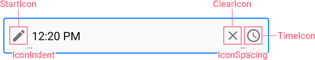
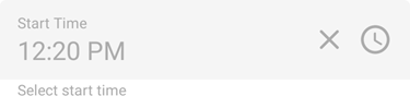
Icons
The time editor can display the following icons:
- Time icon - indicates a time editor.
- Clear icon - removes the selected time.
- Error icon - appears in the error state (HasError is true).
- Custom icons - can be shown on the left or right within the box.
Use the following members to manage the editor’s icons:
Icon | Property | Description |
|---|---|---|
Time Icon | Allows you to replace the default time icon image with a custom icon. | |
Allow you to execute an action when a user taps the time icon. | ||
Allows you to color the icon. | ||
Specifies whether the time icon is visible. | ||
Clear Icon | Specifies when the clear icon is displayed. | |
Specifies the clear icon image. | ||
Allow you to assign an additional action to the clear icon. | ||
Gets or sets the color of the clear icon. | ||
Error Icon | Allows you to replace the default error icon image with a custom one. | |
Allow you to execute an action when a user taps the error icon. | ||
Specifies the error icon’s color. | ||
Specifies whether the error icon is visible. | ||
Custom Icons | Specify custom icons displayed on the left and right within the editor. | |
StartIconClicked / StartIconCommand | Allow you to set actions that occur when a user taps custom icons. | |
Specify icon colors. | ||
Specify whether custom icons are visible. | ||
Common | Specify the color of the icon for each state of the editor. | |
Specifies the distance between an icon and input text (or prefix/suffix, if any). | ||
Specifies the distance between icons. | ||
Specifies the vertical alignment of icons. |
User Interaction
Editors raise the following events on user interaction:
- Tap - Fires when the user taps the editor.
- DoubleTap - Fires when the user double taps the editor.
- LongPress - Fires when the user presses and holds the editor.
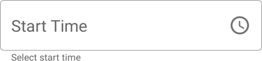
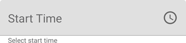
Editor Appearance
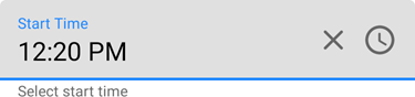
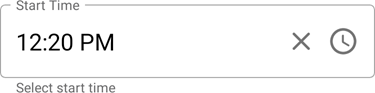
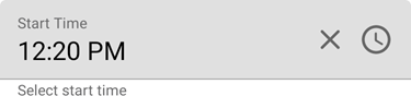
The editor appears as follows depending on the current state and specified BoxMode:
Editor State | BoxMode = Outlined (default) | BoxMode = Filled |
|---|---|---|
Inactive |
|
|
Focused |
|
|
Activated |
|
|
Error |
|
|
Disabled |
|
|
Use the following properties to change the appearance of the edit box and its borders:
Property | Description |
|---|---|
Specify the border color for each state of the editor. | |
Specifies the color of the edit box borders, label, and error icon and error message if there is an input error. | |
BorderThickness | Specify the border thickness for each state of the editor. |
Specifies whether edit box corners are rounded or cut. | |
Specifies the radius of the edit box corners. | |
BackgroundColor | Specifies the edit box fill color. |
Specifies the amount of space between edit box borders and content. |