SimpleButton Class
A simple button.
Namespace: DevExpress.XamarinForms.Editors
Assembly: DevExpress.XamarinForms.Editors.dll
NuGet Package: DevExpress.XamarinForms.Editors
Declaration
public class SimpleButton :
    View,
    IButtonController,
    IViewController,
    IVisualElementController,
    IElementController
Remarks
SimpleButton performs the assigned action when a user taps it. The control can display a caption string (Text), an icon (Icon), or both.

Use the following events to define how the button should respond to taps:
Pressed - Occurs when a user presses the button.
Released - Occurs when a user releases the button.
Clicked - Occurs when a user taps the button and then releases it. This event is fired right after the Released event, but if the user slides their finger away from the button before releasing it, the Clicked event does not occur.
Visual States and Appearance
The button has a different appearance in each state and provides the following properties to customize colors:
Button | Properties |
|---|---|
Default | BorderColor |
Pressed (IsPressed) | PressedBorderColor |
Disabled | DisabledBorderColor |


You can also adjust the following appearance settings for all button states:
Property | Description |
|---|---|
Gets or sets the thickness of the button borders. | |
Gets or sets whether button corners are rounded or cut. | |
Specifies the radius of the button corners. | |
Configure the font settings. | |
Specify the icon position relative to the button caption. | |
Gets or sets the distance between the button caption and borders. | |
Gets or sets the button shadow visibility. | |
Gets or sets whether the ripple animation effect is used. | |
Gets or sets the custom content of the button. |
The following images show buttons with the corner radius set to 15:
CornerMode = Round
| CornerMode = Cut
|


Example
This example shows how to customize button appearance and handle the button click event.
Button State | Default Appearance | Custom Appearance |
|---|---|---|
Default |
|
|
Pressed |
|
|
Disabled |
|
|
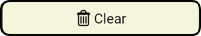


Add the delete.png icon file to your platform-specific projects:
- Android
Add the icon file to the Resources/drawable folder. - iOS
Double-click the Assets.xcassets asset catalog, create a new delete image set, and add the icon image to this image set.
- Android
Use the following properties to adjust the button’s appearance and handle the Clicked event to clear label1 on button tap:
<dxe:SimpleButton Text = "Clear" Icon = "delete" BorderThickness="2" BorderColor="Black" PressedBorderColor="DarkOrange" DisabledBorderColor="DarkGray" TextColor="Black" PressedTextColor="White" DisabledTextColor="DarkGray" IconColor="Black" PressedIconColor="White" DisabledIconColor="DarkGray" BackgroundColor="Beige" DisabledBackgroundColor="Brown" PressedBackgroundColor="Gray" CornerMode = "Round" CornerRadius="10" Clicked = "SimpleButton_Clicked"/>private void SimpleButton_Clicked(object sender, EventArgs e) { label1.Text = ""; }