SwipeItemStyle Class
Stores the swipe item appearance settings.
Namespace: DevExpress.XamarinForms.DataGrid
Assembly: DevExpress.XamarinForms.Grid.dll
NuGet Package: DevExpress.XamarinForms.Grid
Declaration
public class SwipeItemStyle :
    StyleBase
Related API Members
The following members return SwipeItemStyle objects:
Remarks
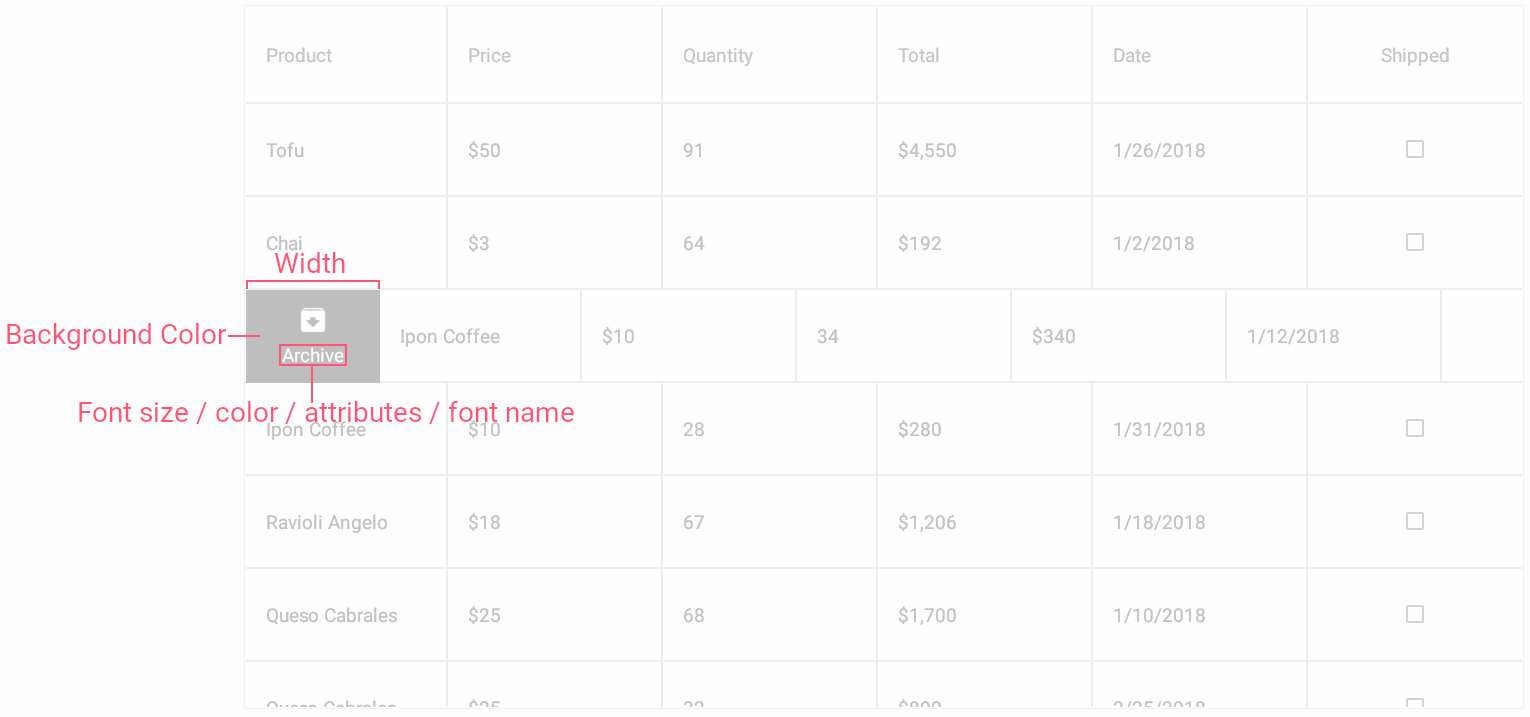
The SwipeItemStyle class provides properties to customize the following appearance parameters of a swipe item:
You can specify a style and apply it to grid’s swipe items in one of the following ways:
Assign a SwipeItemStyle object with the specified properties to the DataGridView.SwipeItemStyle property.
Create a Style class instance with the specified collection of Setter objects, and set the Style.TargetType property to SwipeItemStyle.
SwipeItemStyle‘s settings are applied to all swipe items of the grid. To customize the colors or width of an individual swipe item, use the SwipeItem object’s BackgroundColor, FontColor and Width properties.
Example
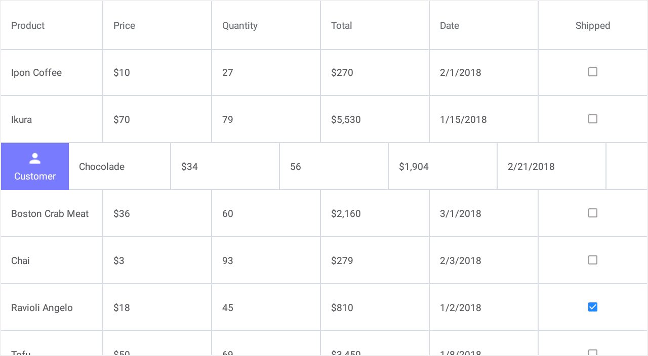
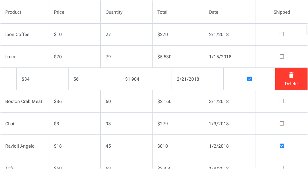
This example shows how to extend the grid’s UI with additional elements (buttons) that appear when a user swipes a data row (from left to right or from right to left) and perform custom actions on tap.
Define two swipe actions for rows of the grid bound to the collection of orders:
- Display information on a customer - When a user swipes a data row from left to right, the Customer button appears on the left side of the row.
- Remove an order - When a user swipes a data row from right to left, the Delete button appears on the right side of the row.
Start Swipe Item
End Swipe Item
Follow the steps below to implement this functionality:
- Add a SwipeItem object to the DataGridView.StartSwipeItems or DataGridView.EndSwipeItems collection.
- Use this object’s Caption, BackgroundColor and Image properties to customize each button appearance.
If you need to apply the same appearance settings to all swipe buttons of the grid, assign aSwipeItemStyleobject with the specified properties to DataGridView.SwipeItemStyle. In the current example, all buttons have the identical width (SwipeItemStyle.Width). - Handle the SwipeItem.Tap event to assign a custom action to a button.
Note
The grid performs the first action from its StartSwipeItems collection or last action from EndSwipeItems in response to a full swipe across the row from left to right or from right to left. To change this behavior, use the DataGridView.FullSwipeMode property.
<dxg:DataGridView x:Name="grid" ItemsSource="{Binding Orders}">
    <!-- ... -->
    <dxg:DataGridView.StartSwipeItems>
            <dxg:SwipeItem Caption="Customer" BackgroundColor="#797bff" Image="person.png"
                           Tap="Swipe_ShowCustomerInfo" />
    </dxg:DataGridView.StartSwipeItems>
    <dxg:DataGridView.EndSwipeItems>
            <dxg:SwipeItem Caption="Delete" BackgroundColor="#ff3b30" Image="delete.png"
                           Tap="Swipe_Delete"/>
    </dxg:DataGridView.EndSwipeItems>

    <dxg:DataGridView.SwipeItemStyle>
        <dxg:SwipeItemStyle Width="100"/>
    </dxg:DataGridView.SwipeItemStyle>
</dxg:DataGridView>