DataGridView Class
A data grid view.
Namespace: DevExpress.XamarinForms.DataGrid
Assembly: DevExpress.XamarinForms.Grid.dll
NuGet Package: DevExpress.XamarinForms.Grid
Declaration
public class DataGridView :
    View,
    ICustomCellTextProvider,
    IGridDataProvider,
    ICellDataProvider,
    IXtraSerializableLayoutEx,
    IXtraSupportDeserializeCollection,
    IStyledElement
Related API Members
The following members return DataGridView objects:
Remarks
DataGridView is a data-aware control that displays data in a tabular format. To show data in a grid and allow users to manage it, use the DataGridView.ItemsSource property to bind the grid to a data source. Note that unbound mode (add and save records directly to a grid) is not supported and the grid cannot operate without a data source. See the following help topic from the Getting Started section for details on data binding: How to: Bind Grid to Data.
Columns
The grid displays data source fields as columns. It automatically generates columns based on a bound data source, or you can add columns to the grid and associate them with data fields manually. The AutoGenerateColumnsMode property specifies how a grid generates columns or prevents columns from automatically being generated.
The grid stores its columns in the DataGridView.Columns collection. An individual column is a GridColumn class descendant that corresponds to the column’s data type. The following column types are supported:
Column Type | Description |
|---|---|
A grid column used to display and edit numeric values. | |
A grid column used to display and edit text values. | |
A grid column used to display and edit text values. The column suggests values as a user types in a cell. | |
A grid column used to display and edit text values. The column displays a drop-down list that contains available values. | |
A grid column used to display and edit date values. | |
A grid column used to display and edit the time. | |
A grid column that displays Boolean values and allows a user to change a cell value by switching between two states. | |
A grid column used to display images. | |
A grid column that allows a user to edit a cell value by selecting an item from the predefined set. | |
A column type that allows you to define a custom template for column cells. |
The GridColumn.FieldName property specifies the data source field to which the column is bound. Each column object provides a set of properties to adjust column settings (e.g., data display format, column width, header caption, content alignment) and manage grid data (sort and group).
The grid allows you to anchor (fix) columns to its left or right edge, so they always remain visible while a user scrolls the view horizontally. To fix a column, set its GridColumn.FixedStyle property to Start or End.
Unbound Columns
In addition to columns bound to data source fields, you can create unbound columns to display data values calculated based on values of other columns. To create an unbound column in the grid, add a column object that corresponds to the type of data the column should display to the DataGridView.Columns collection, and set the following column properties:
- FieldName - a unique string that does not match any field name in the grid’s underlying data source.
- UnboundType - the type of data the column should display (Boolean, DateTime, Decimal, Integer, String or Object).
- UnboundExpression - a formula (string expression) that automatically calculates the column’s values.
The DataGridView.CustomUnboundColumnData event is another way to populate an unbound column with data. It allows you to implement custom logic of any complexity to provide cell values. Also use this event (not an expression) if you need to save changes that a user made in an unbound column.
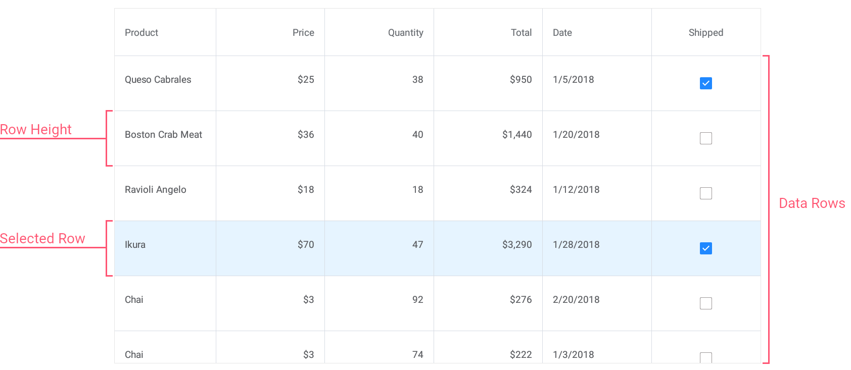
Rows
Data rows in the grid display records from the data source. To obtain the number to data rows in the grid, use the DataGridView.RowCount property.
The grid automatically adjusts data row height to display the entire content of a cell. If you specify the DataGridView.RowHeight property, all data rows will have the same height.
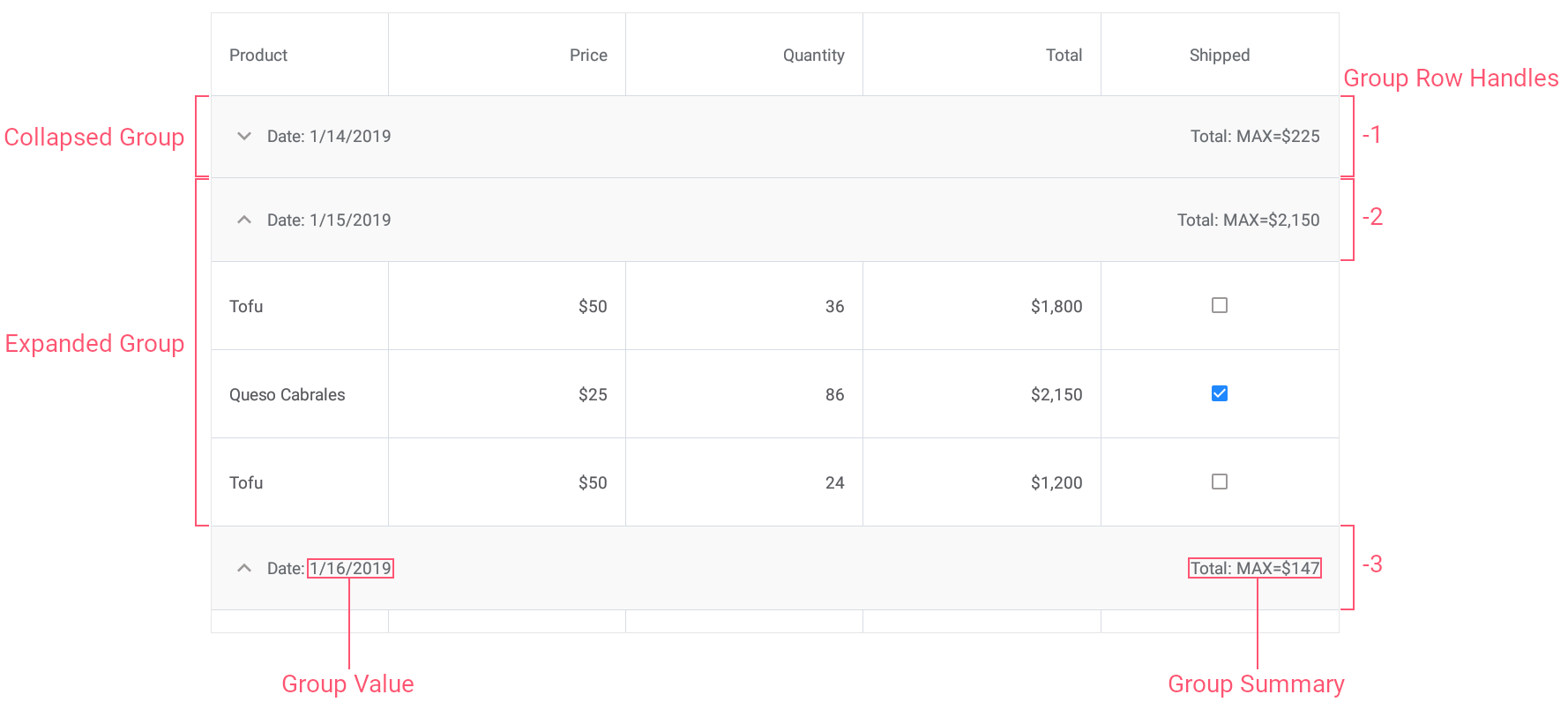
When data is grouped, the grid also displays group rows to separate groups of data rows. End users can tap group rows to expand and collapse groups. The DataGridView.GroupRowHeight property changes the height of group rows.

Row Handles
Grid rows are identified by unique integer values - row handles. Each row has a row handle, regardless of whether a row is currently visible (for example, a row might be scrolled off-screen or hidden within a collapsed group).
A row handle depends on the rows’s current location in the grid and changes dynamically when rows are reordered (for example, when data is sorted or grouped).
- Data row handles are zero-based indexes that correspond to row order from top to bottom.
- Group row handles are negative values that start with -1. The order matches group row order from top to bottom.

The grid exposes the following methods and properties to obtain row handles:
Method | Description |
|---|---|
Returns the handle of the first row that matches the specified criteria. | |
Searches for the value in the column and returns the handle of the corresponding row. | |
Returns the handle of the row that corresponds to the specified record in the data source. | |
Returns the handle of the row at the specified position within the specified group. | |
Gets or sets the selected row handle. |
You can pass row handles as parameters to the following methods that operate with rows:
Method | Description |
|---|---|
Gets the value of the specified cell. | |
Assigns a value to the specified cell. | |
Returns an object that represents a record in the grid’s underlying data source. | |
Gets the index of the data source record to which the specified row handle corresponds. | |
Deletes the specified data row. | |
Scrolls the grid to make the specified row visible. | |
Returns the column’s data value for which the group is created. | |
Returns a value for which the group is created and which is displayed in a group row. | |
Returns a summary value calculated against the specified group of rows. | |
Returns the number of data rows in the group. | |
Indicates whether the specified group row is collapsed. | |
Collapses the specified group of rows. | |
Expands the specified group of rows. |
Cells
The grid displays data values in cells located at the intersection of columns and rows. Use the following methods and properties to obtain and set cell values, and prevent users from changing cell values:
Method | Description |
|---|---|
Gets the value of the specified cell. | |
Gets the text displayed within the specified cell. | |
Assigns a value to the specified cell. | |
Gets or sets whether the grid is read-only. |
Multi-Row Column Layout
You can organize cells that correspond to grid columns into multi-row groups to be shown within data rows, column headers, and data summaries.
Simple Layout
Use the GridColumn.Row property to arrange columns into multiple rows, and the GridColumn.Width property to specify the width for each column. Note that column widths are calculated independently and each row can have a different proportional(*) column width value.
<dxg:DataGridView.Columns>
    <dxg:TextColumn Width="*"/>
    <dxg:TextColumn Width="*"/>
    <dxg:TextColumn Width="*"/>
    <dxg:TextColumn Width="*" Row="1"/>
    <dxg:TextColumn Width="*" Row="1"/>
</dxg:DataGridView.Columns>
Advanced Layout
This layout type is similar to the Xamarin.Forms Grid layout and allows you to span cells across multiple columns/rows (example).
Enable advanced layout mode and specify layout details - the number of columns and rows, and each column width and row height. To do this, set the grid’s AdvancedColumnLayout property to an AdvancedColumnLayout object with the specified ColumnDefinitions and RowDefinitions collections.
Note
In this layout mode, the grid ignores a column’s Width, MinWidth and MaxWidth properties, and uses ColumnDefinitions instead.
The RowHeight, ColumnHeaderHeight and TotalSummaryHeight properties have a higher priority than RowDefinitions.Arrange grid columns within the specified layout. To do this, use the following properties of a column object:
- Column / Row - to define the column position.
- ColumnSpan / RowSpan - to stretch the column across multiple columns/rows within the layout.
<dxg:DataGridView.AdvancedColumnLayout>
    <dxg:AdvancedColumnLayout>
        <dxg:AdvancedColumnLayout.ColumnDefinitions>
            <dxg:ColumnDefinition Width="*"/>
            <dxg:ColumnDefinition Width="*"/>
            <dxg:ColumnDefinition Width="*"/>
        </dxg:AdvancedColumnLayout.ColumnDefinitions>
        <dxg:AdvancedColumnLayout.RowDefinitions>
            <dxg:RowDefinition Height="*"/>
            <dxg:RowDefinition Height="*"/>
            <dxg:RowDefinition Height="*"/>
        </dxg:AdvancedColumnLayout.RowDefinitions>
    </dxg:AdvancedColumnLayout>
<dxg:DataGridView.AdvancedColumnLayout>

<dxg:DataGridView.Columns>
    <dxg:TextColumn RowSpan="2"/>
    <dxg:TextColumn Column="1" ColumnSpan="2"/>
    <dxg:TextColumn Row="1" Column="1"/>
    <dxg:TextColumn Row="1" Column="2" RowSpan="2"/>
    <dxg:TextColumn Row="2" ColumnSpan="2"/>
</dxg:DataGridView.Columns>
Note
If you do not define AdvancedColumnLayout but specify the Column and ColumnSpan / RowSpan properties for columns, the grid uses the default advanced column layout calculated as follows:
- The number of columns is a maximum value assigned to Column or ColumnSpan.
- The number of rows is a maximum value assigned to Row or RowSpan.
- Each column width is set to “*”, each row height is “Auto”.
Edit Data
You can allow users to edit cell values with in-place editors or an edit form.
Related API
Member | Description |
|---|---|
Invokes an in-place editor for the specified cell. | |
Closes a cell in-place editor. | |
Gets or sets a gesture by which a user can invoke an in-place editor for a data cell. | |
Fires when a cell editor is about to be displayed and allows you to cancel the action. | |
The page that allows users to edit grid’s cell values. | |
An edit form for a data object. | |
Contains information on a data row that a user currently edits via the edit form. |
Drag and Drop Rows
The grid has a set of properties and events that allow you to enable drag-and-drop operations and control them at different stages.
Related API
Property | Description |
|---|---|
Gets or sets whether a user is allowed to drag and drop data rows within the grid. | |
Gets or sets whether a user is allowed to drag and drop data rows that are sorted or grouped. | |
Gets or sets the template that defines the visual representation of the dragged row preview displayed during the drag-and-drop operation. | |
Gets or sets the shadow color of the dragged row preview. |
Event | Description |
|---|---|
Occurs when users touch and hold a data row to drag it. | |
Occurs each time a row is over another row when being dragged. | |
Occurs when users drop a row. | |
Occurs after the drag-and-drop operation is completed. |
Input Validation
The grid allows you to validate new values in in-place cell editors or an edit form, indicate errors, and prevent saving invalid data to the data source.
Related API
Member | Description |
|---|---|
Occurs after a user changes a cell value in the in-place editor and attempts to select another cell. | |
Occurs when a value in the in-place cell editor fails validation or when it cannot be saved to a data source. | |
Occurs after a user changes a cell value in the default edit form and moves focus from the editor. | |
Occurs after a user changes the values and attempts to close the edit form. |
Sort Data
Users can tap column headers to sort data in the grid.
Related API
Member | Description |
|---|---|
Specifies whether end users can sort data in the grid. | |
Specifies whether end users can sort data by the column. | |
Specifies whether the grid allows data sorting by multiple columns or by a single column only. | |
Gets or sets the column’s sort order. | |
Gets or sets the column’s position among sorted columns. | |
Specifies whether the grid should sort or group data by column values or display text. | |
Sorts data by the specified column. | |
Clears the sorting applied to the grid. |
<dxg:DataGridView x:Name="grid" ItemsSource="{Binding Orders}"
                 SortMode="Multiple">
    <dxg:DataGridView.Columns>
        <dxg:TextColumn FieldName="Product.Name"
                        SortOrder="Descending" SortIndex="0"/>
        <!-- ... -->
        <dxg:NumberColumn FieldName="Quantity"
                          SortOrder="Ascending" SortIndex="1"/>
        <!-- ... -->
        <dxg:CheckBoxColumn FieldName="Shipped" AllowSort="False"/>
    </dxg:DataGridView.Columns>
</dxg:DataGridView>
Group Data
The grid allows you to group data by a single column.
Groups of data rows (rows that have identical values in a specified column) are separated with group rows that a user can tap to expand or collapse groups. You can also display summary information about groups (e.g., the sum of values, the number of records, the minimum or maximum value) within group rows.
Related API
Member | Description |
|---|---|
Gets or sets whether the grid’s data is grouped by the current column. | |
Gets or sets how data rows are combined into groups. | |
Groups data in the grid by the specified column. | |
Gets or sets whether groups of rows should appear expanded or collapsed immediately after the grid’s data is grouped. | |
Ungroups data in the grid. | |
Gets the number of data row groups within a grid. | |
Gets or sets whether the grid displays a column used to group data. | |
Returns the column’s data value for which the group is created. | |
Returns a value for which the group is created and which is displayed in a group row. | |
Returns a summary value calculated against the specified group of rows. | |
Provides access to the collection of group summary items. | |
Returns the number of data rows in the group. | |
Returns the handle of the row at the specified position within the specified group. | |
Returns the group row handle that identifies the group to which the specified data row belongs. | |
Checks whether the specified row is a group row. | |
Specifies whether end users can collapse and expand groups of rows. | |
Indicates whether the specified group row is collapsed. | |
Collapses the specified group of rows. | |
Collapses all groups of rows. | |
Expands the specified group of rows. | |
Expands all groups of rows. | |
Occurs before a group of rows is collapsed. | |
Occurs after a group of rows has been collapsed. | |
Occurs before a group of rows is expanded. | |
Occurs after a group of rows has been expanded. |
<dxg:DataGridView x:Name="grid" ItemsSource="{Binding Orders}">
    <dxg:DataGridView.Columns>
         <!-- ... -->
        <dxg:DateColumn FieldName="Date" DisplayFormat="d"
                        IsGrouped="true" GroupInterval="Date"/>
         <!-- ... -->
    </dxg:DataGridView.Columns>
</dxg:DataGridView>
Filter Data
You can filter data in the grid against single or multiple columns. When a filter is applied, the grid displays a subset of data records that meet the specified criteria.
Member | Description |
|---|---|
Use either property to apply a filter to the grid. A filter expression can consist of multiple conditions applied to multiple columns. | |
Gets the string that specifies a filter currently used in the grid. | |
Clears the filter applied to data in the grid. |
<dxg:DataGridView ItemsSource="{Binding Orders}"
                  FilterString="Contains([Product.Name], 'Choco')">
    <!-- ... -->
</dxg:DataGridView>
Auto Filter Row
Auto Filter Row allows users to filter data in columns on the fly.

Related API
Member | Description |
|---|---|
Set this property to true to display the auto filter row in the grid. | |
Allows you to disable the auto filter row for an individual column. | |
Gets or sets the value in the auto filter row for the column. | |
Gets or sets the filter condition (equals, contains, for instance) used to compare the value in the auto filter row with column values. | |
Gets or sets whether to filter data each time a value in the auto filter row changes or only when a cell in the auto filter row loses focus. |
The table below lists properties that allow you to customize the auto filter row’s appearance.
Property | Description |
|---|---|
Specify whether to show filter icons in the auto filter row’s cells. | |
Specifies the color of filter icons in the auto filter row’s cells. | |
Specifies the auto filter row’s height. |
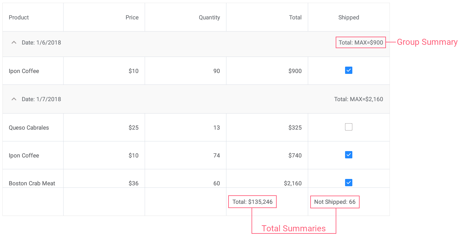
Data Summaries
The grid allows you to display summary information about groups of rows or specific columns. For example, you can display the sum of values, the number of records, the minimum or maximum value, and more.
Two summary types are supported: total summaries (calculated over all rows in a column and displayed below this column) and group summaries (calculated over all rows in a group and displayed in a group row).
Related API
A grid stores its total and group summaries in the DataGridView.TotalSummaries and DataGridView.GroupSummaries collections.
An individual summary (group or total) is a GridColumnSummary object that contains the following summary settings:
Property | Description |
|---|---|
Gets or sets the field name of the column for which a summary should be calculated. | |
Gets or sets the aggregate function type. | |
Gets or sets the pattern used to format the summary value. |
To implement and apply a custom aggregate function, set the GridColumnSummary.Type property to Custom and handle the DataGridView.CalculateCustomSummary event.
<dxg:DataGridView x:Name="grid" ItemsSource="{Binding Orders}"
                 CalculateCustomSummary="OnCalculateCustomSummary">
    <!-- ... -->
    <dxg:DataGridView.GroupSummaries>
        <dxg:GridColumnSummary FieldName="Total" Type="Max"/>
    </dxg:DataGridView.GroupSummaries>

    <dxg:DataGridView.TotalSummaries>
        <dxg:GridColumnSummary FieldName="Total" Type="Sum"
                                DisplayFormat="Total: {0:C0}"/>
        <dxg:GridColumnSummary FieldName="Shipped" Type="Custom"
                                DisplayFormat="Not Shipped: {0}"/>
    </dxg:DataGridView.TotalSummaries>
</dxg:DataGridView>
int count;
// ...

void OnCalculateCustomSummary(object sender, CustomSummaryEventArgs e) {
    if (e.FieldName.ToString () == "Shipped")
        if (e.IsTotalSummary){
            if (e.SummaryProcess == CustomSummaryProcess.Start) {
                count = 0;
            }
            if (e.SummaryProcess == CustomSummaryProcess.Calculate) {
                if (!(bool)e.FieldValue)
                    count++;
                e.TotalValue = count;
            }
        }
}
Pull to Refresh
You can set up the grid so that users can refresh content with a pull-down gesture.
To enable this functionality, set the IsPullToRefreshEnabled property to true. Then, either define a refresh command in a view model and bind it to the PullToRefreshCommand property, or handle the PullToRefresh event. Use the IsRefreshing property to notify the grid that the pull-to-refresh activity is complete and the refresh indicator should be hidden.
Load More
You can set up the grid so that it adds a set of new data items when a user scrolls to the last row.
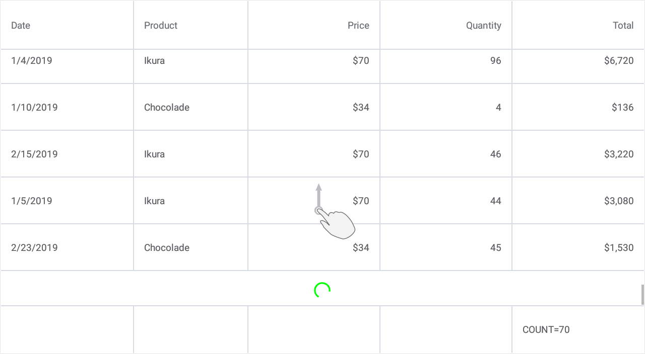
To enable this functionality, set the IsLoadMoreEnabled property to true. Then, either define a load-more command in a view model and bind it to the LoadMoreCommand property, or handle the LoadMore event. Use the IsRefreshing property to notify the grid that the load-more activity is complete and the loading indicator should be hidden. The DataGridView.IndicatorColor property allows you to change the indicator color.
Swipe Actions
You can extend the grid’s UI with additional elements (buttons) that appear when a user swipes a data row (from left to right or from right to left) and perform custom actions on tap.
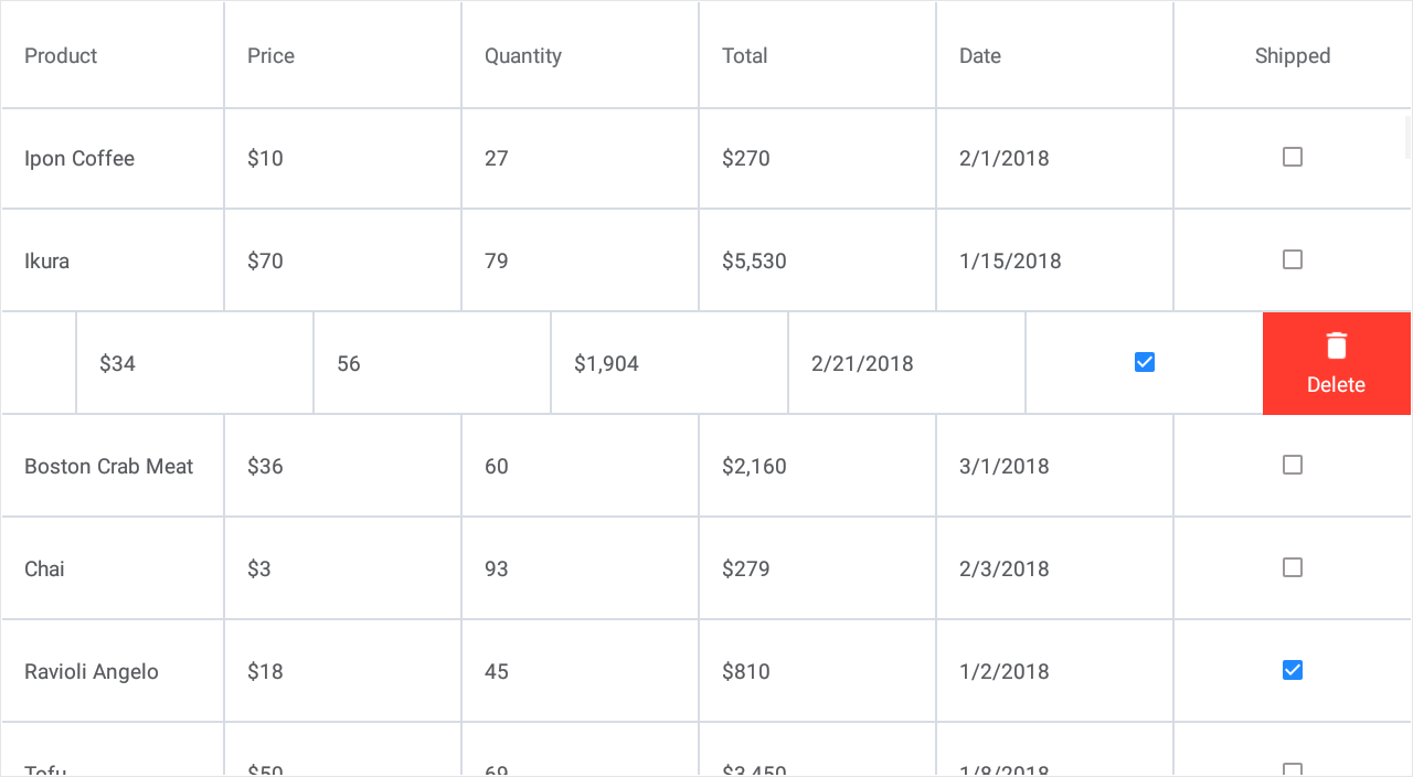
End Swipe Item
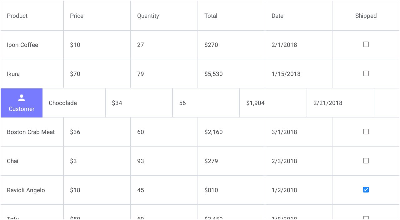
Start Swipe Item
To define a swipe action in the grid, do the following.
- Add a SwipeItem object to the DataGridView.StartSwipeItems or DataGridView.EndSwipeItems collection.
- Use this object’s properties (for example, Image, Caption, FontColor or BackgroundColor) to customize the button appearance.
If you add multiple swipe buttons to the grid and need to apply the same appearance settings to all of them, assign a SwipeItemStyle object with the specified properties to DataGridView.SwipeItemStyle. - Handle the SwipeItem.Tap event to assign a custom action to a button.
<dxg:DataGridView x:Name="grid" ItemsSource="{Binding Orders}">
    <!-- ... -->
    <dxg:DataGridView.StartSwipeItems>
            <dxg:SwipeItem Caption="Customer" BackgroundColor="#797bff" Image="person.png"
                           Tap="Swipe_ShowCustomerInfo" />
    </dxg:DataGridView.StartSwipeItems>
    <dxg:DataGridView.EndSwipeItems>
            <dxg:SwipeItem Caption="Delete" BackgroundColor="#ff3b30" Image="delete.png"
                           Tap="Swipe_Delete"/>
    </dxg:DataGridView.EndSwipeItems>

    <dxg:DataGridView.SwipeItemStyle>
        <dxg:SwipeItemStyle Width="100"/>
    </dxg:DataGridView.SwipeItemStyle>
</dxg:DataGridView>
using DevExpress.XamarinForms.DataGrid;
// ...

private void Swipe_ShowCustomerInfo(object sender, SwipeItemTapEventArgs e) {
    var customer = (e.Item as Order).Customer;
    string customerName = customer.Name;
    string customerPhone = customer.Phone;
    DisplayAlert("Customer", "Name: " + customerName + "\n" + "Phone: " + customerPhone, "OK");
}

private void Swipe_Delete(object sender, SwipeItemTapEventArgs e) {
    grid.DeleteRow(e.RowHandle);
}
The grid performs the first action from its StartSwipeItems or EndSwipeItems collection in response to a full swipe across the row from left to right or from right to left, respectively. To change this behavior, use the DataGridView.FullSwipeMode property.
The SwipeItemShowing event fires when a swipe item is about to be shown when a user swipes a row from left to right or from right to left, and allows you to cancel the action.
Grid Appearance
The following properties allow you to customize the appearance of grid elements (for example, cells, column headers, summaries):
Property | Description |
|---|---|
Gets or sets the grid border color. | |
Gets or sets the grid border thickness. | |
Gets or sets the data cell appearance settings. | |
Gets or sets the group row appearance settings. | |
Gets or sets the column header appearance settings. | |
Gets or sets the total summary panel appearance settings. | |
Gets or sets the swipe item appearance settings. |
You can also create styles for the following target types:
Class | Description |
|---|---|
Stores the data cell appearance settings. | |
Stores the group row appearance settings. | |
Stores the column header appearance settings. | |
Stores the total summary panel’s appearance settings. | |
Stores the swipe item appearance settings. |
<ContentPage xmlns="http://xamarin.com/schemas/2014/forms"
             xmlns:x="http://schemas.microsoft.com/winfx/2009/xaml"
             x:Class="DataGridExample.MainPage"
             xmlns:dxg="http://schemas.devexpress.com/xamarin/2014/forms/datagrid">
    <dxg:DataGridView x:Name="grid" ItemsSource="{Binding Orders}"
                      RowHeight="35" TotalSummaryHeight="35">
        <!-- Specify grid columns and total summaries here. -->

        <!--Customize the appearance of grid cells.-->
        <dxg:DataGridView.CellStyle>
            <dxg:CellStyle Padding="5,5,5,5" BackgroundColor="#333333" BorderColor="#515151"
                           FontSize="8" FontColor="White"
                           SelectionColor="#f78a09" SelectionFontColor="Black"/>
        </dxg:DataGridView.CellStyle>

        <!--Customize the appearance of column headers.-->
        <dxg:DataGridView.ColumnHeaderStyle>
            <dxg:ColumnHeaderStyle BackgroundColor="#333333" BorderColor="#515151"
                             FontSize="12" FontColor="#929292" FontAttributes="Bold"
                             HorizontalLineThickness="2"/>
        </dxg:DataGridView.ColumnHeaderStyle>

        <!--Customize the appearance of the total summary panel displayed at the bottom of the grid.-->
        <dxg:DataGridView.TotalSummaryStyle>
            <dxg:TotalSummaryStyle Padding="2,5,2,5" BackgroundColor="#666666" BorderColor="#515151"
                                   FontSize="8" FontColor="#f78a09"/>
        </dxg:DataGridView.TotalSummaryStyle>
    </dxg:DataGridView>
</ContentPage>

Templates
You can use the following template properties to define how grid elements are displayed:
Visual Element | Property | Binding Context |
|---|---|---|
Data Cell | ||
Column Header | GridColumn.HeaderContentTemplate | |
Group Row | ||
Group Row Caption | GridColumn.GroupCaptionTemplate | |
Group Summary | ||
Total Summary | GridColumn.TotalSummaryTemplate | |
Swipe Item |
This example shows how to define templates for grid column headers. To do this, assign a DataTemplate object to a column’s HeaderContentTemplate property.
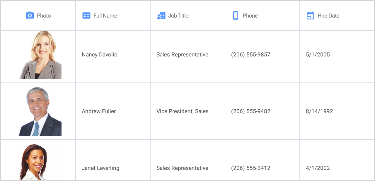
<dxg:DataGridView x:Name = "grid" ItemsSource ="{Binding Employees}">
    <dxg:DataGridView.Columns>
        <dxg:ImageColumn FieldName="Photo">
            <dxg:ImageColumn.HeaderContentTemplate>
                <DataTemplate>
                    <StackLayout Orientation="Horizontal" HorizontalOptions="Center">
                        <Image Source="photo.png" VerticalOptions="Center"/>
                        <Label Text="{Binding FieldName}" VerticalOptions="Center"/>
                    </StackLayout>
                </DataTemplate>
            </dxg:ImageColumn.HeaderContentTemplate>
        </dxg:ImageColumn>
        <dxg:TextColumn FieldName="Name">
            <dxg:TextColumn.HeaderContentTemplate>
                <DataTemplate>
                    <StackLayout Orientation="Horizontal">
                        <Image Source="full_name.png" VerticalOptions="Center"/>
                        <Label Text="Full Name" VerticalOptions="Center"/>
                    </StackLayout>
                </DataTemplate>
            </dxg:TextColumn.HeaderContentTemplate>
        </dxg:TextColumn>
        <dxg:TextColumn FieldName="Position">
            <dxg:TextColumn.HeaderContentTemplate>
                <DataTemplate>
                    <StackLayout Orientation="Horizontal">
                        <Image Source="job_title.png" VerticalOptions="Center"/>
                        <Label Text="Job Title" VerticalOptions="Center"/>
                    </StackLayout>
                </DataTemplate>
            </dxg:TextColumn.HeaderContentTemplate>
        </dxg:TextColumn>
        <dxg:TextColumn FieldName="Phone">
            <dxg:TextColumn.HeaderContentTemplate>
                <DataTemplate>
                    <StackLayout Orientation="Horizontal">
                        <Image Source="phone.png" VerticalOptions="Center"/>
                        <Label Text="{Binding FieldName}" VerticalOptions="Center"/>
                    </StackLayout>
                </DataTemplate>
            </dxg:TextColumn.HeaderContentTemplate>
        </dxg:TextColumn>
        <dxg:DateColumn FieldName="HireDate">
            <dxg:DateColumn.HeaderContentTemplate>
                <DataTemplate>
                    <StackLayout Orientation="Horizontal">
                        <Image Source="hire_date.png" VerticalOptions="Center"/>
                        <Label Text="Hire Date" VerticalOptions="Center"/>
                    </StackLayout>
                </DataTemplate>
            </dxg:DateColumn.HeaderContentTemplate>
        </dxg:DateColumn>
    </dxg:DataGridView.Columns>
</dxg:DataGridView>