AutoCompleteColumn Class
A grid column used to display and edit text values. The column suggests values as a user types in a cell.
Namespace: DevExpress.XamarinForms.DataGrid
Assembly: DevExpress.XamarinForms.Grid.dll
NuGet Package: DevExpress.XamarinForms.Grid
Declaration
public class AutoCompleteColumn :
    TextColumnBase
Remarks
The AutoCompleteColumn is a text column in the DataGridView that suggests values as a user types in a cell.
To populate the collection of suggestions, use one of the following data providers:
- AsyncItemsSourceProvider — a data provider that uses the specified delegate to obtain suggestions in asynchronous mode.
- FilteredItemsSourceProvider — a data provider that uses the specified filter settings to obtain suggestions from an existing collection in synchronous mode.
Use the ItemsSourceProvider property to assign a data provider to the editor.
When suggestions are loaded, the editor displays them in the drop-down list. After a suggestion is selected, it is displayed in the cell. The NoSuggestionsText property specifies the text displayed in the drop-down list if no suggestions are found.
Asynchronous Data Provider
Attach the AsyncItemsSourceProvider to the column and handle its SuggestionsRequested event. Use the Request event argument to specify the method that returns suggestions. To get the text entered in the cell and pass it to the specified method, use the Text event argument.
You can also specify the following options:
- RequestDelay — the time that should elapse after the text is changed and the request is called. Use this parameter to reduce the number of requests as a user types.
- CharacterCountThreshold — the number of entered characters after which the provider starts to make requests. For example, the provider can make requests only if a user enters at least three characters.
The provider cancels the previous request if a new request is submitted. You can use the CancellationToken event argument to cancel the previous request.
Example
The example below uses the AsyncItemsSourceProvider to supply suggestions for the AutoCompleteColumn.
<dxg:DataGridView ItemsSource="{Binding Path=Employees}">
    <dxg:DataGridView.Columns>
        <dxg:AutoCompleteColumn FieldName="JobTitle">
            <dxg:AutoCompleteColumn.ItemsSourceProvider>
                <dxe:AsyncItemsSourceProvider SuggestionsRequested="SuggestionsRequested"
                                              RequestDelay="500"
                                              CharacterCountThreshold="2"/>
            </dxg:AutoCompleteColumn.ItemsSourceProvider>
        </dxg:AutoCompleteColumn>
    </dxg:DataGridView.Columns>
</dxg:DataGridView>
Synchronous Data Provider
The FilteredItemsSourceProvider filters an existing collection based on filter settings. Use the SuggestionsSource property to specify the collection of suggestions. The following properties specify how the provider searches for suggestions in the collection:
- FilterMode — whether suggestions should start with or contain the entered text.
- FilterComparisonType — culture and case rules used to compare the entered text with suggestions.
- FilterMembers — data fields in which to search.
Tip
You can also use the ComboBoxColumn with the IsEditorFilterEnabled option enabled to allow users to select values from a filtered list in the drop-down.
Example
The example below uses the FilteredItemsSourceProvider to supply suggestions for the AutoCompleteColumn.
<ContentPage xmlns="http://xamarin.com/schemas/2014/forms"
             xmlns:x="http://schemas.microsoft.com/winfx/2009/xaml"
             xmlns:dxe="http://schemas.devexpress.com/xamarin/2014/forms/editors"
             xmlns:dxg="http://schemas.devexpress.com/xamarin/2014/forms/datagrid"
             xmlns:scg="clr-namespace:System.Collections.Generic;assembly=netstandard">
    <ContentPage.Content>
        <dxg:DataGridView ItemsSource="{Binding Path=Employees}">
            <dxg:DataGridView.Columns>
                <dxg:AutoCompleteColumn FieldName="JobTitle">
                    <dxg:AutoCompleteColumn.ItemsSourceProvider>
                        <dxe:FilteredItemsSourceProvider FilterMode="Contains"
                                                         FilterComparisonType="CurrentCultureIgnoreCase">
                            <dxe:FilteredItemsSourceProvider.SuggestionsSource>
                                <scg:List x:TypeArguments="x:String">
                                    <x:String>Chief Executive Officer</x:String>
                                    <x:String>Network Administrator</x:String>
                                </scg:List>
                            </dxe:FilteredItemsSourceProvider.SuggestionsSource>
                        </dxe:FilteredItemsSourceProvider>
                    </dxg:AutoCompleteColumn.ItemsSourceProvider>
                </dxg:AutoCompleteColumn>
            </dxg:DataGridView.Columns>
        </dxg:DataGridView>
    </ContentPage.Content>
</ContentPage>
Options
Use the following properties to adjust column settings:
- DisplayMember — if the underlying data field contains business objects, use this property to specify the business object’s data field whose values should be displayed in the drop-down list.
- NoSuggestionsText — specifies the text displayed in the drop-down if no suggestions are found.
You can configure the following options related to all types of grid columns:
- FieldName — specifies the name of the data source’s field associated with the grid column, or serves as an identifier for an unbound column.
- Caption — specifies the caption displayed in the column header.
- DisplayFormat — specifies the pattern used to format values in the column’s cells.
- HorizontalContentAlignment, VerticalContentAlignment — specify the horizontal and vertical alignment of the column’s content.
- MinWidth, MaxWidth, Width — specify the column’s minimum, maximum, and actual widths.
- IsVisible — specifies whether the column is visible in the grid.
Use the following properties to sort and group data in the grid, and calculate cell values based on expressions:
- AllowSort, SortOrder, SortIndex, SortMode — to sort data.
- IsGrouped, GroupInterval, GroupCaptionDisplayFormat — to group data.
- UnboundExpression, UnboundType — to calculate values in columns that are not bound to a data source.
The grid stores columns in the DataGridView.Columns collection. Depending on the AutoGenerateColumnsMode option, the grid automatically generates columns based on the bound data source, or you can add columns to the grid and associate them with data fields manually. See the following help topic for an example: Create Columns for Different Data Types.
Example
This example shows how to create grid columns that display and allow users to edit data of different types (text, numbers, dates and Boolean values). The specified collection contains columns bound to the data source fields (Product.Name, Product.UnitPrice, Quantity, Date and Shipped), and one unbound column (Total) that displays data values calculated based on the values of other columns.
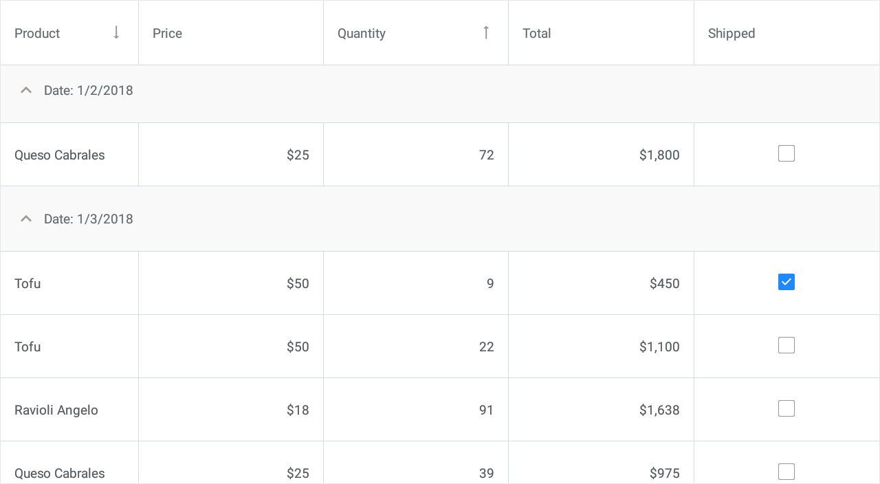
<dxg:DataGridView x:Name="grid" ItemsSource="{Binding Orders}" SortMode="Multiple">
    <dxg:DataGridView.Columns>
        <dxg:TextColumn FieldName="Product.Name" Caption = "Product" Width = "150"
                        SortOrder = "Descending" SortIndex = "0"/>
        <dxg:NumberColumn FieldName="Product.UnitPrice" Caption = "Price" DisplayFormat="C0"/>
        <dxg:NumberColumn FieldName="Quantity"
                        SortOrder = "Ascending" SortIndex = "1"/>
        <dxg:NumberColumn FieldName="Total"
                        UnboundType="Integer" UnboundExpression="[Quantity] * [Product.UnitPrice]"
                        DisplayFormat="C0" IsReadOnly="True"/>
        <dxg:DateColumn FieldName="Date" DisplayFormat="d"
                        IsGrouped = "true" GroupInterval = "Date"/>
        <dxg:CheckBoxColumn FieldName="Shipped" AllowSort = "False"/>
    </dxg:DataGridView.Columns>
</dxg:DataGridView>