PointSeries Class
Displays data as a collection of points.
Namespace: DevExpress.XamarinForms.Charts
Assembly: DevExpress.XamarinForms.Charts.dll
NuGet Package: DevExpress.XamarinForms.Charts
Declaration
public class PointSeries :
    XYSeries,
    IXYSeriesDataOwner
Remarks
This series type is useful when it’s necessary to show stand-alone data points on the same chart plot.

Series Data
To provide data for the point series, set the PointSeries.Data property to the SeriesDataAdapter class instance. Use the adapter’s properties to specify the data source for the series, and to define the data source members used to generate series points and labels (this series type requires 1 argument and 1 value for a data point).
You can also create a custom data adapter to populate the series with data. For example, it can be useful when data is generated on the fly and you don’t need to store it.
<ContentPage.BindingContext>
    <local:MainViewModel/>
</ContentPage.BindingContext>
<dxc:ChartView>
    <dxc:ChartView.Series>
        <dxc:PointSeries>
            <dxc:PointSeries.Data>
                <dxc:SeriesDataAdapter DataSource="{Binding NightTemperature}"
                                       ArgumentDataMember="Month">
                    <dxc:ValueDataMember Type="Value" Member="Temperature"/>
                </dxc:SeriesDataAdapter>
            </dxc:PointSeries.Data>
        </dxc:PointSeries>
    </dxc:ChartView.Series>
</dxc:ChartView>
public class MainViewModel {
   public List<WeatherDataItem> NightTemperature { get; }

   public MainViewModel() {
       NightTemperature = new List<WeatherDataItem> {
           new WeatherDataItem(new DateTime(2001, 1, 1), 2),
           new WeatherDataItem(new DateTime(2001, 2, 1), 2),
           new WeatherDataItem(new DateTime(2001, 3, 1), 3),
           new WeatherDataItem(new DateTime(2001, 4, 1), 5),
           new WeatherDataItem(new DateTime(2001, 5, 1), 8),
           new WeatherDataItem(new DateTime(2001, 6, 1), 11),
           new WeatherDataItem(new DateTime(2001, 7, 1), 13),
           new WeatherDataItem(new DateTime(2001, 8, 1), 13),
           new WeatherDataItem(new DateTime(2001, 9, 1), 11),
           new WeatherDataItem(new DateTime(2001, 10, 1), 8),
           new WeatherDataItem(new DateTime(2001, 11, 1), 5),
           new WeatherDataItem(new DateTime(2001, 12, 1), 2)
       };
   }
}

public class WeatherDataItem {
   public DateTime Month { get; }
   public double Temperature { get; }

   public WeatherDataItem(DateTime month, double temperature) {
       this.Month = month;
       this.Temperature = temperature;
   }
}

Important
ChartView chooses the X-axis type depending on data in the first series. If you specify the axis X for the chart or an individual series, set the ChartView.AxisX or Series.AxisX property to an object that is compatible with the series’ data type (otherwise, the chart does not display the series).
Series Labels
You can accompany series’ data points with labels to show point values as text on a chart:

To enable series labels, set the PointSeries.Label property to the MarkerSeriesLabel object, and use this object’s properties to adjust the label settings:
TextPattern - Formats series label text.
A pattern includes regular text (which is displayed as is) and placeholder strings enclosed in braces. Placeholders define which values are shown in labels. You can use the following placeholders to specify the text pattern for point series’ labels:Placeholder
Description
{S}
Displays a series name.
{A}
Displays a series point argument.
{V}
Displays a series point value.
Note
To format these values, you can use default format strings after the
$sign.
For example, in the{V$#.##}string,Vis a placeholder,$is a format string separator, and#.##is a format string.- Angle, Indent - Specify how a label is positioned relative to a series point.
- Style - Provides access to the SeriesLabelStyle object that stores label appearance settings (TextStyle).
- Visible - Allows you to show or hide labels for the series.
<dxc:PointSeries>
    <dxc:PointSeries.Label>
        <dxc:MarkerSeriesLabel TextPattern="{}{V$#}°C"
                               Angle="-60"
                               Indent="12">
            <dxc:MarkerSeriesLabel.Style>
                <dxc:SeriesLabelStyle>
                    <dxc:SeriesLabelStyle.TextStyle>
                        <dxc:TextStyle Color="DarkBlue" Size="8"/>
                    </dxc:SeriesLabelStyle.TextStyle>
                </dxc:SeriesLabelStyle>
            </dxc:MarkerSeriesLabel.Style>
        </dxc:MarkerSeriesLabel>
    </dxc:PointSeries.Label>
</dxc:PointSeries>
Legend
A legend (ChartBaseView.Legend) shows which color corresponds to which series.

The LegendItemsBehavior property specifies whether legend items identify entire series or individual points. Each item includes a marker and text. The default text is either the series’ DisplayName property value or the corresponding data point value.
The series’ LegendTextPattern property allows you to configure a string that the series provides for a legend item.
You can use the following placeholders to specify text patterns for legend items:
Placeholder | Description |
|---|---|
{S} | Displays a series name (DisplayName). |
{A} | Displays a series point argument. |
{V} | Displays a series point value. |
Note
To format these values, you can use default format strings after the $ sign.
For example, in the {V$#.##} string, V is a placeholder, $ is a format string separator, and #.## is a format string.
<dxc:PointSeries LegendTextPattern="{}{S} Temperature in London">
    <!--...-->
</dxc:PointSeries>
To exclude a particular series from the legend, set that series’ VisibleInLegend property to false.
Hints
ChartView can display hints (ChartView.Hint) as tooltips or as a crosshair cursor to show information about a tapped series point. A hint requests data to display from a series. Use the Series.HintOptions property to specify which data the series should return for a hint.
Tooltips
This example demonstrates how to set up the chart so that it shows a tooltip for a series point when a user taps it, and configure a tooltip for each series on the chart.

- Set the chart hint’s Behavior property to the TooltipHintBehavior class instance.
Set each series’ HintOptions property to the SeriesHintOptions object and use the PointTextPattern property to specify the tooltip text pattern.
You can use the following placeholders to specify text patterns for tooltips:Placeholder
Description
{S}
Displays a series name (DisplayName).
{A}
Displays a series point argument.
{V}
Displays a series point value.
Note
To format these values, you can use default format strings after the
$sign.
For example, in the{V$#.##}string,Vis a placeholder,$is a format string separator, and#.##is a format string.
<ContentPage.Resources>
    <dxc:SeriesHintOptions x:Key="pointSeriesHintOptions" PointTextPattern="{}{A$MMMM}: {V}°C"/>
</ContentPage.Resources>

<dxc:ChartView>
    <dxc:ChartView.Hint>
        <dxc:Hint>
            <dxc:Hint.Behavior>
                <dxc:TooltipHintBehavior />
            </dxc:Hint.Behavior>
        </dxc:Hint>
    </dxc:ChartView.Hint>

    <dxc:ChartView.Series>
        <dxc:PointSeries HintOptions="{StaticResource pointSeriesHintOptions}">
            <!--Series Data-->
        </dxc:PointSeries>
        <dxc:PointSeries HintOptions="{StaticResource pointSeriesHintOptions}">
            <!--Series Data-->
        </dxc:PointSeries>
    </dxc:ChartView.Series>
</dxc:ChartView>
Crosshair Cursor
This example demonstrates how to set up the chart so that it shows a series point hint as a crosshair cursor, and manage each series interaction with the hint.

- Set the chart hint’s Behavior property to the CrosshairHintBehavior class instance.
Set each series’ HintOptions property to the SeriesCrosshairOptions object and specify this object’s properties:
- ShowInLabel - to specify whether the crosshair label should provide information for points of the current series.
PointTextPattern - to define the text pattern used to show information about the series point within a crosshair label.
You can use the following placeholders to specify text patterns for items of the crosshair label:Placeholder
Description
{S}
Displays a series name (DisplayName).
{A}
Displays a series point argument.
{V}
Displays a series point value.
Note
To format these values, you can use default format strings after the
$sign.
For example, in the{V$#.##}string,Vis a placeholder,$is a format string separator, and#.##is a format string.- AxisLineVisible, AxisLabelVisible - to specify whether the crosshair cursor should display axis lines and labels for the series.
<ContentPage.Resources>
    <dxc:SeriesCrosshairOptions x:Key="pointSeriesHintOptions"
                                PointTextPattern="{}{S}: {V}°C"
                                ShowInLabel="True"
                                AxisLabelVisible="True"
                                AxisLineVisible="True"/>
</ContentPage.Resources>

<dxc:ChartView>
    <dxc:ChartView.Hint>
        <dxc:Hint>
            <dxc:Hint.Behavior>
                <dxc:CrosshairHintBehavior GroupHeaderTextPattern="Temperature in London: {A$MMMM}"/>
            </dxc:Hint.Behavior>
        </dxc:Hint>
    </dxc:ChartView.Hint>

    <dxc:ChartView.Series>
        <dxc:PointSeries HintOptions="{StaticResource pointSeriesHintOptions}">
            <!--Series Data-->
        </dxc:PointSeries>
        <dxc:PointSeries HintOptions="{StaticResource pointSeriesHintOptions}">
            <!--Series Data-->
        </dxc:PointSeries>
    </dxc:ChartView.Series>
</dxc:ChartView>
Note
A crosshair cursor also requests data to display from axes. Use the AxisBase.HintOptions property to specify how the hint interacts with the axis.
Series Appearance
To configure the point series appearance, set the PointSeries.Style property to the PointSeriesStyle object. This object’s MarkerSize and MarkerStyle properties allow you to change the size and color of point markers.
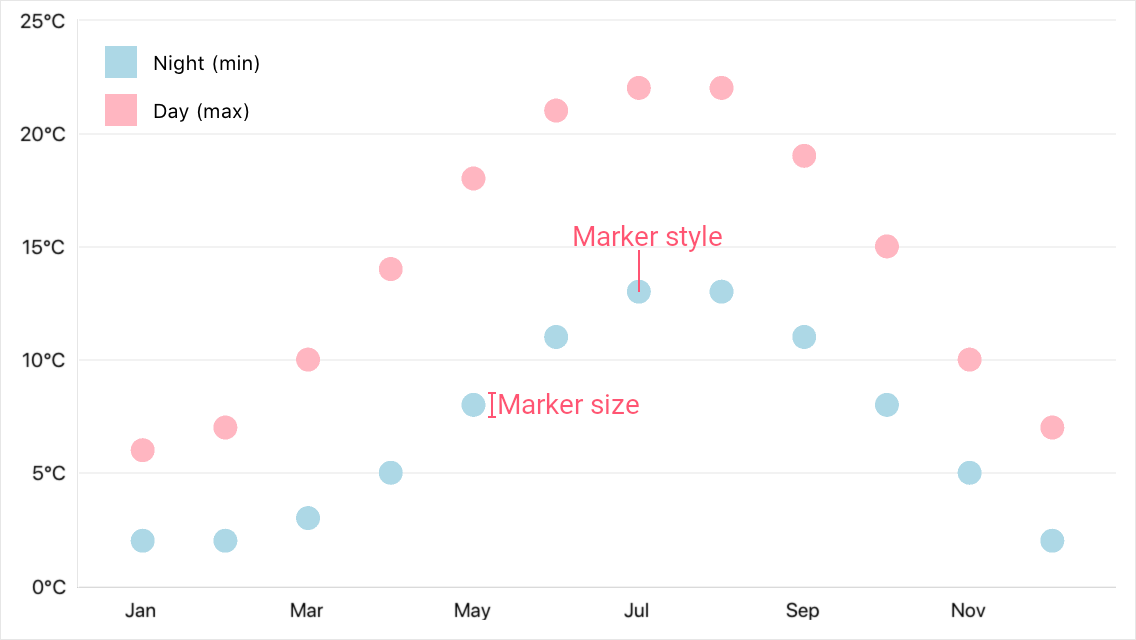
<dxc:PointSeries>
    <dxc:PointSeries.Style>
        <dxc:PointSeriesStyle MarkerSize="12">
            <dxc:PointSeriesStyle.MarkerStyle>
                <dxc:MarkerStyle Fill="LightBlue"/>
            </dxc:PointSeriesStyle.MarkerStyle>
        </dxc:PointSeriesStyle>
    </dxc:PointSeries.Style>
</dxc:PointSeries>