Views: Visual Elements
- 6 minutes to read
This document lists the visual elements in Views.
All-Day Area
Specific to the Day View, Work-Week View, Week View. |
|---|
The All-Day Area consists of cells and shows appointments for a day or several days:
- All-Day Area
- All-Day Appointment
- All-Day Cell
The following settings manage this element:
Property | Description |
|---|---|
Gets or sets the maximum number of rows that the view allocates for all-day appointments. |
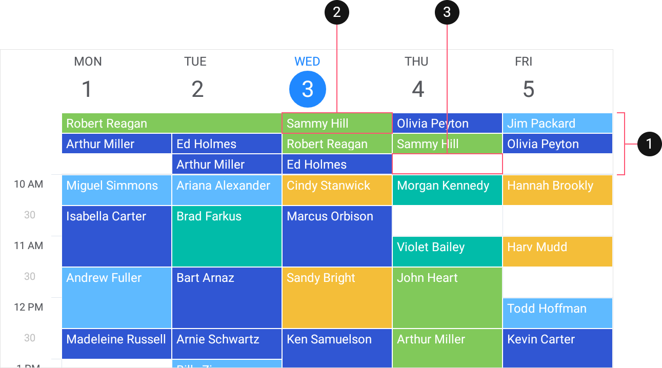
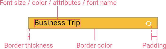
All-Day Appointment
Specific to the Day View, Work-Week View, Week View. |
|---|
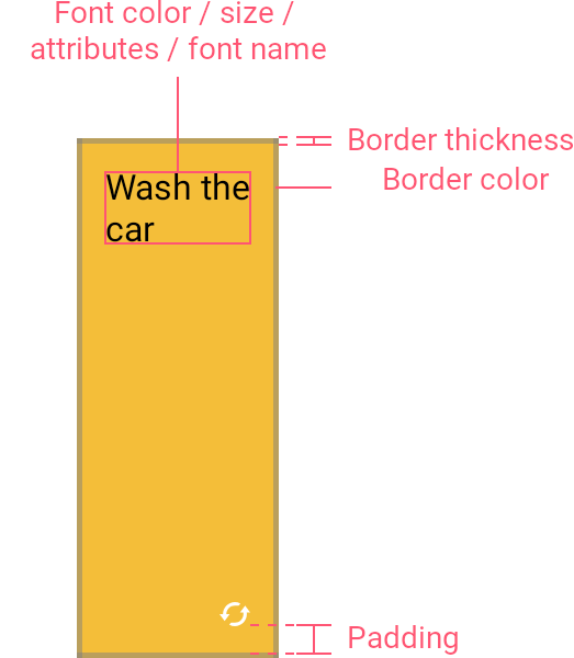
The All-Day Appointment represents a scheduled activity that lasts 24 hours or longer. The scheduler displays these appointments in the all-day area that is below Header Items, above day view cells. An AppointmentItem object stores a Start and End dates, a Label, and a Subject, that characterize the appointment.
The View provides the following settings that manage the all-day appointment’s appearance:
The table below lists View properties that configure all-day appointments:
Property | Description |
|---|---|
Gets or sets appearance settings of all-day appointments. | |
Gets or sets a data template that specifies the representation of all-day appointments. | |
Gets or sets the height of all-day appointments in the View. |
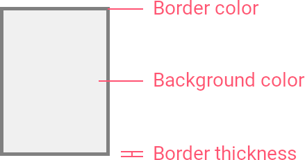
All Day Area Cell
Specific to the Day View, Work-Week View, Week View. |
|---|
The All Day Area Cell is an element of the all-day area‘s grid and represents a day interval in the View. Cells visually align scheduled all-day appointments. The View displays the following cell types:
- Regular All-Day Area Cell
- Today All-Day Cell
The View provides the following settings that manage the all-day cell’s appearance:
The table below contains View properties that customize all-day cells:
Property | Description |
|---|---|
Gets or sets appearance settings of all-day cells. | |
Gets or sets a data template that specifies the representation of all-day cells. |
Appointment
Specific to the Day View, Work-Week View, Week View, Month View. |
|---|
The Appointment is an activity scheduled for a specific time interval. An AppointmentItem object stores a Start and End dates, a Label, and a Subject, that characterize the appointment.
The View provides the following settings that manage the appointment’s appearance:
The table below lists View properties that configure appointments:
Property | Description |
|---|---|
Gets or sets appearance settings of appointments. | |
Gets or sets a data template that specifies the representation of appointments. | |
Gets or sets the minimum height of appointments in the View. |
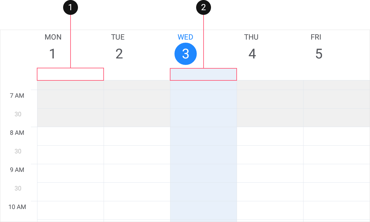
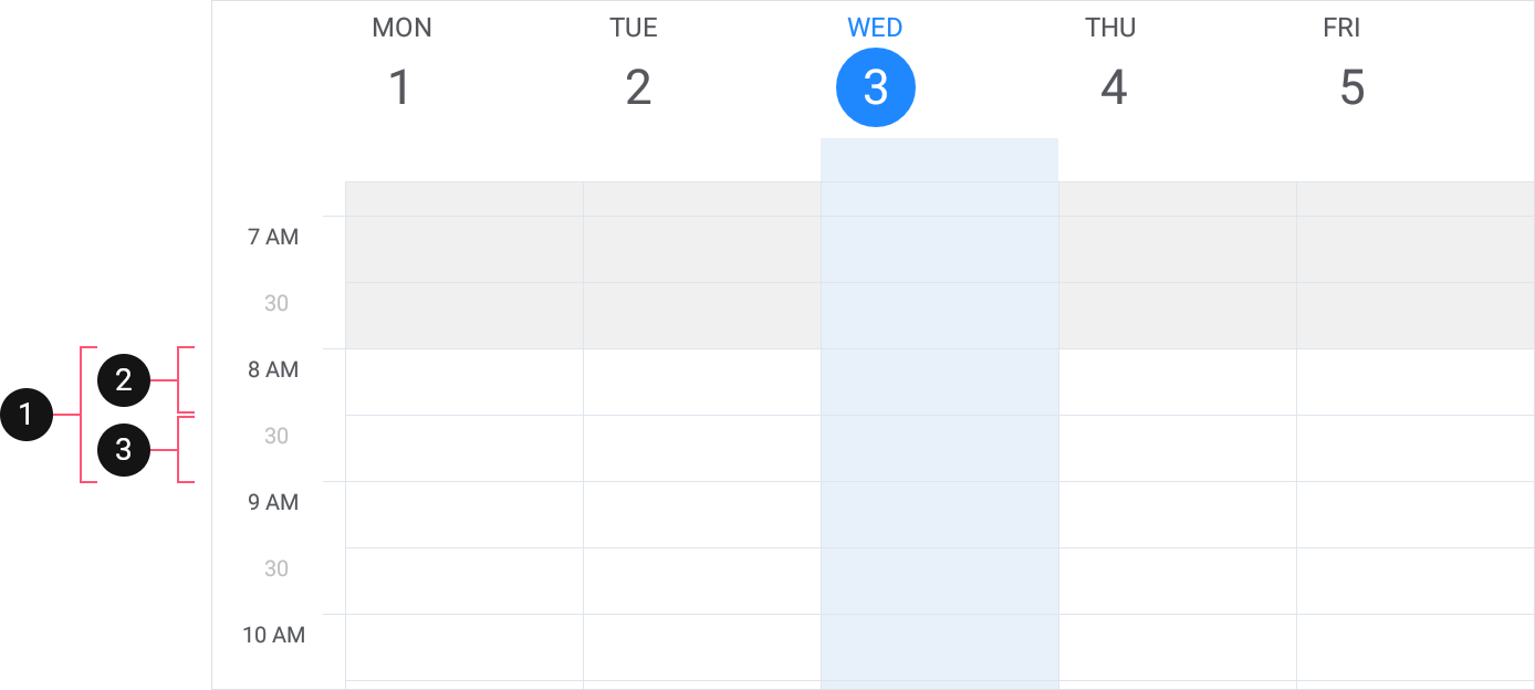
Day View Cell
Specific to the Day View, Work-Week View, Week View. |
|---|
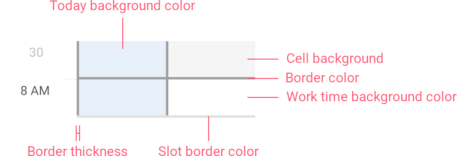
The Day View Cell is an element of the scheduler day grid and represents a time interval in the View. Cells visually align scheduled appointments. Views display the following cell types:
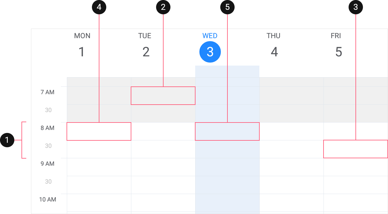
- TimeScaleInterval defines scale intervals into which the view splits a time interval (SchedulerView.WorkTime or twenty-four hours) it shows. Slots divide intervals into cells (2, 3). The TimeScaleSlotCount property specifies the number of slots within a scale interval.
- Interval Day View Cell - a cell that corresponds to the first slot in a scale interval.
- Slot Day View Cell - all other cells.
- Work Time Day View Cell - a cell within the SchedulerView.WorkTime interval. These cells can be either Interval or Slot.
- Today Time Day View Cell. These cells can be either Interval or Slot.
The View provides the following options that configure the day view cell’s appearance:
The table below lists View properties that manage cells:
Property | Description |
|---|---|
Gets or sets appearance settings of cells. | |
Gets or sets a data template that specifies the representation of cells. | |
Gets or sets the minimum height of cells. |
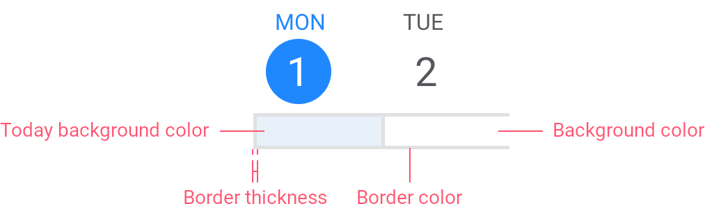
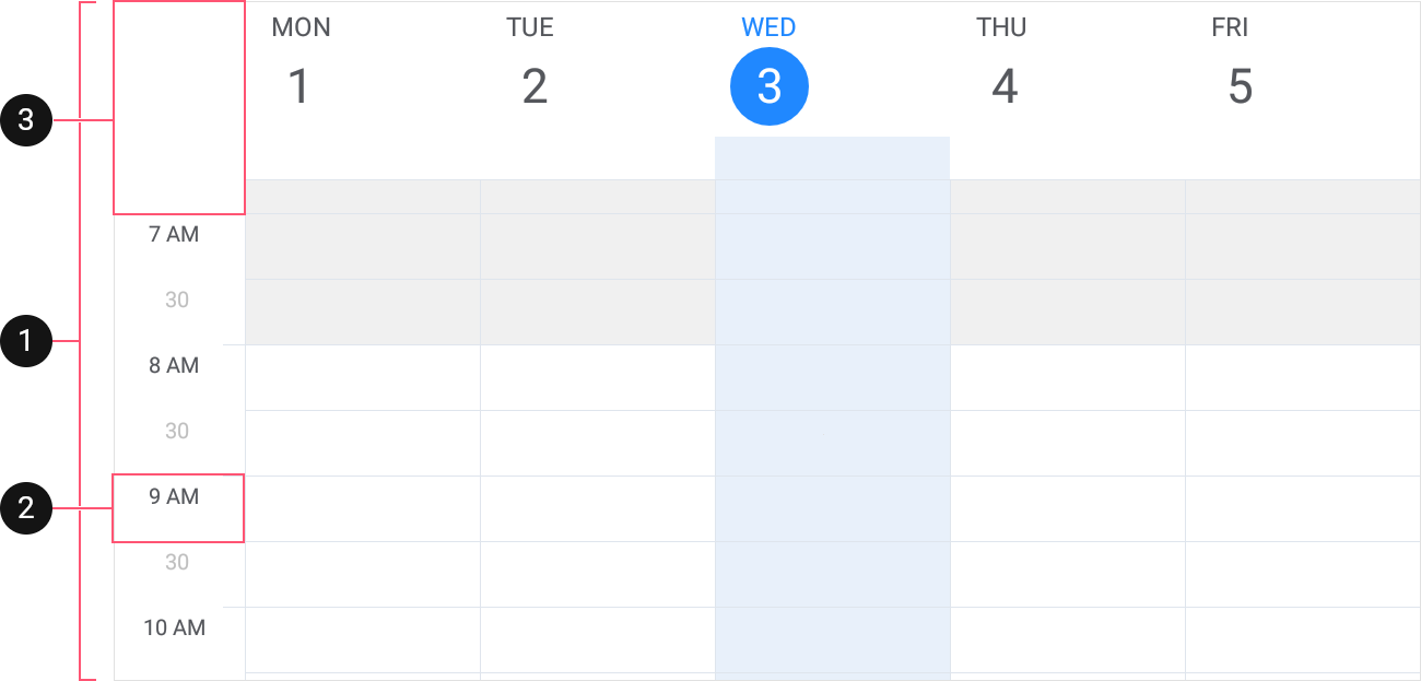
Day View Header Item
Specific to the Day View, Work-Week View, Week View. |
|---|
Header Items identify days in the View. Views support the following types of headers:
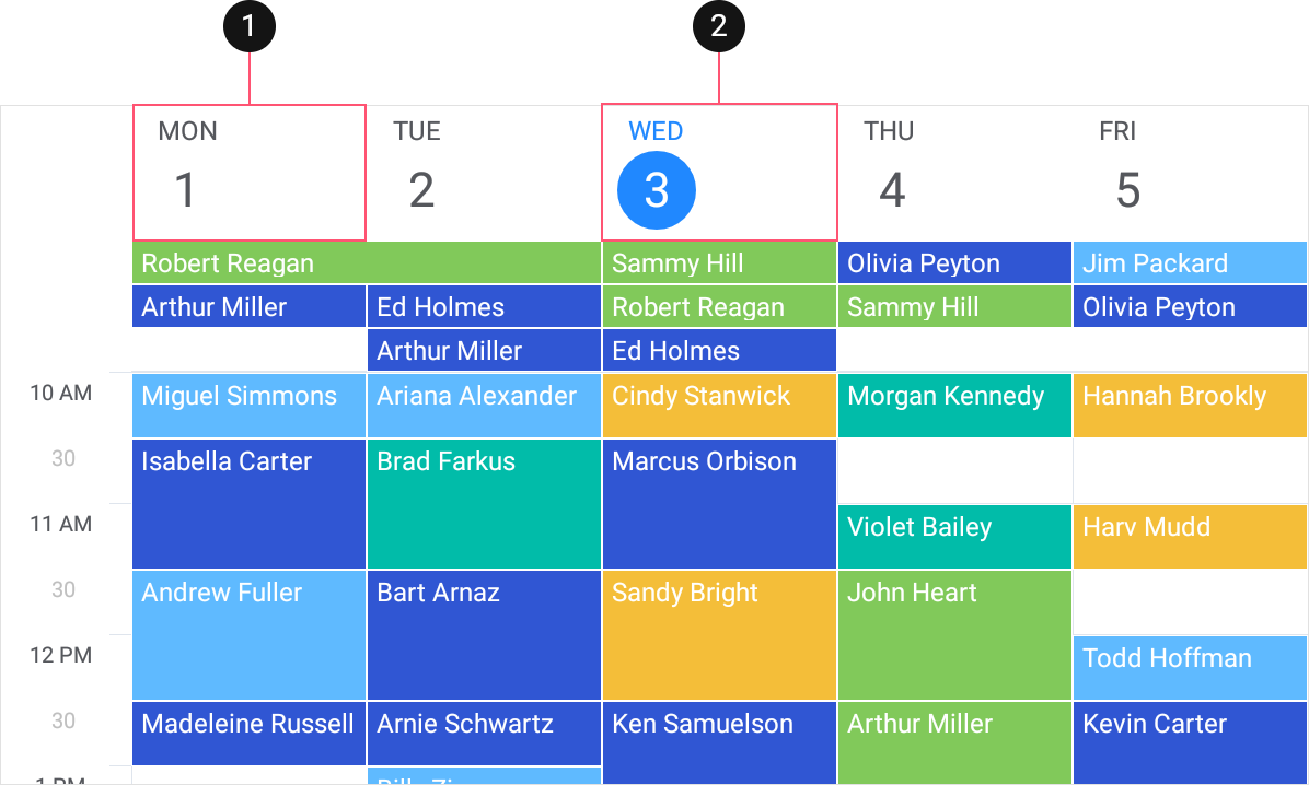
- Regular Header Item
- Today Header Item
The View provides the following options that configure the header’s appearance:
The table below lists View properties that manage headers:
Property | Description |
|---|---|
Gets or sets appearance settings of header items. | |
Gets or sets a data template that specifies the representation of header items. |
Time Ruler
Specific to the Day View, Work-Week View, Week View. |
|---|
The Time Ruler displays time intervals that the View uses to lay out appointments:
- Time Ruler
- Time Ruler Header
- Time Ruler Cell
The following settings configure this element:
Property | Description |
|---|---|
Gets or sets the width of the time ruler. |
Time Ruler Header
Specific to the Day View, Work-Week View, Week View. |
|---|
The Time Ruler Header is an area above time ruler cells in which you can put custom content. The View provides the following options that configure the default header’s appearance:
The table below lists View properties that manage time ruler header:
Property | Description |
|---|---|
Gets or sets appearance settings of time ruler cells. | |
Gets or sets a data template that that specifies the representation of time ruler cells. |
Time Ruler Cell
Specific to the Day View, Work-Week View, Week View. |
|---|
The Time Ruler Cell represents a time unit in the View. The time ruler holds cells the view shows. Views support the following types of cells:
- TimeScaleInterval defines scale intervals into which the time ruler splits a time interval (SchedulerView.WorkTime or twenty-four hours) it shows. Slots divide intervals into cells (2, 3). The TimeScaleSlotCount property specifies the number of slots within a scale interval.
- Interval Time Ruler Cell - a cell that corresponds to the first slot in a scale interval.
- Slot Time Ruler Cell - all other cells.
The View provides the following options that configure the cell’s appearance:
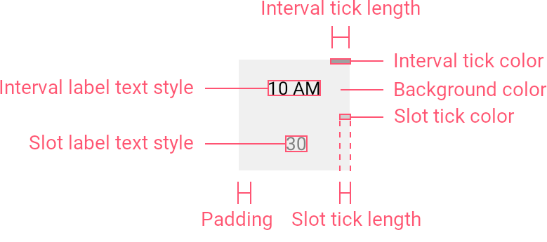
The table below lists View properties that manage time ruler cells:
Property | Description |
|---|---|
Gets or sets appearance settings of time ruler cells. | |
Gets or sets a data template that that specifies the representation of time ruler cells. |
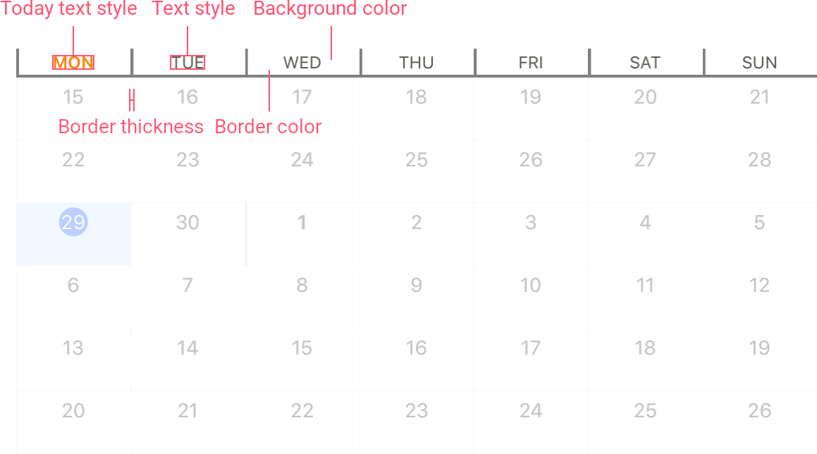
Month View Cell
Specific to the Month View. |
|---|
The Month View Cell is an element that represents a time interval (day) in the Month View. Cells visually align scheduled appointments. The Month View displays the following cell types:
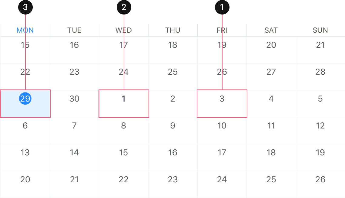
- Cell
- First Day of the Month Cell
- Today Cell
This view model provides the following settings that you can customize:
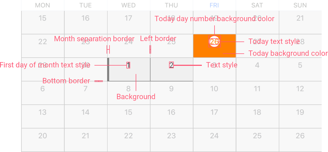
The table below lists View properties that manage cells:
Property | Description |
|---|---|
Gets or sets appearance settings of cells. | |
Gets or sets a data template that specifies the Xamarin.Forms.View the Month View uses to show cells. |
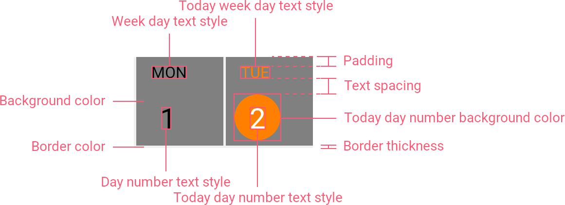
Month View Header Item
Specific to the Month View. |
|---|
Header Items identify days in the View. The Month View supports the following types of headers:
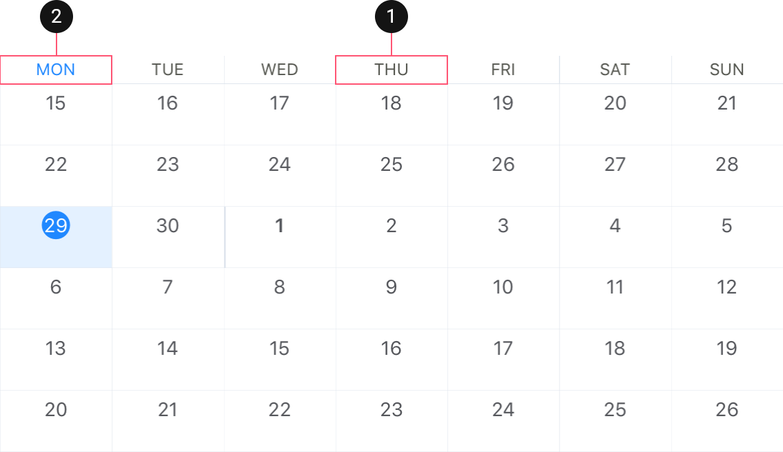
- Regular Header Item
- Today Header Item
The View provides the following options that configure the header’s appearance:
The table below lists View properties that manage headers:
Property | Description |
|---|---|
Gets or sets appearance settings of header items. | |
Gets or sets a data template that specifies the Xamarin.Forms.View the Month View uses to show header items. |