Lesson 1: Create a Pie Chart
- 4 minutes to read
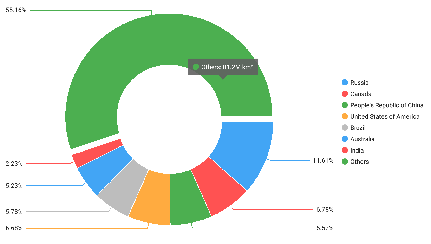
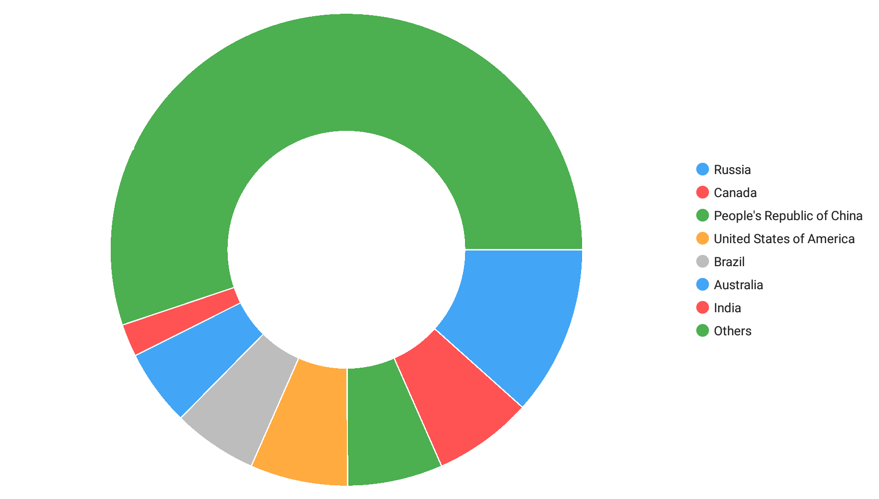
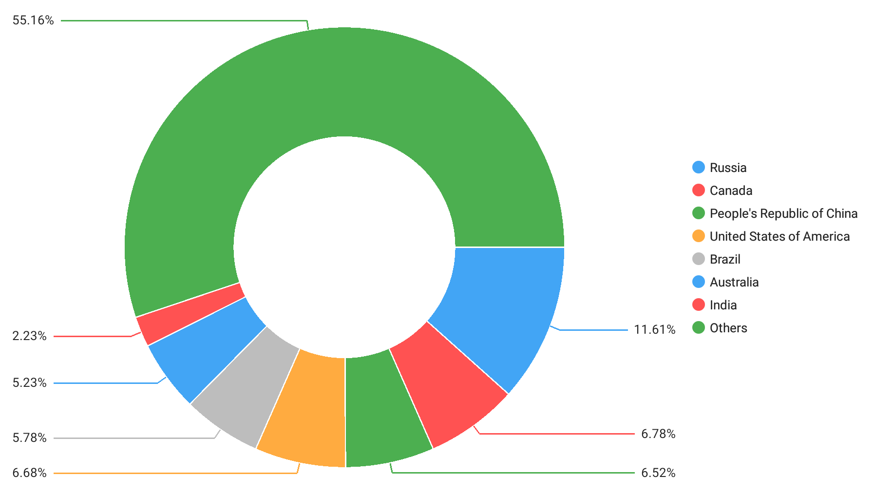
This guide explains how to use the Pie Chart View to develop an application that compares countries by area.
Pie Chart
Custom Chart Appearance
Step 1. Create a New Application and Add a Pie Chart
- Create a new Xamarin.Forms cross-platform solution and include the DevExpress Charts component.
In the MainPage.xaml file of the .NET Standard project containing the shared code, use the dxc prefix to declare a namespace and add a PieChartView to the content page using the following XAML markup:
<ContentPage xmlns="http://xamarin.com/schemas/2014/forms"
             xmlns:x="http://schemas.microsoft.com/winfx/2009/xaml"
             x:Class="PieChartExample.MainPage"
             xmlns:dxc="clr-namespace:DevExpress.XamarinForms.Charts;assembly=DevExpress.XamarinForms.Charts">
        <dxc:PieChartView x:Name="chart">
        </dxc:PieChartView>
</ContentPage>
Step 2. Populate the Pie Chart with Data
Create a new ViewModel.cs file in a project with the shared code and add the following classes to it:
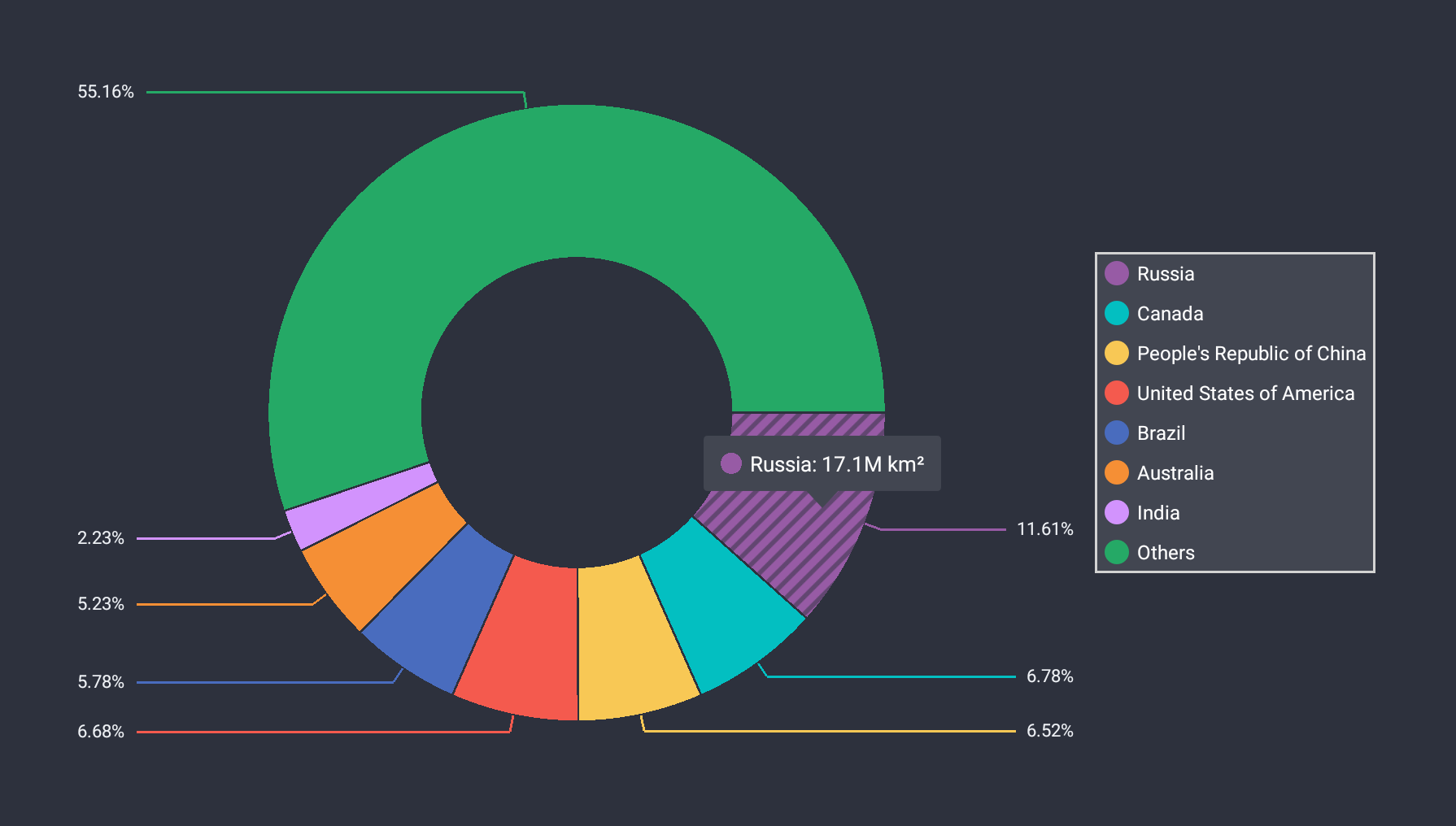
using System.Collections.Generic;
using Xamarin.Forms;
// ...

class ViewModel {
    public IReadOnlyList<LandAreaItem> LandAreas { get; }

    public ViewModel()
    {
        LandAreas = new List<LandAreaItem>() {
            new LandAreaItem("Russia", 17.098),
            new LandAreaItem("Canada", 9.985),
            new LandAreaItem("People's Republic of China", 9.597),
            new LandAreaItem("United States of America", 9.834),
            new LandAreaItem("Brazil", 8.516),
            new LandAreaItem("Australia", 7.692),
            new LandAreaItem("India", 3.287),
            new LandAreaItem("Others", 81.2)
        };
    }
}

class LandAreaItem {
    public string CountryName { get; }
    public double Area { get; }

    public LandAreaItem(string countryName, double area) {
        this.CountryName = countryName;
        this.Area = area;
    }
}
In the code-behind MainPage.xaml.cs file, create a new class that implements the IPieSeriesData interface:
using System.Collections.Generic;
using Xamarin.Forms;
using DevExpress.XamarinForms.Charts;
// ...

class LandAreaDataAdapter : BindableObject, IPieSeriesData, IChangeableSeriesData {
    public const string ItemsSourcePropertyName = "ItemsSource";
    public static readonly BindableProperty ItemsSourceProperty = BindableProperty.Create(
        propertyName: ItemsSourcePropertyName,
        returnType: typeof(IReadOnlyList<LandAreaItem>),
        declaringType: typeof(LandAreaDataAdapter),
        propertyChanged: OnItemsSourcePropertyChanged
    );

    public event DataChangedEventHandler DataChanged;
    public IReadOnlyList<LandAreaItem> ItemsSource {
        get => (IReadOnlyList<LandAreaItem>)GetValue(ItemsSourceProperty);
        set => SetValue(ItemsSourceProperty, value);
    }

    public int GetDataCount() => (ItemsSource == null) ? 0 : ItemsSource.Count;
    public object GetKey(int index) => ItemsSource[index];
    public string GetLabel(int index) => ItemsSource[index].CountryName;
    public double GetValue(int index) => ItemsSource[index].Area;

    static void OnItemsSourcePropertyChanged(BindableObject bindable, object oldValue, object newValue) {
        if (!(bindable is LandAreaDataAdapter adapter)) return;
        DataChangedEventHandler handler = adapter.DataChanged;
        if (handler != null) {
            handler.Invoke(adapter, DataChangedEventArgs.Reset());
        }
    }
}
In the MainPage.xaml file, create a new DonutSeries object, bind it to data and add this object to the PieChartView.Series collection:
<ContentPage xmlns="http://xamarin.com/schemas/2014/forms"
             xmlns:x="http://schemas.microsoft.com/winfx/2009/xaml"
             xmlns:local="clr-namespace:PieChartExample"
             x:Class="PieChartExample.MainPage"
             xmlns:dxc="clr-namespace:DevExpress.XamarinForms.Charts;assembly=DevExpress.XamarinForms.Charts">
    <ContentPage.BindingContext>
        <local:ViewModel/>
    </ContentPage.BindingContext>
    <dxc:PieChartView>
        <dxc:PieChartView.Series>
            <dxc:DonutSeries>
                <dxc:DonutSeries.Data>
                    <local:LandAreaDataAdapter ItemsSource="{Binding LandAreas}"/>
                </dxc:DonutSeries.Data>
            </dxc:DonutSeries>
        </dxc:PieChartView.Series>
    </dxc:PieChartView>
</ContentPage>
Step 3. Add a Legend to the Pie Chart
Create a new Legend object, modify its settings, and assign it to the PieChartView.Legend property:
    <dxc:PieChartView>
        <!--...-->
        <dxc:PieChartView.Legend>
            <dxc:Legend Orientation="TopToBottom"
                        HorizontalPosition="RightOutside"
                        VerticalPosition="Center"/>
        </dxc:PieChartView.Legend>
    </dxc:PieChartView>
 ]
]
Step 4. Enable Series Labels
Set the DonutSeries.Label property to the PieSeriesLabel class instance with the specified Position, TextPattern, and Indent settings:
<dxc:PieChartView>
    <dxc:PieChartView.Series>
            <dxc:DonutSeries>
                <!--...-->
                <dxc:DonutSeries.Label>
                    <dxc:PieSeriesLabel Position="TwoColums" TextPattern="{}{VP}%" Indent="20"/>
                </dxc:DonutSeries.Label>
        </dxc:DonutSeries>
    </dxc:PieChartView.Series>
</dxc:PieChartView>
Step 5. Enable the Pie Chart Tooltips
To show hints, create a new PieHint object, set its Enabled property to True, and assign the hint to the PieChartView.Hint property:
<dxc:PieChartView>
    <dxc:PieChartView.Hint>
        <dxc:PieHint Enabled="True"/>
    </dxc:PieChartView.Hint>
    <!--...-->
</dxc:PieChartView>
Specify tooltip text pattern for the donut segments:
<dxc:PieChartView>
    <!--...-->
    <dxc:PieChartView.Series>
        <dxc:DonutSeries>
            <!--...-->
            <dxc:DonutSeries.HintOptions>
                <dxc:PieSeriesHintOptions PointTextPattern="{}{L}: {V}M km²"/>
            </dxc:DonutSeries.HintOptions>
        </dxc:DonutSeries>
    </dxc:PieChartView.Series>
</dxc:PieChartView>
Step 6. Modify the Pie Chart Appearance
Set the PieChartView.ChartStyle property to the PieChartStyle object. Specify Palette and BackgroundColor properties to modify the color scheme, and change Padding to define the distance between the diagram and the chart edges.
using Xamarin.Forms; // ... class ViewModel { // ... readonly Color[] palette; public Color[] Palette => palette; public ViewModel() { // ... palette = PaletteLoader.LoadPalette("#975ba5", "#03bfc1", "#f8c855", "#f45a4e", "#496cbe", "#f58f35", "#d293fd", "#25a966");} } static class PaletteLoader { public static Color[] LoadPalette(params string[] values) { Color[] colors = new Color[values.Length]; for (int i = 0; i < values.Length; i++) colors[i] = Color.FromHex(values[i]); return colors; } }- Use the PieChartView.SelectionBehavior property to specify how to highlight a selected pie slice:
<dxc:PieChartView SelectionBehavior="Hatch"> <!--...--> </dxc:PieChartView> - Define the appearance of the chart legend. Set the Legend.Style property to the LegendStyle object, and specify this object’s properties that customize the legend border, background and items:
<dxc:PieChartView.Legend>
    <!--...-->
        <dxc:Legend.Style>
            <dxc:LegendStyle BorderColor="LightGray" BorderThickness="3"
                             BackgroundColor="#424651"
                             MarkerSize="30" TextIndent="10"
                             ItemsVerticalIndent="20">
                <dxc:LegendStyle.TextStyle>
                    <dxc:TextStyle Color="White" Size="24"/>
                </dxc:LegendStyle.TextStyle>
            </dxc:LegendStyle>
        </dxc:Legend.Style>
</dxc:PieChartView.Legend>
Change the connector thickness and text settings to modify the appearance of the pie chart labels. Set the PieSeriesLabel.Style property to the PieSeriesLabelStyle object with the specified TextStyle and the ConnectorThickness properties.
<dxc:PieChartView>
    <dxc:PieChartView.Series>
            <dxc:DonutSeries>
                <!--...-->
                <dxc:DonutSeries.Label>
                    <dxc:PieSeriesLabel Position="TwoColums" TextPattern="{}{VP}%" Indent="20">
                        <dxc:PieSeriesLabel.Style>
                            <dxc:PieSeriesLabelStyle ConnectorThickness="3">
                                <dxc:PieSeriesLabelStyle.TextStyle>
                                    <dxc:TextStyle Color="#eff2f6" Size="22"/>
                                </dxc:PieSeriesLabelStyle.TextStyle>
                            </dxc:PieSeriesLabelStyle>
                        </dxc:PieSeriesLabel.Style>
                    </dxc:PieSeriesLabel>
                </dxc:DonutSeries.Label>
        </dxc:DonutSeries>
    </dxc:PieChartView.Series>
</dxc:PieChartView>
Use the BackgroundColor property to change the hint background.
<dxc:PieChartView>
    <dxc:PieChartView.Hint>
        <dxc:PieHint Enabled="True">
            <dxc:PieHint.Style>
                <dxc:PieHintStyle BackgroundColor="#424651"/>
            </dxc:PieHint.Style>
        </dxc:PieHint>
    </dxc:PieChartView.Hint>
</dxc:PieChartView>
Show Result]