Specify Options
- 5 minutes to read
Methods that you can use in Razor syntax mirror client-side widget options. Note the character casing difference illustrated in the table below:
| Widget Option | Control Method |
|---|---|
| dataSource | DataSource |
| tooltip | Tooltip |
| showColumnHeaders | ShowColumnHeaders |
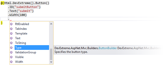
Fluent API syntax allows you to chain method calls. In Visual Studio, IntelliSense provides the available method names, their accepted values, and short descriptions.
Simple Options
To specify an option, call the corresponding control method and pass the option’s value.
@(Html.DevExtreme().Button()
    .ID("submitButton") // sets the control container's "ID" attribute
    .Text("submit") // sets the button text
    .Width(100) // sets the button width
)
You can also use an Option method that accepts an option name and value as parameters to specify control options.
@(Html.DevExtreme().Button()
    .Option("text", "submit")
    .Option("width", 100)

    // or

    //.Text("submit")
    //.Width(100)
)
To specify options that accept a predefined set of values, use .NET enums. Refer to a particular option’s description to find out if it accepts an enum.
@(Html.DevExtreme().DateBox()
    .Type(DateBoxType.DateTime) // uses the DateBoxType .NET enum to set the type
)
new JS() Expression
The new JS() expression allows you to embed JavaScript expressions into Razor syntax and thus have a control depend on client-side settings. For example, you can assign a JavaScript variable or expression to a control’s option. The following code defines a JavaScript variable named myText and then assigns its value to the Button’s Text option:
<script>
    var myText = "Submit";
</script>

@(Html.DevExtreme().Button()
    .Text(new JS("myText"))
)
It is essential to use new JS() when you nest a control within a template and the control configuration should depend on template parameters. See Bind a Nested Control to Template Parameters and Multi-Nested Controls for more information.
A common use-case is DataGrid’s Master-Detail Display where you should pass a master row key to the inner grid. Refer to Pass Additional Load Parameters.
ID Option
You should specify the ID option to access a control’s JavaScript API at runtime (for example, to call methods).
The ID option’s value should meet basic HTML5 requirements. Make sure that the specified value is unique, especially if the page uses controls in partial views or templates.
Controls in Partial Views
A Razor file can include multiple instances of the same partial view with DevExtreme controls. In such cases, ensure the ID attributes of rendered controls are unique. To specify unique IDs, use a model property.
The following example demonstrates how to pass a model to a partial view and use a model property to specify a button’s ID attribute:
@Html.Partial("_MyPartial", new { ID = 1 })

@Html.Partial("_MyPartial", new { ID = 2 })
@(Html.DevExtreme().Button()
    .ID("button" + Model.ID)
)
If you use a hard-coded ID, several partial view instances render controls with the same ID.
Nested Controls in Templates
If you specify the ID option for a control used within an ItemTemplate or a CellTemplate template (see nested templates), use the new JS() expression to specify a unique ID for this control.
@(Html.DevExtreme().List()
    .DataSource(DataSource)
    .ItemTemplate(@<text>
        @(Html.DevExtreme().Button()
            .ID(new JS("'list_button_' + ID"))
        )
    </text>)
)
The List control is bound to the following data source:
Nested Options and Collections
You can use lambda expressions to configure nested options. A lambda parameter starts a new chain of methods that specify the nested options.
@(Html.DevExtreme().Chart()
    .Legend(l => l // configures the chart legend (l - lambda parameter)
        .Visible(false) // hides the legend in the chart
    )
    .Tooltip(t => t // configures the tooltip (t - lambda parameter)
        .Enabled(true) // enables the tooltip
        .Font(f => f // configures the tooltip's text (f - lambda parameter)
            .Color("blue") // paints the tooltip's text in blue
        )
    )
)
You can also use lambda expressions to configure options that represent item collections. In this case, the lambda parameter performs the role of an item factory, and its Add() method adds a new item to the collection.
@(Html.DevExtreme().DataGrid()
    .Columns(columns => { // specifies a collection of columns
        columns.Add() // adds the "CustomerID" column
            .DataField("CustomerID");
        columns.Add() // adds the "OrderDate" column
            .DataField("OrderDate")
            .DataType(GridColumnDataType.Date);
    })
)
Custom Options
When you need to attach extra data to a control, you can create a custom option using the Option method.
The following code example uses the TabPanelItemBuilder.Option method to create a new tabExtras option for tab items. To specify the option value, the new JS() expression is used.
@(Html.DevExtreme().TabPanel()
    .Items(items => {
        items.Add()
            // the following methods set the standard options
            .Title("Orders")
            .Text("Order History")
            // the following method sets the extra option
            .Option("tabExtras", new {
                masterKey = new JS("key")
            })
    })
)
The extra option can be used to provide data (for example, masterKey) to nested controls. See the example code in the Multi-Nested Controls article.
You can also find this code in Demo: Advanced Master-Detail View.