Date Filter
- 6 minutes to read
The Date Filter dashboard item allows you to filter dashboard data based on the selected data range. The range can be relative (Last 3 Months), use fixed dates (01-01-2018), or presets (Month-to-date). You can also filter dates before or after a specified date.
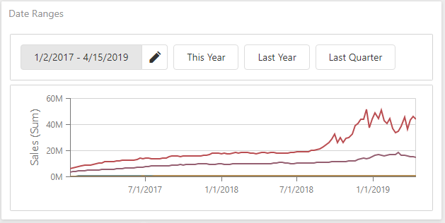
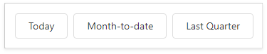
The DateFilter item displays a set of intervals that can be used as quick filters:
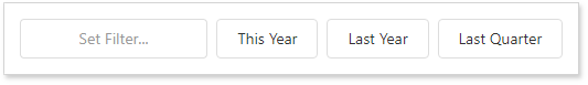
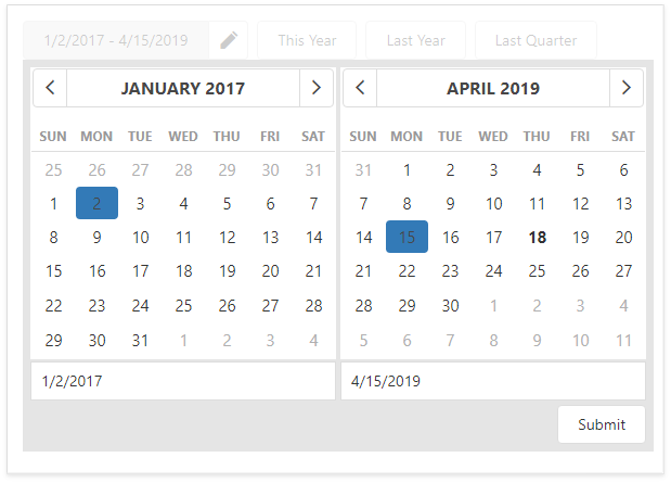
End-users can click the Set Filter button to invoke the Date Picker:
Add a New Date Filter to the Dashboard
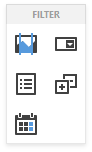
To create a Date Filter item, click the Date Filter item (the  icon) in the Toolbox Filter section:
In code, create the DateFilterItem class instance and add it to the Dashboard.Items collection:
A Date Filter dashboard item that allows end users to filter other dashboard items by date-time values. | |
Provides access to a collection of dashboard items. |
Bind to Data
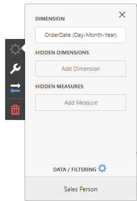
Click the Dimension placeholder in the data section and select the required data source field in the Binding section of the invoked data item menu to bind the Date Filter to data:
In code, use the following API member:
Specifies a dimension that provide values for the Date Filter. |
Date Picker
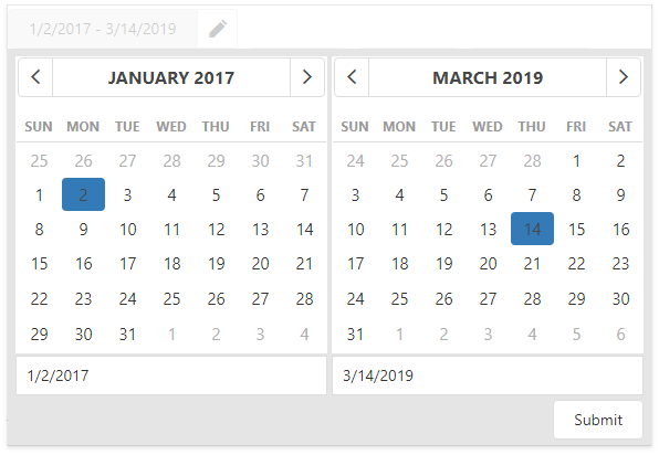
The Date Filter item displays a Date Picker that is a button with a drop-down calendar. A drop-down calendar allows the end-user to select a single date or a date range:
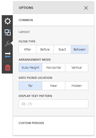
You can specify whether the Date Picker is located at the near end of the Quick Filter series, at the far end, or whether it is hidden. Go to the dashboard item Options menu, open the Layout section and set the Date Picker Location option.
To change the Date Picker location, use the following property:
Specifies the Date Picker’s location in the Date Filter. |
Display Format
To specify the date-time value format, use the Format Type option in the Format section of the data item menu, as described in the Formatting Data topic.
You can specify a custom string displayed in the Date Picker component. Go to the dashboard item Options menu, open the Layout section and fill in the Display Text Pattern text field:
You can include placeholders in a custom string. The {0} placeholder is the interval’s start, the {1} placeholder is the interval’s end.
In code, use the following API members:
Provides access to the format settings for date-time values. | |
Specifies a string displayed in the Date Picker. |
Create Quick Filters
Quick Filters are buttons displayed within the Date Filter item. Each button is bound to a predefined date-time period that can be used to perform a selection. You can click the button to apply a custom period to a Date filter:
You can use the Select Date Time Period button in the Date Filter’s item caption that invokes the drop-down list with quick filters.
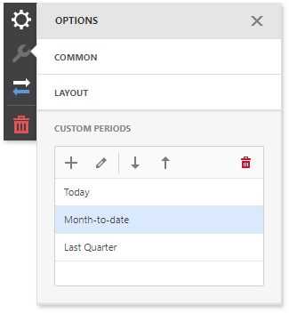
To add quick filters, open the Date Filter’s Options menu and go to the Custom Periods section. Click “+” to add a new period:
Click the edit icon to invoke the editor’s panel and configure a custom period. The following image illustrates how to modify the Month-to-Date custom period:
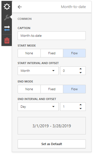
You can specify the following settings for the start/end boundaries.
- Caption - Specifies a custom periods caption.
- Start Mode - Specifies a mode of the start boundary.
- End Mode - Specifies a mode of the end boundary.
The following modes used to set custom periods are available.
- None - The selection will begin from the start/end of the visible range.
- Fixed - Allows you to select a specific date value using the calendar. Use the Start/End Date option to set a value.
Flow - Allows you to select a relative date value. The Interval option specifies the interval between the current date and the required date. The Offset option allows you to set the number of such intervals.
Note that the Offset option can accept negative and positive values. Negative values correspond to dates before the current date, while positive values correspond to future dates.
Below you can find some examples of how to set up custom periods:
Fixed custom periods
Name | Settings |
|---|---|
2018 | Start Point
End Point
|
Q1 2017 | Start Point
End Point
|
Flow custom periods
Name | Settings |
|---|---|
6 Months | Start Point
End Point
|
Year to date | Start Point
End Point
|
Last Month | Start Point
End Point
|
In code, create the DateTimePeriod objects and add them to the DateFilterItem.dateTimePeriods collection to create quick filters:
A date-time period that is used to select a predefined range in the Range Filter and Date Filter items. | |
Gets a collection of date-time periods used as Quick Filters. |
Arrange Quick Filters
Quick filters in the DateFilter item can be arranged horizontally or vertically. The default mode is auto height, in which quick filters are displayed horizontally and the dashboard item shrinks automatically to fit the items and save space.
To specify the arrangement mode, go to the dashboard item Options menu, open the Layout section and specify the Arrangement Mode setting:
In code, use the following API member:
Specifies a layout of the elements inside the Date Filter. |
Example
The following example shows how to create the Date Filter item, bind it to data and add to the existing dashboard.
Create a dimension and use the dataMember property to bind it to the existing data source’s column. Then use the created dimension in the dashboard item to bind the Date Filter to data.
Create a DateTimePeriod instance and add it to the DateFilterItem.dateTimePeriods collection to create quick filters.
After you add the created dashboard item to the Dashboard.items collection, call the Dashboard.rebuildLayout method to rebuild the dashboard layout and display changes.
// Use the line below for a modular approach:
// import * as Model from 'devexpress-dashboard/model'
// Use the line below for an approach with global namespaces:
// var Model = DevExpress.Dashboard.Model;

// ...
public createDateFilter() {
    // Create a data item for the Date Filter item.
    var dateFilterDate = new Model.Dimension();
    dateFilterDate.dataMember("OrderDate");
    dateFilterDate.dateTimeGroupInterval("DayMonthYear")

    // Create the Date Filter and bind it to data.
    var dateFilter = new Model.DateFilterItem();
    dateFilter.name('Date Filter');
    dateFilter.dataSource(sqlDataSource.componentName());
    dateFilter.dataMember(sqlDataSource.queries()[0].name());
    dateFilter.dimension(dateFilterDate);

    // Create a custom period for quick filters.
    var monthToDayPeriod = new Model.DateTimePeriod();
    monthToDayPeriod.name("Month to Date");
    monthToDayPeriod.start.flow.interval("Month").offset(0);
    monthToDayPeriod.start.mode("Flow");
    monthToDayPeriod.end.flow.interval("Day").offset(1);
    monthToDayPeriod.end.mode("Flow");

    dateFilter.dateTimePeriods.push(monthToDayPeriod);

    control.dashboard().items.push(dateFilter);
    // ...
    control.dashboard().rebuildLayout();
}