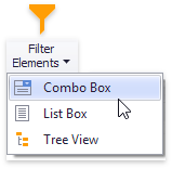
Filter Elements Overview
- 3 minutes to read
The Dashboard Designer allows you to create three types of filter elements that provide the capability to filter other dashboard items.
To add the required filter element to the dashboard, use the Filter Elements button in the Home ribbon tab.
Combo Box
The Combo Box dashboard item allows end users to select a value(s) from the drop-down list.
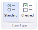
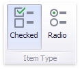
You can switch the combo box type using the ribbon Design tab, in the Item Type group of the Filter Element Tools contextual tab set.
| Combo Box Type | Example | Description |
|---|---|---|
| Standard | 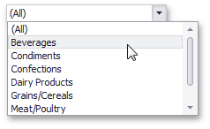 |
Allows end users to select only a single value. |
| Checked | 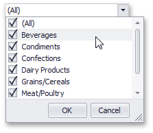 |
Allows end users to select multiple values in the invoked drop-down list. |
The Combo Box is the ComboBoxDashboardItem class in Dashboard API. To specify the combo box type, use the ComboBoxDashboardItem.ComboBoxType property.
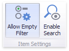
To manage combo box settings, use the Item Settings ribbon group.
| Setting | Description | API |
|---|---|---|
| Allow Empty Filter | Allows an empty selection when no item is selected and the filter does not apply. Enables the Clear Master Filter button that resets the filter to an empty selection. Applies only to the Standard combo box type. | ComboBoxDashboardItem.ShowAllValue |
| Enable Search | Allows end users to filter the list by typing in the box. | ComboBoxDashboardItem.EnableSearch |
List Box
The List Box dashboard item allows end users to select a value(s) from the list.
You can switch the list box type using the ribbon Design tab, in the Item Type group of the Filter Element Tools contextual tab set.
| List Box Type | Example | Description |
|---|---|---|
| Checked | 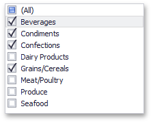 |
Allows end users to select multiple values in the list box. |
| Radio | 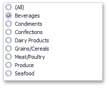 |
Allows end users to select a single value in the radio group. |
The List Box is the ListBoxDashboardItem class in Dashboard API. To specify the list box type, use the ListBoxDashboardItem.ListBoxType property.
To manage combo box settings, use the Item Settings ribbon group.
| Setting | Description | API |
|---|---|---|
| Allow Empty Filter | Allows an empty selection when no item is selected and the filter does not apply. Enables the Clear Master Filter button that resets the filter to an empty selection. Applies only to the Radio list box type. | ListBoxDashboardItem.ShowAllValue |
| Enable Search | Allows end users to filter the list by typing in the box. | ListDashboardItem.EnableSearch |
Tree View
The Tree View dashboard item displays values hierarchically and allows end users to expand/collapse nodes.
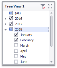
The Tree View is the TreeViewDashboardItem class in dashboard API.
You can specify Tree View settings using the ribbon Design tab in the Filter Element Tools contextual tab set.
| Setting | Description | API |
|---|---|---|
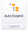 |
Specifies the initially expanded Tree View state. | TreeViewDashboardItem.AutoExpandNodes property |
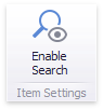 |
Allows end users to filter the nodes by typing in the item’s edit box. | TreeViewDashboardItem.EnableSearch |