Intermediate Level Aggregations
- 8 minutes to read
The dashboard controls can aggregate and summarize data on different levels.
- The Underlying level - The Query Builder allows you to group, sort, filter, or summarize data before it is displayed in the Dashboard control.
- The Summary level - Anyone with access to the Dashboard Designer can specify dimensions and measures for dashboard items, and thus shape and summarize data. Refer to the following help topic for more information: Binding to Data.
- The Intermediate level - You can introduce calculated fields where the data summary level does not depend (or only partially depends) on the current visualization level in dashboard items. Such calculated fields must use the
aggrfunction that specifies how to summarize data.
Overview
To set up an intermediate level aggregation, create a new calculated field and use the aggr function. This function has the following syntax:
aggr(summaryExpression, dimension1, dimension2, ...)
The first argument is a summary expression calculated against a specific data source field. The subsequent arguments are the dimensions that define the calculation level.
For instance, the following function calculates yearly product sales:
aggr(Sum([Sales]), [Product], GetYear([Date]))
The function with non-specified dimension arguments combines all data into one group. For instance, the following function calculates grand total sales:
aggr(Sum([Sales]))
If you create the calculated field that includes the aggr function and drop the created field into an existing dashboard item, the Dashboard joins the resulting aggregation with the already displayed data. This means that you can add data with the increased or decreased granularity to the dashboard item.
Less Detailed Granularity
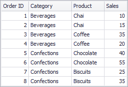
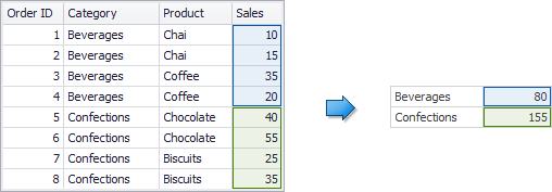
Consider the following data source that contains customer orders:
To aggregate this data by individual categories, create the SalesByCategory calculated field with the following expression:
aggr(Sum([Sales]), [Category])
The internal table below is generated for this calculated field:
You can add the following columns to a Grid dashboard item: Category, Product, and the sum of Sales.
If you drop the calculated field onto this Grid, the sum of sales for each category is repeated in each Grid row. In other words, you added data with less detailed granularity than specified by the item’s dimensions.
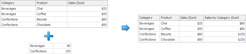
For instance, you can use these values later to calculate each product’s contribution to the sales category.
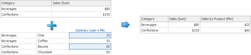
More Detailed Granularity
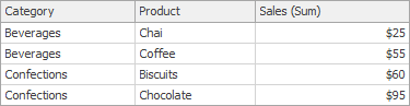
This section assumes you operate with the same data. You can create a SalesByProduct calculated field that computes product sales:
aggr(Sum([Sales]), [Product])
The following internal table is generated for this calculated field.
A Grid item displays sales by category. You can drop the created calculated field onto the Grid and set its summary type to Min. The Grid displays minimum product sales for each category. In this instance, you added aggregation of more detailed granularity to the dashboard item.
Shift the Calculation Level
You can use the joinRule function to shift the calculation level. For example, you can have a dashboard item calculate yearly values, and use the following function to add summaries for preceding years:
aggr(Sum([ExtendedPrice]), joinRule(GetYear([Date]), GetYear([Date]) - 1))
Note
The joinRule function is available only for client data processing mode.
All of the examples below are created in the WinForms Designer, but you can also create calculated fields with the same expressions in the Web Dashboard.
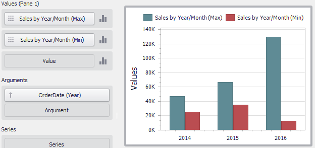
Example 1 - Highest/Lowest Sales by Year
The following example shows how to display the highest and lowest monthly sales for each year.
In this example, the Chart dashboard item shows yearly sales numbers.
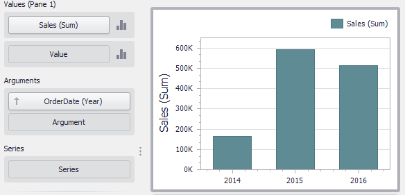
To display the highest/lowest monthly sales for each year, create a new calculated field with the following expression.
aggr(Sum([Sales]), GetYear([OrderDate]), GetMonth([OrderDate]))
Drop this field (Sales by Year/Month in the image below) to the Values section and set its summary type to Max. Drop the same field to Values again, but set its summary type to Min. The resulting Chart will display the highest and lowest monthly sales for each year.
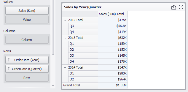
Example 2 - Percent of Grand Total
This example shows how to calculate the contribution of quarterly sales to total yearly sales.
In this example, the Pivot dashboard item displays the sum of sales by year/quarter. The Sales field is placed in the Values section and the hierarchy of OrderDate fields (with the Year and Quarter group intervals) is placed in Rows.
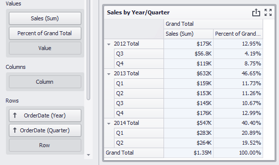
Do the following to display quarterly sales as a percentage of total sales.
Calculate grand total sales. Create a calculated field that uses the following
aggrfunction:aggr(Sum([Sales]))Set the name of the created field to Grand Total Sales.
Calculate the contribution of quarterly sales to total yearly sales:
Sum([Sales]) / Sum([Grand Total Sales])Name this field Percent of Grand Total and drop it to Values to see the contribution of quarterly sales to total yearly sales.
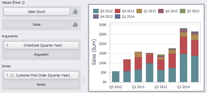
Example 3 - Sales Breakdown by Customer’s First Order Date
The Chart dashboard item below displays quarterly sales.
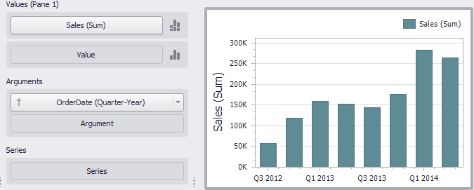
The following expression determines the quarter when customers made their first purchase.
aggr(Min(GetDateQuarterYear([OrderDate])), [CustomerID])
Set the name of the created field to Customer First Order and drop this field to the Series section to see the result. Each bar now displays a breakdown by customers, grouped by their first order date.
Example 4 - Customer Order Count
The example shows how to group customers by the number of orders placed.
The Chart below shows the number of orders placed by each customer.
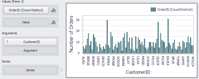
The calculated field below evaluates the number of unique orders placed by each customer.
aggr(CountDistinct([OrderID]), [CustomerID])
Set the name of this field to Customer Order Count and drop this field to arguments. Then, drop the CustomerID field to Values and change its summary type to Count Distinct.
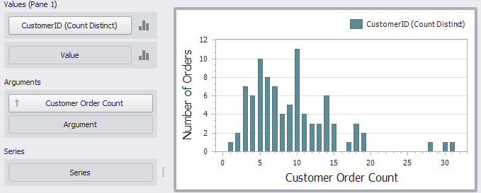
The Chart now groups customers by the number of orders placed.
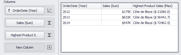
Example 5 - Highest Product Sales by Year
This scenario requires the use of nested aggregations. In this example, the dashboard shows products with the highest sales in a year along with sales values.
The initial Grid dashboard item shows sales of all products by year (the OrderDate column with the Year group interval and the Sales column). The data source also contains the ProductName field.
Follow the steps below:
Create the calculated field that returns product sales for individual years.
aggr(Sum([Sales]), GetYear([OrderDate]), [ProductName])Set its name to Product Sales by Year.
Create the calculated field that returns maximum sales values.
aggr(Max([Product Sales by Year]), GetYear([OrderDate]))Set its name to Max Product Sales by Year.
Finally, create a calculated field that returns the name of the product with the highest sales and a corresponding sales value.
Iif([Max Product Sales by Year] = [Product Sales by Year], [ProductName] + ' ($' + [Product Sales by Year] + ')', null)Specify the name as Highest Product Sales. Then, drop this field to the Columns section to see products with the highest sales in a year along with sales values.
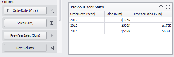
Example 6 - Year-on-Year Comparison
The two examples in this section compare sales during a time period to sales during the corresponding period the previous year.
The Previous Year Sales Grid displays sales by year in comparison with the previous year’s sales. The PrevYearSales field is calculated by the following expression:
aggr(Sum([Sales]), joinRule(GetYear([OrderDate]),GetYear([OrderDate])-1))
The joinRule function here is used to shift the calculated sales back a year. Add the created field to the Grid’s Columns section to see the result:
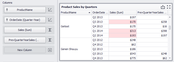
The second Grid, Product Sales by Quarters, displays quarterly sales numbers in comparison with corresponding quarterly numbers from the previous year.
The PrevQuarterYearSales calculated field aggregates sales by products and the previous year’s quarter. The joinRule function is used to calculate the second dimension.
aggr(Sum([Sales]),[ProductName],joinRule(GetDateQuarterYear([OrderDate]),GetDateQuarterYear(AddYears([OrderDate], -1))))
Add the created field to the Grid’s Columns section to see the result. A format rule is applied to highlight sales that declined in comparison to the previous year:
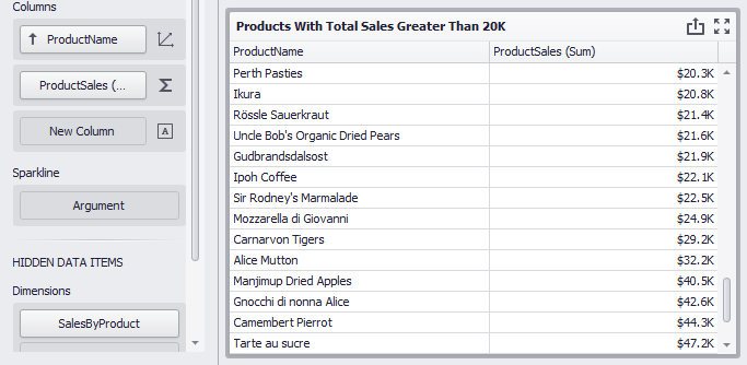
Example 7 - How to Display Product Sales that are Greater than $20k
The example shows how to filter item source data by the aggregated ProductSales field and how to display total product sales that are greater than $20k.
The Grid item below displays product sales:
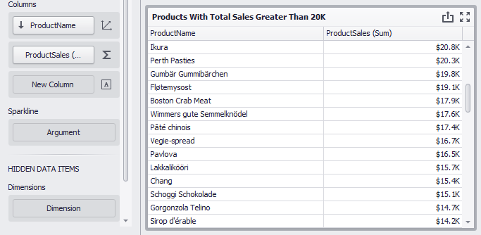
The following SalesByProduct calculated field determines the total product sales:
aggr(Sum([ProductSales]), [ProductName])
Add the created field to the Grid’s hidden dimension section and set the expression [SalesByProduct] > 20000.0m in a dashboard item filter to see the total product sales that are greater than $20k.
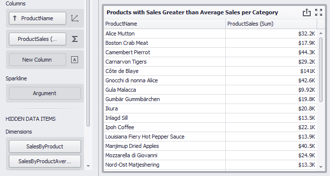
Example 8 - How to Display Products with Sales Greater than Average Sales per Category
The example shows how to filter item source data by the aggregated ProductSales field and how to display totals only for those products whose sales are greater than the average in the corresponding category.
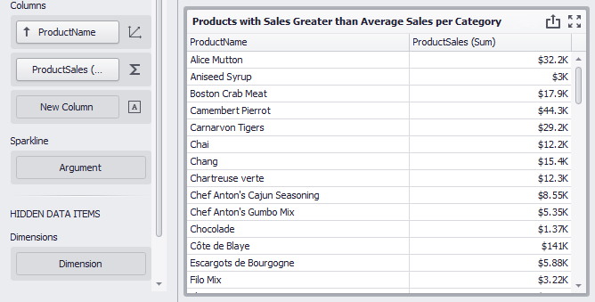
The SalesByProduct calculated field uses the following function to obtain the total sales by product:
aggr(Sum([ProductSales]), [ProductName])
The following function determines average product sales per category (the SalesByProductAverage calculated field):
aggr(Avg([SalesByProduct]), [CategoryName])
Add the created fields to the Grid’s hidden dimension section and set the expression [SalesByProduct] > [SalesByProductAverageInCategory] in a dashboard item filter to see totals only for those products whose sales are greater than the average in the corresponding category.