Dashboard View
The Dashboard view shows an analysis summary that includes information about code coverage, unit tests, and code issues (diagnostics).
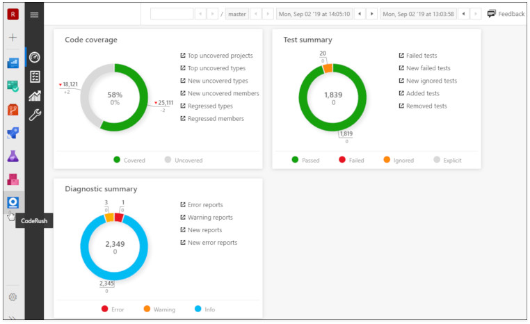
The view includes the following panes:
Each pane uses a doughnut chart to visualize data. In the Differences mode, divergence from the baseline are indicated by a second set of numbers (in grey) placed below the totals for the active build.

The top number is an absolute value (the total for that data point) and the grey number below it indicates the delta or change, relative to the baseline. The arrow icon to the left of each total indicates whether the change is an improvement (green triangle pointing up), or a decline (red triangle pointing down).