DxSpinEdit<T> Class
An editor with spin buttons that allow users to increment/decrement numeric values.
Namespace: DevExpress.Blazor
Assembly: DevExpress.Blazor.v23.2.dll
NuGet Package: DevExpress.Blazor
Declaration
public class DxSpinEdit<T> :
    DxMaskedInputBase<T>,
    IFocusableEditor
Type Parameters
| Name | Description |
|---|---|
| T | The data type. |
Remarks
The DevExpress Spin Edit for Blazor (<DxSpinEdit>) allows you to display and edit numeric values. Users can do any of the following to change the editor’s value:
- Press the spin buttons. When a user presses or holds a spin button, it continuously increments/decrements the editor’s value.
- Scroll the mouse wheel.
- Use the Up and Down arrow keys.
- Type a new value in the edit box.

Touch screens display the increment and decrement spin buttons separately.

Add a Spin Edit to a Project
Follow the steps below to add the Spin Edit component to an application:
- Use a DevExpress Project Template to create a new Blazor Server or Blazor WebAssembly application. If you use a Microsoft project template or already have a Blazor project, configure your project to incorporate DevExpress Blazor components.
- Add the
<DxSpinEdit>…</DxSpinEdit>markup to a.razorfile. - Configure the component: specify the editor’s value, apply a mask, add a clear button and placeholder, and so on (see the sections below).
Edit Value
Use the Value property to specify an editor’s value or to bind the value to a data source object. You can use the @bind attribute to bind the Value property to a data field. Refer to the following topic for details: Two-Way Data Binding.
<DxSpinEdit Value="15"></DxSpinEdit>

<DxSpinEdit @bind-Value="@DecimalValue"></DxSpinEdit>

@code {
    Decimal DecimalValue { get; set; } = 15;
}
The component supports the following data types:
- Integer numeric data types
- Floating-point numeric types
- Nullable types of all the types listed above
The Value property is updated when the editor loses focus (OnLostFocus mode). You can set the BindValueMode property to OnInput or OnDelayedInput to update the Value property when a user changes the input value.
If you do not use two-way data binding, handle the ValueChanged event to respond to the editor’s value change. The code below enables the Update Value button when a user changes the editor value.
<DxSpinEdit Value="@NumericValue" ValueChanged="@((int newValue) => OnValueChanged(newValue))"></DxSpinEdit>
<DxButton Enabled="@IsEnabled">Update Value</DxButton>

@code {
    int NumericValue = 0;
    bool IsEnabled = true;

    void OnValueChanged(int newValue) {
        NumericValue = newValue;
        if (newValue != 0)
            IsEnabled = false;
        else IsEnabled = true;
    }
}
Apply a Mask
The Spin Edit component supports Numeric masks. Apply a numeric mask to ensure that users can only enter integers, currency, percentage, or other numbers in a specific format. Users can navigate between digits and increase/decrease digit values with the Up and Down arrow keys and mouse wheel.

Assign a predefined or custom pattern to the Mask property to apply a numeric mask. To customize the mask settings, add the DxNumericMaskProperties component to the Spin Edit markup.
@using System.Globalization

<DxSpinEdit @bind-Value="Value"
            Mask="@NumericMask.Currency">
    <DxNumericMaskProperties Culture="Culture" />
</DxSpinEdit>

@code{
    Double Value { get; set; }
    CultureInfo Culture = CultureInfo.GetCultureInfo("fr-FR");
}
Nullable Value and Placeholder
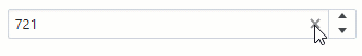
If the Spin Edit’s data type is nullable, users can delete the editor value (set it to null).
You can also set the ClearButtonDisplayMode property to Auto to show the Clear button when the editor has a non-null value. Use the NullText property to display the prompt text (placeholder) in the editor when its value is null.
<DxSpinEdit @bind-Value="@NumericValue"
            ClearButtonDisplayMode="DataEditorClearButtonDisplayMode.Auto"
            NullText="Type a value..."
CssClass="cw-320" />

@code {
    int? NumericValue { get; set; } = 721;
}
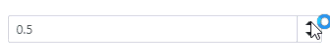
Minimum / Maximum Values
Use the MinValue and MaxValue properties to limit the editor’s minimum and maximum values.
Note
- The Spin Edit does not allow users to set a value that is less or more than the
MinValueandMaxValue. - If you set the Value property to a value outside the range, the Spin Edit changes its value to the closest available value and displays it.
<DxSpinEdit @bind-Value="DecimalValue"
            MinValue="0M"
            MaxValue="1M" />

@code {
    Decimal DecimalValue { get; set; } = 0.5M;
}
Increment Value
Use the Increment property to change the editor’s unit value. This value is added to/subtracted from the Value property value each time a user clicks the increment/decrement spin button.
<DxSpinEdit @bind-Value="DecimalValue"
            Increment="0.1M"
            MinValue="0M"
            MaxValue="1M" />

@code {
    Decimal DecimalValue { get; set; } = 0.5M;
}
Display Format
Use the DisplayFormat property to format the Spin Edit’s display value when the editor is not focused. See the Standard Numeric Format Strings and Custom Numeric Format Strings help topics for more information.
The following example demonstrates how to apply the currency format:
<DxSpinEdit @bind-Value="@DecimalValue"
            DisplayFormat="C" />

@code {
    Decimal DecimalValue { get; set; } = 320.5m;
}

Appearance Customization
Use the SizeMode property to specify a Spin Edit size. The code below applies different size modes to Spin Edit components.
<DxSpinEdit @bind-Value="@DecimalValue" SizeMode="SizeMode.Small"></DxSpinEdit>

<DxSpinEdit @bind-Value="@DecimalValue" SizeMode="SizeMode.Medium"></DxSpinEdit>

<DxSpinEdit @bind-Value="@DecimalValue" SizeMode="SizeMode.Large"></DxSpinEdit>

@code {
    Decimal DecimalValue { get; set; } = 15;
}

To customize Spin Edit input, use the InputCssClass property. The following code snippet applies a custom style to input borders:
<style>
    .my-style {
        border: 1px solid lightseagreen;
    }
</style>

<DxSpinEdit Value="15" CssClass="my-style"></DxSpinEdit>

For more information, refer to the following help topics:
Hide Built-In Spin Buttons
Set the ShowSpinButtons property to false.
<DxSpinEdit Value="15" ShowSpinButtons="false"></DxSpinEdit>

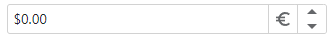
Add Command Buttons
You can add custom command buttons to the Spin editor. Refer to Command Buttons for more information.
The following code adds a custom currency button to the Spin editor.
@using System.Globalization

<DxSpinEdit @bind-Value="@Price"
                Mask="@NumericMask.Currency">
        <Buttons>
            <DxEditorButton IconCssClass="@($"editor-icon {CurrencyButtonIconClass}")"
                            Tooltip="Change currency"
                            Click="@OnChangeCultureInfoButtonClick"
                            CssClass="dx-demo-editor-width" />
        </Buttons>
        <ChildContent>
            <DxNumericMaskProperties Culture="MaskCultureInfo" />
            </ChildContent>
</DxSpinEdit>

@code{
double Price { get; set; }
string CurrencyButtonIconClass { get; set; } = "editor-icon-euro";
CultureInfo MaskCultureInfo { get; set; } = CultureInfoItems[0];
    static CultureInfo[] CultureInfoItems { get; set; } = {
            CultureInfo.GetCultureInfo("en-US"),
            CultureInfo.GetCultureInfo("de-DE")
    };
    void OnChangeCultureInfoButtonClick() {
        var isCurrentCultureUs = MaskCultureInfo.Equals(CultureInfoItems[0]);
        MaskCultureInfo = isCurrentCultureUs ? CultureInfoItems[1] : CultureInfoItems[0];
        CurrencyButtonIconClass = isCurrentCultureUs ? "editor-icon-dollar" : "editor-icon-euro";
    }
}

<style>
    .dx-demo-editor-width {
        max-width: 320px;
        width: 100%;
    }
</style>
Input Validation
You can add a standalone Spin Edit or the Form Layout component to the Blazor’s standard EditForm. This form validates user input based on data annotation attributes defined in a model and indicates errors.
<EditForm Model="@starship"
          OnValidSubmit="@HandleValidSubmit"
          OnInvalidSubmit="@HandleInvalidSubmit">
    <DataAnnotationsValidator/>
    <DxFormLayout SizeMode="Params.SizeMode">
        @*...*@
        <DxFormLayoutItem Caption="Maximum Accommodation:"
                        ColSpanMd="6">
        <DxSpinEdit Id="accommodation" ShowValidationIcon="true"
                    @bind-Value="@starship.MaximumAccommodation"/>
    </DxFormLayout>
</EditForm>

@code {
    Starship starship = new() {
        ProductionDate = DateTime.Now + TimeSpan.FromDays(1),
        Description = "Default description"
    };
}
For more information, refer to the following help topic: Validate Input.
Disable Value Change on Mouse Wheel Scrolling
Users can scroll the mouse wheel to change the Spin Edit’s Value. Set the AllowMouseWheel property to false to disable this feature.
<DxSpinEdit Value="15" AllowMouseWheel="false"/>
Read-Only State
Use the Enabled and ReadOnly properties to disable and mark the Spin Edit as read-only.
<DxSpinEdit @bind-Value="@NumericValue" ReadOnly="true" />

@code {
    int? NumericValue { get; set; } = 180798;
}
HTML Attributes and Events
You can use HTML attributes and events to configure the Spin Edit.
<DxSpinEdit Value="1"
            list="values"
            maxlength="2"
            @onwheel="MyFunction">
</DxSpinEdit>
@*Supply a list of the predefined values*@
<datalist id="values">
    <option value=10/>
    <option value=30/>
    <option value=50/>
</datalist>

@code {
    void MyFunction(){
        //...
    }
}

Troubleshooting
If a Blazor application throws unexpected exceptions, refer to the following help topic: Troubleshooting.