DxFormLayoutGroup Class
Namespace: DevExpress.Blazor
Assembly: DevExpress.Blazor.v23.2.dll
NuGet Package: DevExpress.Blazor
Declaration
public class DxFormLayoutGroup :
    FormLayoutGroupBase,
    IFormLayoutLevel
Remarks
Use the DxFormLayoutGroup class to organize layout elements.
Create a Group
To specify a group caption, use the Caption property. Use the CaptionPosition property to place the caption of a nested item above it (Vertical) or at its left border (Horizontal). You can use ColSpanXX properties to specify the group width. The following example arranges items into groups with captions:
<DxFormLayout>
    <DxFormLayoutGroup Caption="Personal Information" ColSpanMd="6">
        <DxFormLayoutItem Caption="First Name:">
            @* ... *@
        </DxFormLayoutItem>
    </DxFormLayoutGroup>
    <DxFormLayoutGroup Caption="Work Information" ColSpanMd="6">
        <DxFormLayoutItem Caption="Position:">
           @* ... *@
        </DxFormLayoutItem>
    </DxFormLayoutGroup>
</DxFormLayout>
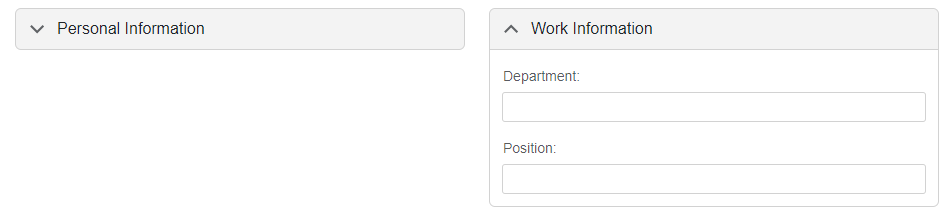
Expand a Group
Use the Expanded property to expand and collapse groups in code. Users can click expand buttons to do the same in UI. Set the ExpandButtonDisplayMode property to Start or End to show these buttons. Handle the ExpandedChanged event to react to group state changes.
<DxFormLayout>
    <DxFormLayoutGroup Caption="Personal Information"
                       Expanded="false"
                       ExpandButtonDisplayMode="GroupExpandButtonDisplayMode.Start"
                       ColSpanMd="6">
        <DxFormLayoutItem Caption="First Name:" ColSpanMd="12">
            <DxTextBox />
        </DxFormLayoutItem>
        <DxFormLayoutItem Caption="Last Name:" ColSpanMd="12">
            <DxTextBox />
        </DxFormLayoutItem>
    </DxFormLayoutGroup>
    <DxFormLayoutGroup Caption="Work Information"
                       ExpandButtonDisplayMode="GroupExpandButtonDisplayMode.Start"
                       ColSpanMd="6">
        <DxFormLayoutItem Caption="Department:" ColSpanMd="12">
            <DxTextBox />
        </DxFormLayoutItem>
        <DxFormLayoutItem Caption="Position:" ColSpanMd="12">
            <DxTextBox />
        </DxFormLayoutItem>
    </DxFormLayoutGroup>
</DxFormLayout>
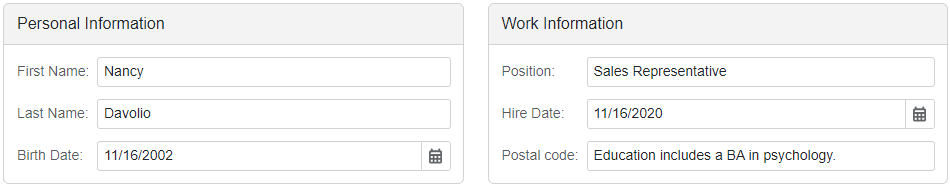
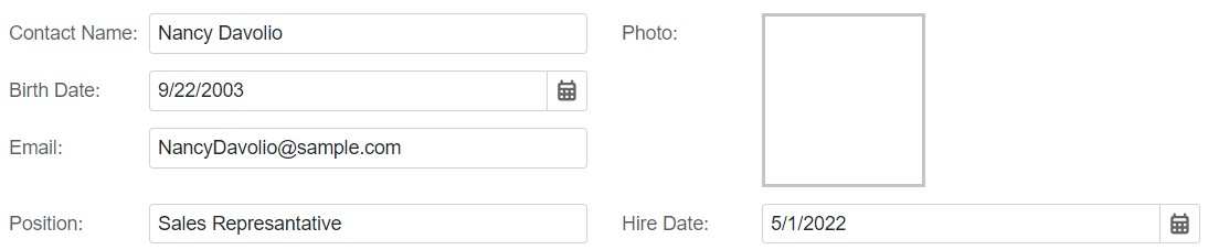
Customize Appearance
Set the Decoration property to FormLayoutGroupDecoration.None to disable card decorations for groups.
The code sample below combines items into a group and disables its card decoration to imitate row-span behavior:
<DxFormLayout ItemCaptionAlignment="ItemCaptionAlignment.All">
    <DxFormLayoutGroup Decoration="FormLayoutGroupDecoration.None" ColSpanMd="6">
        <DxFormLayoutItem Caption="Contact Name:" ColSpanMd="12">
            <DxTextBox @bind-Text="@Name" />
        </DxFormLayoutItem>
        <DxFormLayoutItem Caption="Birth Date:" ColSpanMd="12">
            <DxDateEdit @bind-Date="@BirthDate" Mask="@DateTimeMask.ShortDate" />
        </DxFormLayoutItem>
        <DxFormLayoutItem Caption="Email:" ColSpanMd="12">
            <DxTextBox @bind-Text="@Email" />
        </DxFormLayoutItem>
    </DxFormLayoutGroup>
    <DxFormLayoutItem ColSpanMd="6" Caption="Photo:">
        <div style="width:119px;height:126px; border: solid rgba(0,0,0,0.23);"></div>
    </DxFormLayoutItem>
    <DxFormLayoutItem Caption="Position:" ColSpanMd="6">
        <DxTextBox @bind-Text="@Position" />
    </DxFormLayoutItem>
    <DxFormLayoutItem Caption="Hire Date:" ColSpanMd="6">
        <DxDateEdit @bind-Date="@HireDate" />
    </DxFormLayoutItem>
</DxFormLayout>

@code {
string Name { get; set; } = "Nancy Davolio";
    DateTime BirthDate { get; set; } = DateTime.Now.AddYears(-20);
    string Email { get; set; } = "NancyDavolio@sample.com";
    string Position { get; set; } = "Sales Represantative";
    DateTime HireDate { get; set; } = new DateTime(2022, 5, 1);
}
You can also use the following group members to modify content and apply custom styles:
- CssClass
- Specifies the name of the component’s CSS class.
- CaptionTemplate
- Specifies the template used to display the group’s caption.
- CaptionCssClass
- Specifies the name of the CSS class applied to the layout group’s caption.
- HeaderContentTemplate
- Specifies the template used to display the group’s header content.
- HeaderTemplate
- Specifies the template used to display the group header.
- HeaderCssClass
- Specifies the name of the CSS class applied to the group header.
- HeaderIconCssClass
- Specifies the CSS class of a Form Layout group header’s icon.
- HeaderIconUrl
- Specifies the URL of the group header’s icon.
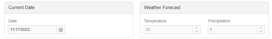
Enabled and Read-Only Modes
You can disable auto-generated editors within the the group or mark them as read-only.
<DxFormLayout Data="forecast">
    <DxFormLayoutGroup Caption="Current Date" ColSpanMd="6" ReadOnly="true">
        <DxFormLayoutItem Caption="Date" Field="@nameof(WeatherForecast.Date)" ReadOnly="true" />
    </DxFormLayoutGroup>
    <DxFormLayoutGroup Caption="Weather Forecast" ColSpanMd="6" Enabled="false">
        <DxFormLayoutItem Caption="Temperature" Field="@nameof(WeatherForecast.TemperatureC)" Enabled="false" />
        <DxFormLayoutItem Caption="Precipitation" Field="@nameof(WeatherForecast.Precipitation)" />
    </DxFormLayoutGroup>
</DxFormLayout>