DxComboBox<TData, TValue>.EditBoxTemplate Property
Specifies a template used to display the ComboBox’s item in the edit box.
Namespace: DevExpress.Blazor
Assembly: DevExpress.Blazor.v23.1.dll
NuGet Package: DevExpress.Blazor
Declaration
[Parameter]
public RenderFragment<TData> EditBoxTemplate { get; set; }
Property Value
| Type | Description |
|---|---|
| RenderFragment<TData> | The template content. |
Remarks
You can use the EditBoxTemplate property to customize the appearance of a ComboBox item displayed in the edit box. It can be the selected item or the focused item when a user tries to select it, but has not submitted this action yet.
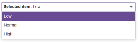
<DxComboBox Data="@Items"
            @bind-Value="@Value">
    <EditBoxTemplate>
        Selected item: @context
    </EditBoxTemplate>
</DxComboBox>

@code {
    string Value { get; set; } = "Low";
    IEnumerable<string> Items = new List<string>() { "Low", "Normal", "High" };
}
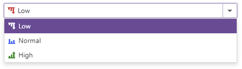
Show Item Icons in the Edit Box
The most popular usage scenario for the EditBoxTemplate property is to show item icons in the edit box.
<DxComboBox Data="@Items"
            @bind-Value="@Value"
            CssClass="cw-480" >
    <EditBoxTemplate>
        @GetTemplateContent(context)
    </EditBoxTemplate>
    ...
</DxComboBox>

@code {
    string Value { get; set; } = "Low";
    IEnumerable<string> Items = new List<string>() {"Low", "Normal", "High"};
    RenderFragment GetTemplateContent(string item) {
        return @<div class="template-container">
                   <svg class="@GetIconCssClass(item)" role="img">
                       <use href="@GetIconHref(item)"/>
                   </svg>
                   @item
               </div>;
    }
    string GetIconHref(string item) {
        return item != null ? StaticAssetUtils.GetImagePath($"icons/levels.svg#dx-{item.ToLower()}-level") : string.Empty;
    }
    string GetIconCssClass(string item) {
        var cssClass = "template-icon";
        if (item != null)
            cssClass += $" {item.ToLower()}-level";
        return cssClass;
    }
}
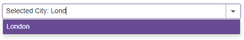
User Input Support and Filter Mode
You can also create an edit box template that supports user input and filter mode:
- Add
<EditBoxTemplate>…</EditBoxTemplate>to the ComboBox markup. - Declare a DxInputBox object within the
EditBoxTemplatemarkup. - Use the
DxComboBox‘s InputCssClass to customize input box appearance. - Optional. Set the DxComboBox.AllowUserInput to
true. - Optional. Use the DxComboBox.FilteringMode property to enable filter mode.
- Optional. Use the NullText property to display the prompt text in the edit box when the editor’s Value is
null.
<DxComboBox Data="@Cities"
            @bind-Value="@CurrentCity"
            AllowUserInput="true"
            FilteringMode="DataGridFilteringMode.StartsWith"
            NullText="Select City ..."
            ClearButtonDisplayMode="DataEditorClearButtonDisplayMode.Auto">
    <EditBoxTemplate>
        @if (context != null) {
            <span style="white-space: pre;">Selected City: </span>
        }
        <DxInputBox/>
    </EditBoxTemplate>
</DxComboBox>

@code {
    string CurrentCity { get; set; } = "London";
    IEnumerable<string> Cities = new List<string>() { "New York", "London", "Berlin", "Paris" };
}
See Also