Menu
- 3 minutes to read
IMPORTANT
Bootstrap Controls for ASP.NET Core are in maintenance mode. We don’t add new controls or develop new functionality for this product line. Our recommendation is to use the ASP.NET Core Controls suite.
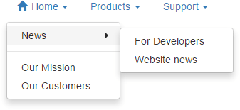
The Bootstrap Menu control offers you an elegant way to provide website navigation options to your end-users. Like other DevExpress web controls, building standard menus for your web application is not the only thing you can deliver with this suite. With integrated template technology, you can easily transform menu items into anything you can imagine. For instance, you can transform a single-item menu into a popup entry form.
This topic lists the features that are unique to the Bootstrap Menu Control.
Control Features
- You can bind a menu to a data source so that your menu structure is retrieved from an XML file or a database table.
- Templates can be specified for root-level items, sub-menu items or for each item individually.
- A menu control allows you to visually indicate selected items.
Client-Side Features
- You can use client-side events to perform custom actions when a sub-menu is being invoked or hidden, and when end-users click a menu item.
- The client-side API allows you to traverse through the entire menu structure and obtain each and every item’s settings.
Root-level Menu Features
- Horizontal or vertical layout can be used for the root level. This means you can build menus that open sideways as well as main menus.
Sub-menus
- You can customize how fast a sub-menu appears or closes after end-user selection.
- A menu control automatically adjusts the sub-menu position so that sub-menus are completely visible within the browser window, when possible.
- Parent menu items can display small glyphs that indicate the presence of sub-menus. By default, such glyphs are displayed in all parent items except for those at the root level. You can enable sub-menu glyphs at the root level or make them invisible in all items.
- Sub menus can display a side strip (gutter) with customizable size and appearance.
Separators
You may wish to display separators between each neighboring menu item pair in the entire menu, or only between items at the root level. Note that the menu control offers you numerous settings, allowing you to control the appearance and layout of item separators - from margins to the background image.
Item Features
- Tooltips can be specified for each menu item.