BootstrapTab Class
Represents an individual tab.
Namespace: DevExpress.Web.Bootstrap
Assembly: DevExpress.Web.Bootstrap.v19.1.dll
Declaration
Related API Members
The following members return BootstrapTab objects:
Remarks
The BootstrapTab class contains the settings which define an individual tab within the BootstrapTabControl. Each tab can display an image and text. An end user can click the tab to switch between the tabs. Note that only one tab can be visible at a time. The tabs allow you to directly update particular page areas or point an end user to any specific location. The Tab.NavigateUrl property of a tab object can be used to specify an URL which defines the navigation location.
All the tabs are stored in the tab control’s BootstrapTabControl.Tabs collection. Individual tabs can be accessed using index notation.
The tab’s visibility and position are specified by its TabBase.Visible and TabBase.VisibleIndex properties. The TabBase.Enabled property specifies whether the tab can be activated. A disabled tab cannot be activated by an end user or via code, its header is displayed grayed.
Note that the BootstrapTab class has a client-side equivalent - an object of the ASPxClientTab type.
Example
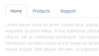
This example demonstrates the basic functionality of the Tab control.
- Initialize a new instance of the BootstrapTabControl class.
- Add required tabs to the BootstrapTabControl.Tabs collection. Each tab item is represented by the
BootstrapTabobject.
The image below demonstrates the result:
<dx:BootstrapTabControl runat="server">
    <Tabs>
        <dx:BootstrapTab Text="Home">
        </dx:BootstrapTab>
        <dx:BootstrapTab Text="Products">
        </dx:BootstrapTab>
        <dx:BootstrapTab Text="Support">
        </dx:BootstrapTab>
    </Tabs>
</dx:BootstrapTabControl>