Floating Action Button
- 5 minutes to read
The BootstrapFloatingActionButton control is a button that appears in front of a container (HTML element or control) when users interact with the container’s elements.
Button Types
The BootstrapFloatingActionButton stores its items in the Items collection. The are two available Floating Action Button’s item types:
- Action that executes the specified action once users click the button.
- Action Group that serves as a container for multiple actions (action items).
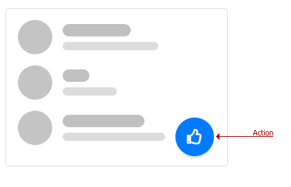
Action
To create an Action, use a BootstrapFABAction object as shown in the following example:
<dx:BootstrapFloatingActionButton runat="server" ContainerCssSelector="#default-fab">
    <Items>
        <dx:BootstrapFABAction ActionName="a1" ContextName="context1" Text="Create Item"/>
    </Items>
</dx:BootstrapFloatingActionButton>
For more information about BootstrapFABAction settings, refer to the table below::
Member | Description |
|---|---|
Specifies the action identifier within the actions collection. | |
Specifies the context name. The context defines which Floating Action Button’s item (Action or Action Group) is active. | |
Specifies the action’s text. | |
Provides access to the action’s image settings. |
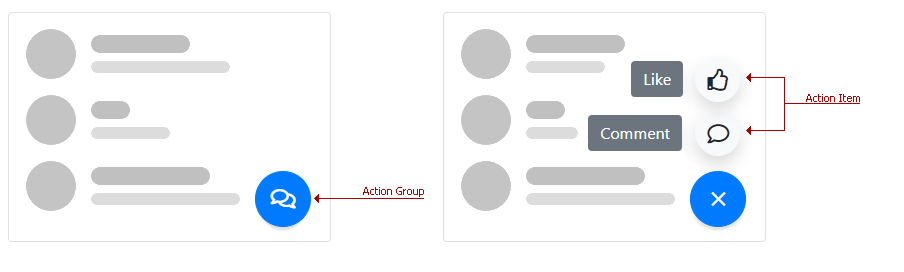
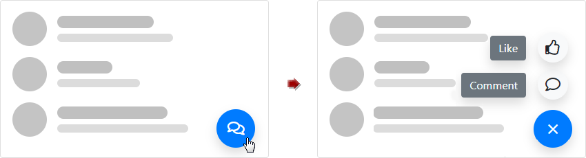
Action Group
To create an Action Group, use a BootstrapFABActionGroup object as shown in the following example:
<dx:BootstrapFloatingActionButton ID="FABActionGroup" runat="server" ContainerCssSelector="#action-group">
    <ClientSideEvents Init="onActionGroupInit" />
    <Items>
        <dx:BootstrapFABActionGroup ContextName="c1">
            <Items>
                <dx:BootstrapFABActionItem ActionName="comment" Text="Comment" IconCssClass="far fa-comment"></dx:BootstrapFABActionItem>
                <dx:BootstrapFABActionItem ActionName="like" Text="Like" IconCssClass="far fa-thumbs-up"></dx:BootstrapFABActionItem>
            </Items>
        </dx:BootstrapFABActionGroup>
    </Items>
    <ClientSideEvents ActionItemClick="onFloatingActionButtonActionItemClick"  />
</dx:BootstrapFloatingActionButton>
For more information about BootstrapFABActionGroup settings, refer to the table below::
Member | Description |
|---|---|
Specifies the context name. The context defines which Floating Action Button’s item (Action or Action Group) is active. | |
Specifies the action group’s text. | |
Provides access to the collapse image settings. | |
Provides access to the expand image settings. |
Each BootstrapFABActionGroup object stores its action items in the Items collection. An Action Item ( BootstrapFABActionItem ) provides the following settings:
Member | Description |
|---|---|
Specifies the action item’s name. | |
Specifies the action item’s text. | |
Provides access to the action item’s image settings. |
Main Features
The Bootstrap Floating Action Button includes the following features:
- Specify a Container Control
- Position
- Customizable Appearance
- Full-Featured Client-Side Functionality
- Online Demos
Specify a Container Control
You can associate the Floating Action Button with any HTML element or web control on a page. For this purpose, use the ContainerCssSelector property. The button is displayed over the specified container.
<dx:BootstrapFloatingActionButton runat="server" ContainerCssSelector="#default-fab" InitialActionContext="c1">
    <Items>
        <dx:BootstrapFABAction ActionName="a1" ContextName="c1"></dx:BootstrapFABAction>
    </Items>
</dx:BootstrapFloatingActionButton>
Position
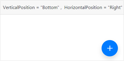
The table below lists properties and their corresponding enumerations used to specify a Floating Action Button’s position.
Position | Property | Values |
|---|---|---|
Vertical | ||
Horizontal |
Customizable Appearance
The Floating Action Button provides users with the following appearance-related features:
Bootstrap-Specific Render
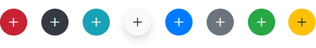
The RenderOption property specifies Bootstrap-specific styles that can be applied to the Floating Action Button. The BootstrapFloatingActionButtonRenderOption enumeration defines the available styles.
<dx:BootstrapFloatingActionButton ClientInstanceName="fab" runat="server" ContainerCssSelector="#render-option" InitialActionContext="cSuccess">
    <Items>
        <dx:BootstrapFABAction ActionName="action" ContextName="cDanger">
            <SettingsBootstrap RenderOption="Danger" />
        </dx:BootstrapFABAction>
        <dx:BootstrapFABAction ActionName="action" ContextName="cDark">
            <SettingsBootstrap RenderOption="Dark" />
        </dx:BootstrapFABAction>
        <%-- ... --%>
    </Items>
</dx:BootstrapFloatingActionButton>
Image
Use the following API to specify an image for a Floating Action Button and nested action items:
- IconCssClass - Specifies an image for an Action Item.
- ExpandIconCssClass / CollapseIconCssClass - Specify expand/collapse images for an Action Group.
<dx:BootstrapFloatingActionButton ID="FABActionGroup" runat="server" ContainerCssSelector="#action-group">
    <Items>
        <dx:BootstrapFABActionGroup ContextName="c1" ExpandIconCssClass="far fa-comments">
            <Items>
                <dx:BootstrapFABActionItem ActionName="comment" Text="Comment" IconCssClass="far fa-comment"></dx:BootstrapFABActionItem>
                <dx:BootstrapFABActionItem ActionName="like" Text="Like" IconCssClass="far fa-thumbs-up"></dx:BootstrapFABActionItem>
            </Items>
        </dx:BootstrapFABActionGroup>
    </Items>
</dx:BootstrapFloatingActionButton>
Text
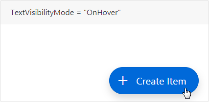
The Text property specifies the button’s text, and you can use the TextVisibilityMode property to specify the text’s visibility.
- Hidden – The button text is always hidden.
- OnHover – The button text is only displayed when users hover the mouse pointer over the Floating Action Button.
- Always – The button text is always visible.
<dx:BootstrapFloatingActionButton runat="server" ContainerCssSelector="#on-hover-mode" TextVisibilityMode="OnHover">
    <Items>
        <dx:BootstrapFABAction ActionName="a1" ContextName="c1" Text="Create Item"></dx:BootstrapFABAction>
    </Items>
</dx:BootstrapFloatingActionButton>
Note
The text of Action Items in Action Groups is displayed on the left of the corresponding items.
Badge
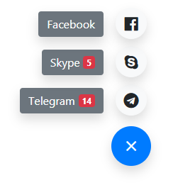
The Floating Action Button control can display supplementary information action items and/or action buttons within a badge. A badge can display text and/or icon. To access the badge’s contents on the server, use the Badge property.
You can use the methods listed below to manage badges on the client:
- BootstrapClientFABActionItem.GetBadgeText /BootstrapClientFABAction.GetBadgeText - Gets the text of the action item/action badge.
- BootstrapClientFABActionItem.SetBadgeText /BootstrapClientFABAction.SetBadgeText - Sets the text of the action item/action badge.
- BootstrapClientFABActionItem.GetBadgeCssClass /BootstrapClientFABAction.GetBadgeCssClass – Gets the CSS class applied to the action item/action badge.
- BootstrapClientFABActionItem.SetBadgeCssClass /BootstrapClientFABAction.SetBadgeCssClass - Sets the CSS class applied to the action item/action badge.
- BootstrapClientFABActionItem.GetBadgeIconCssClass /BootstrapClientFABAction.GetBadgeIconCssClass - Gets the icon CSS class of the action item/action badge.
- BootstrapClientFABActionItem.SetBadgeIconCssClass /BootstrapClientFABAction.SetBadgeIconCssClass - Sets the icon CSS class of the action item/action badge.
<dx:BootstrapFloatingActionButton runat="server" ContainerCssSelector="#fab-badge">
    <Items>
        <dx:BootstrapFABActionGroup ContextName="messages" Text="Messages">
            <Badge Text="19" CssClass="badge-light" />
            <Items>
                <dx:BootstrapFABActionItem ActionName="telegram" Text="Telegram" IconCssClass="fab fa-telegram">
                    <Badge Text="14" CssClass="badge-danger" />
                </dx:BootstrapFABActionItem>
                <dx:BootstrapFABActionItem ActionName="skype" Text="Skype" IconCssClass="fab fa-skype">
                    <Badge Text="5" CssClass="badge-danger" />
                </dx:BootstrapFABActionItem>
                <dx:BootstrapFABActionItem ActionName="facebook" Text="Facebook" IconCssClass="fab fa-facebook">
                </dx:BootstrapFABActionItem>
            </Items>
        </dx:BootstrapFABActionGroup>
    </Items>
</dx:BootstrapFloatingActionButton>
Full-Featured Client-Side Functionality
On the client side, use the BootstrapClientFloatingActionButton class to interact with the control as specified below:
- SetActionContext(contextName) /GetActionContext - Gets or sets which action/action group is displayed in response to a user action.
- SetHorizontalPosition(horizontalPosition) / SetVerticalPosition(verticalPosition) - Gets or sets the Floating Action Button’s horizontal and vertical position.
- SetContainerCssSelector(selector) - Associates the Floating Action Button with the specified container.
Online Demos
To see Bootstrap Floating Action Button and its features in action, refer the links below: