Color Edit
- 3 minutes to read
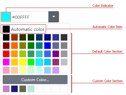
The BootstrapColorEdit control allows end users to specify a color. They can type a value in the edit box or pick a color from the drop-down palette.
The main Bootstrap Color Edit features are:
- Multiple Ways to Specify Color Value
- Custom Color Picker
- Custom Palettes
- Automatic Color Item
- Color on Error
- Caption and Help Text
- Prompt Text (Watermark)
- Built-in Validation
- Full-Featured Client-Side API
- Online Demos
Multiple Ways to Specify Color Value
You can use any of the following notations to specify colors in the edit box:
- Longhand or shorthand hexadecimal color notations - #f0f, #D8D8D8;
- RGB values without an alpha channel - rgb(0,256,256);
- Standard HTML colors - red, green;
- Standard SVG colors.
To disable the editor’s text box, set the AllowUserInput property to false.
Use the Color / Value properties to specify the editor’s value (color-based or in text format).
Custom Color Picker
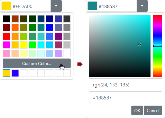
To show the Custom Color palette, set the EnableCustomColors property to true.
Custom Palettes
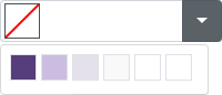
Use the Items property to customize the drop-down color palette.
Automatic Color Item
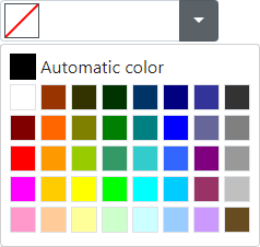
To show an Automatic Color Item at the top of the palette, set the EnableAutomaticColorItem property to true and use the AutomaticColor property to specify item’s color.
Color on Error
When a user enters an incorrect color code into the Color Edit, the control is automatically set to the previous valid color. To change this behavior, set the ColorOnError property to Null so that the control is set to a null value in these cases.
Caption and Help Text
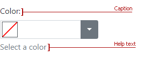
Use the Caption and the HelpText properties to specify the Color Edit’s caption and auxiliary help text.
Prompt Text

Use the NullText property to display prompt text (watermark) in the editor’s edit box. The specified text is displayed when the editor’s value is null and the editor is not focused. The prompt text disappears when the editor is focused.
To specify whether the text should also be displayed in the focused state, use the NullTextDisplayMode property.
<dx:BootstrapColorEdit runat="server" NullText="Select a color" NullTextDisplayMode="UnfocusedAndFocused"/>
Built-in Validation
The Bootstrap Color Edit control allows you to validate user input on the client and server side. Refer to the Validation topic for more information.
Full-Featured Client-Side API
On the client side, use the BootstrapClientColorEdit class to interact with the editor as specified below:
- ColorChanged - This event fires after a user changes the color in the color editor.
- GetColor / SetColor(value) - Returns/sets the editor’s color.
Online Demos
DevExpress Bootstrap controls are shipped with online feature-based demos. To preview the Bootstrap Color Editor and its features, click See Demos.