Reporting
- 6 minutes to read
Reporting is the name for an approach that enables you to print the Bootstrap Scheduler control using the XtraReports for printing. It involves creating a report which is based on Scheduler information, or represents one of the Scheduler views. Then, standard methods for constructing and printing the report may be utilized to obtain the desired printout.
This approach is aimed at providing extreme flexibility in constructing print styles for the Scheduler data.
Printing via Reports
This document describes a technique of creating an XtraSchedulerReport which can be used to compose a printable document, based on the Scheduler information, or representing one of the Scheduler views.
This approach is aimed at providing extreme flexibility in constructing print styles for the Scheduler data. It utilizes the XtraReports Suite to create a report containing controls specially designed to represent Scheduler entities. This report is an object of the XtraSchedulerReport class, which is a descendant of the XtraReport class, offering many useful features available in XtraReports.
The report retrieves scheduler data via the print adapter. The main purpose of the print adapter is to compose a data set used in the report. In order to filter the Scheduler data, the print adapter provides a set of validation events. There are two print adapter types - the ASPxSchedulerStoragePrintAdapter and ASPxSchedulerControlPrintAdapter. For example, you can handle the ASPxSchedulerPrintAdapterBase.ValidateAppointments event, to print appointments which meet specific criteria.
The next level of data representation is the report view. It is like the view which exists in the Scheduler, so there are ReportDayView, ReportWeekView and ReportTimelineView components.
Report Controls
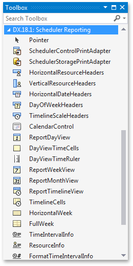
The base XtraReport class is a container for report bands with report controls placed inside them. Scheduler Reporting adds a set of special controls described in the Scheduler Report Controls and Components document. The following picture illustrates the Scheduler Reporting Toolbox available in VS Designer. The table below categorizes reporting controls into several groups depending on the related scheduler elements.
|
|
To render scheduling data, two distinct control sets are implemented. The most important set consists of controls representing time cells with appointments. They are listed below:
The auxiliary controls form the following groups:
- headers - the HorizontalResourceHeaders, VerticalResourceHeaders, HorizontalDateHeaders, DayOfWeekHeaders, TimelineScaleHeaders.
- calendar - the CalendarControl control
- time ruler - the DayViewTimeRuler control
- information - controls used to display miscellaneous information, the TimeIntervalInfo, the FormatTimeIntervalInfo and ResourceInfo controls
These controls should be placed in the DetailBand of the report, and are similar to the XtraReport controls, although they have their own peculiarities. A control is linked to a particular View, and some controls are linked to each other, as well.
The basics of building the XtraScheduler Report is essentially the same as for XtraReports. We suggest that you review the XtraReports documentation, e.g. the Introduction to Banded Reports document, to become familiar with reports, if you haven’t already done so.
Instructions for creating a scheduler report are provided in the How to: Print the ASPxScheduler Using a Report Preview (Step-by-Step Guide) document.
Can Shrink and Can Grow Features
This document introduces the Can Shrink and Can Grow features of the Scheduler reporting controls representing the time cells.
When building a report, a common task is to maximize the informational content visible, and to use the page space in the most efficient way. To help you, Scheduler Reporting has a VerticalLayout option (Fit/Tile), but this option may not be sufficient for a good result.
Currently the Scheduler Reporting has two additional options for the HorizontalWeek and TimelineCells controls, namely CanShrink and CanGrow. They enable you to modify the layout as required, to ensure the cell size fits the content. To show how these options can be used, let’s illustrate two typical scenarios.
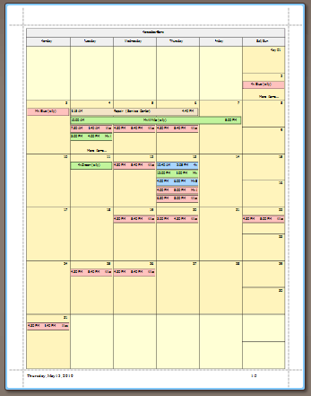
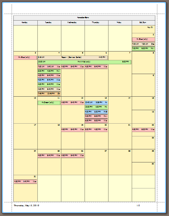
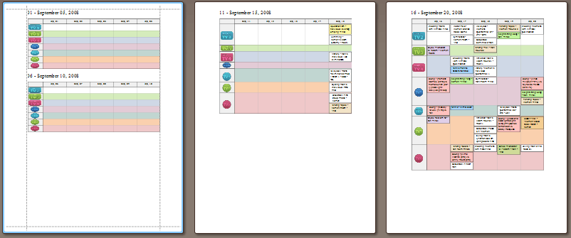
The first scenario is a monthly report. The requirements are: each month for each resource should be printed on a separate page, while the displayed information is maximized.
To achieve this, use the HorizontalWeek control. It represents a month, so we set its height to the height of the page’s working area. The HorizontalWeek.VerticalLayoutType option should be set to ControlContentLayoutType.Fit. In this mode, all weeks are fit into the visual border of the control (as it is set in Designer). Any of the CanShrink/CanGrow options can be switched on, allowing the control to re-arrange its cells to maximize the number of appointments displayed. Note that the total height of the control remains the same. It is the same height that we set in the Designer mode.
The pictures below illustrate the report before and after the HorizontalWeek.CanShrink and HorizontalWeek.CanGrow options are switched on.
|
|
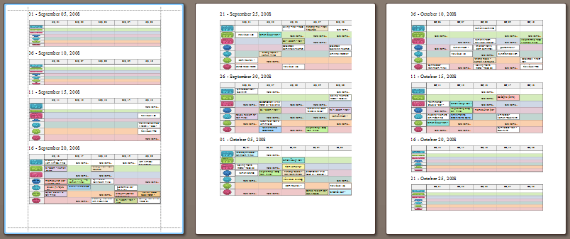
The next scenario is a task to build a timeline report. The report should display all available information, and no restrictions are posed on the page’s height. Use the TimeLineCells control. Now we set the TimelineCells.VerticalLayoutType option to ControlContentLayoutType.Tile. We set the height of the control in the Design mode. It represents the height of one resource.
If the TimelineCells.CanGrow option is switched on, the control can enlarge any resource as needed, to fit all appointments. The picture below illustrates that the height of several resources is increased so all appointments are visible. Other resources maintain the same height that has been specified in Designer.
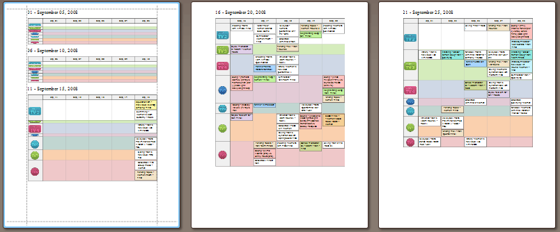
The TimelineCells.CanShrink option specifies that cells can reduce their size if there is free space left. The cell height has an upper limit, specified in the design mode, and the cells will not be stretched beyond this border. The picture below shows that the height of cells with little or no appointments is decreased so the layout becomes more compact.
If both options (CanShrink and CanGrow) are switched on in the Tile mode, it enables you to display data optimally, in most cases. CanShrink allows the cell to shrink if there is less data than it can display with the height specified at design time, while CanGrow allows the cell to grow, in order to fit multiple appointments. See the following picture:
SmartSync Feature
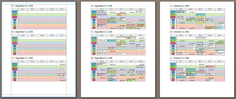
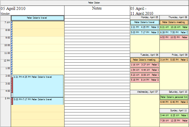
This document introduces the SmartSync feature of the Scheduler reporting controls. This feature allows date-time and resource iterations to be synchronized when printing a report. So, different Tri-fold reports can be constructed, as illustrated below.
You can construct a report of the standard tri-fold style, with lined space for notes in the center:
Another variation is the resource report, integrating Day, Week and Month views:
To enable synchronization required for tri-fold reports, set the ASPxSchedulerPrintAdapterBase.EnableSmartSync to true and specify the ASPxSchedulerPrintAdapterBase.SmartSyncOptions as required. Last picture is taken for the report with the SmartSyncOptions.GroupType set to SchedulerGroupType.Resource.