Views
- 9 minutes to read
The Bootstrap Scheduler control displays appointment data using a standard view. These views define the time intervals (for instance, the Day view displays only one or several days at a time), the user interface elements, and the control’s behavior specific to the currently active view. This view plays a major part in the Scheduler control’s appearance.
The following view types are supported:
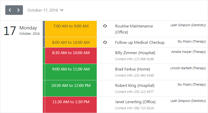
Agenda View
Note
Online Demo To see the Agenda View in action, view the following demo online: Agenda View
The Agenda View displays a chronological list of appointments, grouped by a day. The BootstrapScheduler.AgendaView property is used to access the BootstrapAgendaView object that represents this view’s options. The image below demonstrates the Scheduler control with its ASPxScheduler.ActiveViewType property set to AgendaView.
<dx:BootstrapScheduler runat="server" ActiveViewType="Agenda" Start="2016, 10, 17"
    AppointmentDataSourceID="AppointmentDataSource" ResourceDataSourceID="efResourceDataSource">
    <Views>
        <AgendaView Enabled="true" ScrollAreaHeight="600">
            <AppointmentDisplayOptions ShowResource="true" />
        </AgendaView>
        ...
    </Views>
</dx:BootstrapScheduler>
The following table lists the BootstrapAgendaView class’s main properties which implement its core functionality:
| Member Name | Description |
|---|---|
| AgendaView.AppointmentDisplayOptions | Provides access to the appointment’s display options. |
| AgendaView.DayCount | Specifies the number of days that can be displayed simultaneously within the Agenda View. |
| AgendaView.Templates | Provides access to an AgendaViewTemplates object containing templates for the Agenda View‘s visual elements. |
| AgendaView.DayHeaderOrientation | Gets or sets a value that specifies a day header’s orientation. |
| AgendaView.AllowFixedDayHeaders | Gets or sets whether a day header should be fixed when scrolling. |
| ASPxAgendaViewAppointmentDisplayOptions.IconCellVisibility | Gets or sets a value specifying whether an icon cell is visible. |
Day View
Note
Online Demo To see the Day View in action, view the following demo online: Day View
The Day View gives the most detailed view of appointments for a particular day. This view’s options are represented via the BootstrapDayView object, which is accessed via the BootstrapScheduler.DayView property. The image below demonstrates the Scheduler control with its ASPxScheduler.ActiveViewType property set to DayView.
<dx:BootstrapScheduler runat="server" ActiveViewType="Day" GroupType="Resource"
    AppointmentDataSourceID="AppointmentDataSource" ResourceDataSourceID="efResourceDataSource">
    <Views>
        <DayView ResourcesPerPage="2" />
        ...
    </Views>
</dx:BootstrapScheduler>
The following table lists the main properties of the BootstrapDayView class which implement its basic functionality.
| Member Name | Description |
|---|---|
| BootstrapDayView.AppointmentDisplayOptions | Provides access to the Day View appointments display options. |
| DayView.DayCount | Gets or sets the number of days that are simultaneously displayed within the Day View. |
| DayView.ShowAllDayArea | Gets or sets a value which specifies if the All-Day Area is shown when a Scheduler shows its data in the Day view. |
| DayView.ShowDayHeaders | Gets or sets a value which specifies if day headers are shown when a scheduler shows its data in the Day or the Work-Week views. |
| DayView.ShowMoreButtonsOnEachColumn | Gets or sets a value indicating whether to show the more buttons on each column in the Day View. |
| DayView.ShowWorkTimeOnly | Gets or sets a value indicating if the scheduler should show its data only for the working hours in a Day View. |
| AppointmentDisplayOptions.SnapToCellsMode | Gets or sets the method of snapping appointments to time cells. |
| DayView.TimeScale | Gets or sets the time interval for the time zones and time slots in the scheduling area. |
| DayView.TimeSlots | Gets the View’s collection of time slots. |
| DayView.VisibleTime | Gets or sets the time of the view’s day interval. |
| DayView.WorkTime | Gets or sets the work time interval for a Day View. |
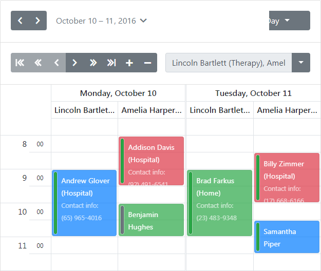
Work-Week View
Note
Online Demo To see the Work-Week View in action, view the following demo online: Work-Week View
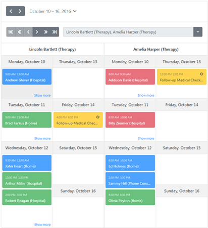
The Work-Week View displays appointments for the working days in a particular week or several weeks. This view’s options are represented via the BootstrapWorkWeekView object, which is accessed via the BootstrapScheduler.WorkWeekView property. The image below demonstrates the Scheduler control with its ASPxScheduler.ActiveViewType property set to WorkWeekView.
<dx:BootstrapScheduler runat="server" ActiveViewType="WorkWeek" GroupType="Resource"
    AppointmentDataSourceID="AppointmentDataSource" ResourceDataSourceID="efResourceDataSource">
    <OptionsResourceNavigator EnableIncreaseDecrease="false" />
    <Views>
        <WorkWeekView ResourcesPerPage="1" />
        ...
    </Views>
</dx:BootstrapScheduler>
The following table lists the main properties of the BootstrapWorkWeekView class which implement its basic functionality.
| Member Name | Description |
|---|---|
| BootstrapWorkWeekView.AppointmentDisplayOptions | Provides access to the appointments display options. |
| DayView.DayCount | Gets or sets the number of days that are simultaneously displayed within the view. |
| DayView.ShowAllDayArea | Gets or sets a value which specifies if the All-Day Area is shown when a Scheduler shows its data in the view. |
| DayView.ShowDayHeaders | Gets or sets a value which specifies if day headers are shown when a scheduler shows its data in the Day or the Work-Week views. |
| WorkWeekView.ShowFullWeek | Gets or sets a value indicating whether this view should show a full week. |
| DayView.ShowMoreButtonsOnEachColumn | Gets or sets a value indicating whether to show the more buttons on each column in the view. |
| DayView.ShowWorkTimeOnly | Gets or sets a value indicating if the scheduler should show its data only for the working hours in a view. |
| DayView.TimeScale | Gets or sets the time interval for the time zones and time slots in the scheduling area. |
| DayView.TimeSlots | Gets the View’s collection of time slots. |
| DayView.VisibleTime | Gets or sets the time of the view’s day interval. |
| DayView.WorkTime | Gets or sets the work time interval for a view. |
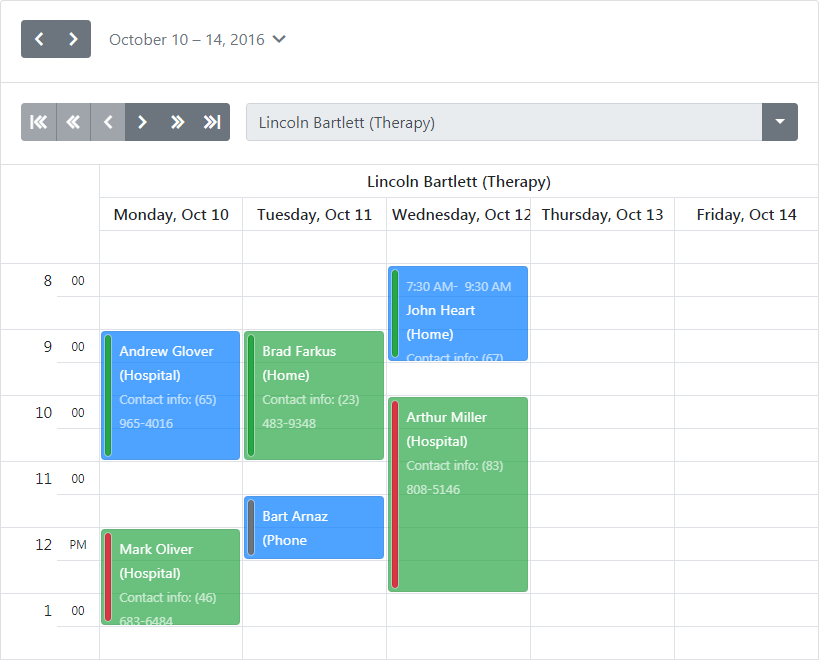
Full Week View
Note
Online Demo To see the Full Week View in action, view the following demo online: Full Week View
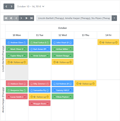
The Full Week View displays appointments for the entire week. This view’s options are represented by the BootstrapFullWeekView object, which is accessed using the BootstrapScheduler.FullWeekView property. The image below demonstrates the Scheduler control with its ASPxScheduler.ActiveViewType property set to the SchedulerViewType.FullWeek.
<dx:BootstrapScheduler runat="server" ActiveViewType="FullWeek" GroupType="Resource"
    AppointmentDataSourceID="AppointmentDataSource" ResourceDataSourceID="efResourceDataSource">
    <OptionsResourceNavigator EnableIncreaseDecrease="false" />
    <views>
        <FullWeekView ResourcesPerPage="1" />
        ...
    </views>
</dx:BootstrapScheduler>
The following table lists the main properties of the BootstrapFullWeekView class which implement its basic functionality.
| Member Name | Description |
|---|---|
| ASPxScheduler.FirstDayOfWeek | Gets the day which the Bootstrap Scheduler‘s week starts from. |
| BootstrapFullWeekView.AppointmentDisplayOptions | Provides access to the appointment’s display options. |
| DayView.ShowAllDayArea | Gets or sets a value which specifies if the All-Day Area is shown when a Scheduler shows its data in the view. |
| DayView.ShowDayHeaders | Gets or sets a value which specifies if day headers are shown when a scheduler shows its data in the Day or the Work-Week views. |
| DayView.ShowMoreButtonsOnEachColumn | Gets or sets a value indicating whether to show the more buttons on each column in the view. |
| DayView.ShowWorkTimeOnly | Gets or sets a value indicating if the scheduler should show its data only for the working hours in a view. |
| DayView.TimeScale | Gets or sets the time interval for the time zones and time slots in the scheduling area. |
| DayView.TimeSlots | Gets the View’s collection of time slots. |
| DayView.VisibleTime | Gets or sets the time of the view’s day interval. |
| DayView.WorkTime | Gets or sets the work time interval for a view. |
| SchedulerViewBase.GetVisibleIntervals | Returns a copy of the visible time interval collection for the current view. |
| SchedulerViewBase.SetVisibleIntervals | Substitutes the visible time interval collection items with new ones. |
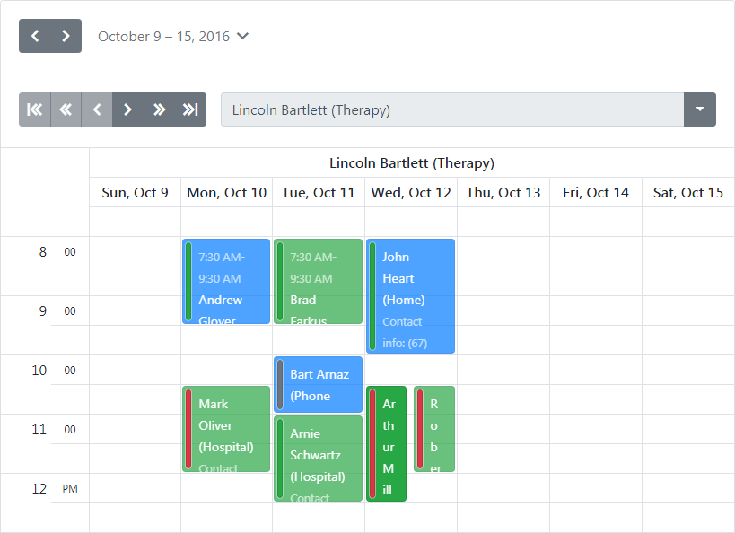
Week View
Note
Online Demo To see the Week View in action, view the following demo online: Week View
The Week View displays appointments for any given weekly period. This view’s options are represented via the BootstrapWeekView object, which is accessed via the BootstrapScheduler.WeekView property. The image below demonstrates the Scheduler control with its ASPxScheduler.ActiveViewType property set to WeekView.
<dx:BootstrapScheduler runat="server" ActiveViewType="Week" GroupType="Resource"
    AppointmentDataSourceID="AppointmentDataSource" ResourceDataSourceID="efResourceDataSource">
    <OptionsResourceNavigator EnableIncreaseDecrease="false" />
    <Views>
        <DayView Enabled="false"/>
        <WorkWeekView Enabled="false"/>
        <WeekView ResourcesPerPage="2" />
        <MonthView Enabled="false" />
        <TimelineView Enabled="false" />
        <AgendaView Enabled="false" />
    </Views>
    <OptionsBehavior ShowViewSelector="false" />
    ...
</dx:BootstrapScheduler>
The following table lists the main properties of the BootstrapWeekView class which implement its basic functionality.
| Member Name | Description |
|---|---|
| WeekView.AppointmentDisplayOptions | Provides access to the appointment’s display options. |
Month View
Note
Online Demo To see the Month View in action, view the following demo online: Month View
The Month View is the least detailed of the views, and is designed to allow your end-users to browse and analyze long-term plans. This view positions the days in sequence horizontally, so that they form weeks, while weeks are placed one under another. This view’s options are represented via the BootstrapMonthView object, which is accessed via the BootstrapScheduler.MonthView property. The image below demonstrates the Scheduler control with its ASPxScheduler.ActiveViewType property set to MonthView.

<dx:BootstrapScheduler runat="server" GroupType="Resource" AppointmentDataSourceID="AppointmentDataSource"
    ResourceDataSourceID="efResourceDataSource" ActiveViewType="Month" Start="2016, 10, 17">
    <OptionsResourceNavigator EnableIncreaseDecrease="false" />
    <Views>
        <DayView Enabled="false" />
        <WorkWeekView Enabled="false" />
        <WeekView Enabled="false" />
        <MonthView ResourcesPerPage="1">
            <AppointmentDisplayOptions StartTimeVisibility="Never" EndTimeVisibility="Never" StatusDisplayType="Bounds" ShowRecurrence="true"/>
            <CellAutoHeightOptions Mode="LimitHeight" MinHeight="140" />
        </MonthView>
        <TimelineView Enabled="false" />
        <AgendaView Enabled="false" />
    </Views>
    <OptionsBehavior ShowViewSelector="false" />
    ...
</dx:BootstrapScheduler>
The following table lists the main properties of the BootstrapMonthView class which implement its basic functionality.
| Member Name | Description |
|---|---|
| MonthView.AppointmentDisplayOptions | Provides access to the appointment’s display options. |
| MonthView.CompressWeekend | Gets or sets a value indicating if the weekend days (Saturday and Sunday) should be displayed as one day. |
| MonthView.ShowWeekend | Gets or sets a value indicating if the scheduler should also show its data for the weekend days (Saturday and Sunday) in a Month View. |
| MonthView.WeekCount | Gets or sets the number of weeks that are simultaneously displayed within the Week View. |
Timeline View
Note
Online Demo To see the Timeline View in action, view the following demo online: Timeline View
The Timeline View displays appointments as horizontal bars along the timescales, and provides end-users with a clearer overview for scheduling purposes. This view’s options are represented via the BootstrapTimelineView object, which is accessed via the BootstrapScheduler.TimelineView property. The image below demonstrates the Scheduler control with its ASPxScheduler.ActiveViewType property set to TimelineView.
<dx:BootstrapScheduler runat="server" GroupType="Resource" ActiveViewType="Timeline"
    AppointmentDataSourceID="AppointmentDataSource" ResourceDataSourceID="efResourceDataSource">
    <OptionsResourceNavigator EnableIncreaseDecrease="false" />
    <Views>
        <TimelineView ResourcesPerPage="3" IntervalCount="5">
            <Scales>
                <dx:TimeScaleMonth />
                <dx:TimeScaleDay />
            </Scales>
        </TimelineView>
        ...
    </Views>
</dx:BootstrapScheduler>
The following table lists the main properties of the BootstrapTimelineView class which implement its basic functionality.
| Member Name | Description |
|---|---|
| TimelineView.AppointmentDisplayOptions | Provides access to the appointment’s display options. |
| TimelineView.Scales | Provides access to a collection of time scales displayed in the timeline view. |
| TimelineView.GetBaseTimeScale | Gets the time scale with the minimum time interval among enabled scales. |
| TimelineView.WorkTime | Gets or sets the work time interval for a Timeline View. |
| TimelineView.CellAutoHeightOptions | Provides access to options for specifying cell auto height behavior. |
| AppointmentDisplayOptions.SnapToCells | Obsolete. Specifies whether the appointment should snap to cell borders. |