Header Filter
- 2 minutes to read
Column headers can display filter buttons. Clicking a filter button invokes a filter dropdown, which lists unique values within a column, and enables you to apply filter criteria against this column. The buttons are hidden by default. To show filter buttons, set the ASPxGridSettings.ShowHeaderFilterButton property to true. You can control the filter button availability for individual columns using a column’s GridDataColumnSettings.AllowHeaderFilter property.
Note that if a filter is applied to a column, other column header filters display unique values of the sorted cards. To show the full list of values (include values of cards hidden by sorting), hold down SHIFT and click a header filter button.
Header Filter Modes
A Header filter can operate in the four modes listed below. A specific filter mode can be specified for individual columns using a column’s GridDataColumnHeaderFilterSettings.Mode property.
The following two list modes are available for all grid columns.
List. The header filter is displayed as a regular list of filter items. Clicking an item invokes a corresponding action and automatically closes the dropdown.
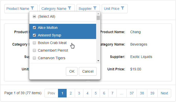
CheckedList. The header filter is displayed as a checked list of filter items. In this mode, an end-user can select multiple items simultaneously. When the dropdown window is closed by clicking the OK button, the grid will display those records that contain checked values.
The following two list modes are available for date columns only.
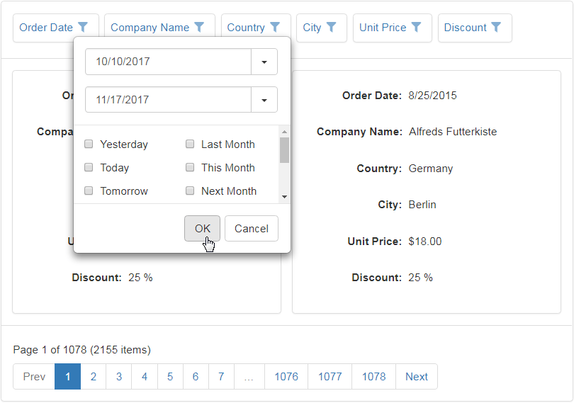
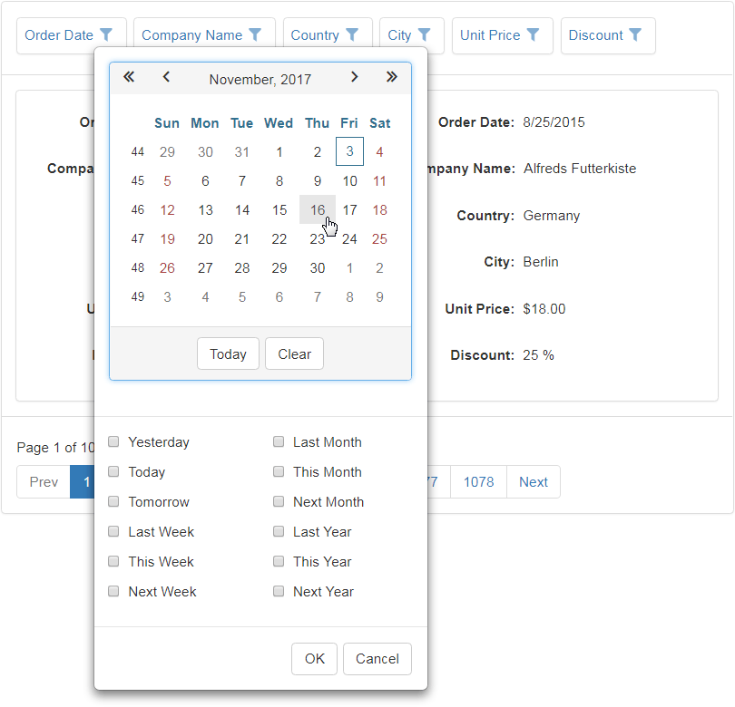
DateRangeCalendar. The header filter displays a calendar and a set of predefined items. The calendar settings can be customized using the CardViewDataColumnHeaderFilterSettings.DateRangeCalendarSettings property.
DateRangePicker. The header filter displays a date range picker and a set of predefined items. The editor settings can be customized using the CardViewDataColumnHeaderFilterSettings.DateRangePickerSettings property.