Toolbar
- 6 minutes to read
The BootstrapToolbar control is a set of buttons arranged in groups.

The main Bootstrap Toolbar features are:
- Multiple Button Types
- Data Binding
- Bootstrap-Specific Render
- Templates
- Adaptivity
- Automatic Postback
- Fully Featured Client-Side API
- Online Demos
Multiple Button Types
Use the control’s Items collection to populate it with buttons. Root-level toolbar items are instances of the BootstrapToolbarItem class. Each button can display an icon, a text or both. You can customize buttons to turn them into the following types:
Button
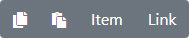
<dx:BootstrapToolbar runat="server">
    <Items>
        <dx:BootstrapToolbarItem Name="Copy" IconCssClass="fa fa-copy" />
        <dx:BootstrapToolbarItem Name="Paste" IconCssClass="fa fa-paste" />
        <dx:BootstrapToolbarItem Name="Item1" Text="Item" />
        <dx:BootstrapToolbarItem Name="Link" Text="Link" NavigateUrl="#DefaultToolbar" />
    </Items>
</dx:BootstrapToolbar>
Drop-down list
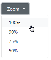
Child items are specified as BootstrapToolbarMenuItem objects that belong the parent item’s Items collection.
<dx:BootstrapToolbar runat="server">
    <Items>
        <dx:BootstrapToolbarItem Text="Zoom" Icon="fa fa-zoom" BeginGroup="true">
            <Item Text="100%"></Item>
            <Item Text="90%"></Item>
            <Item Text="75%"></Item>
            <Item Text="50%"></Item>
        </dx:BootstrapToolbarItem>
    </Items>
</dx:BootstrapToolbar>
The DropDownMode property allows you to split a drop-down item into two buttons: one behaves like a regular button; the other invokes a pop-up menu.
Radio button

The Radio Group UI specifies that only one toolbar item within a group can be checked at a time. To enable this functionality, specify equal GroupName properties for toolbar items that should be used as a Radio Group.
<dx:BootstrapToolbar runat="server">
    <Items>
        <dx:BootstrapToolbarItem GroupName="align" IconCssClass="fa fa-align-left" />
        <dx:BootstrapToolbarItem GroupName="align" IconCssClass="fa fa-align-center" />
        <dx:BootstrapToolbarItem GroupName="align" IconCssClass="fa fa-align-right" />
    </Items>
</dx:BootstrapToolbar>
Check box

Set a toolbar item’s GroupName property to a unique value to force the item to change its checked state on every click.
<dx:BootstrapToolbar runat="server">
    <Items>
        <dx:BootstrapToolbarItem GroupName="UniqueGroupName" IconCssClass="fa fa-adjust" />
        <dx:BootstrapToolbarItem IconCssClass="fa fa-bell">
            <Items>
                ...
            </Items>
        </dx:BootstrapToolbarItem>
    </Items>
</dx:BootstrapToolbar>
Custom
Use the Template property to create a custom toolbar item.
<dx:BootstrapToolbar runat="server">
    <Items>
        <dx:BootstrapCustomToolbarItem>
            <Template>
                <div class="d-flex align-items-center">
                      ...
                </div>
            </Template>
        </dx:BootstrapCustomToolbarItem>
    </Items>
</dx:BootstrapToolbar>
Data Binding
Use the DataSourceID property to bind a Toolbar control to a data source object. The object should implement the IHierarchicalEnumerable or IHierarchicalDataSource interface.
A data-bound Toolbar automatically creates a toolbar item for each data item. A created item’s properties obtain values from data item attributes with corresponding names. You can also use the following properties to explicitly specify the mapping between toolbar item properties and data item attribute names:
- BeginGroupField – Specifies the data source field that identifies toolbar items that should start a group.
- IconCssClassField - Specifies the data source field that provides names of CSS classes that define the toolbar items’ images.
- NameField - Specifies the name of a data field that provides toolbar item’s names.
- NavigateUrlField - Specifies the name of a data field that provides URLs that are opened when the toolbar item is clicked.
- TextField - Specifies the name of a data field that provides toolbar item’s text.
- ToolTipField - Specifies the name of a data field that provides the tooltip text for toolbar items.
<dx:BootstrapToolbar runat="server" DataSourceID="ToolbarDataSource" TextField="Text" NameField="Name" BeginGroupField="BeginGroup" IconCssClassField="Icon">
</dx:BootstrapToolbar>

<asp:XmlDataSource ID="ToolbarDataSource" runat="server" DataFile="~/App_Data/ToolbarItems.xml" XPath="/Toolbar/*"></asp:XmlDataSource>
Bootstrap-Specific Render

Use the RenderOption property to specify contextual styles for the Toolbar’s root items.
<dx:BootstrapToolbar runat="server">
    <Items>
        <dx:BootstrapToolbarItem Text="Info">
            <SettingsBootstrap RenderOption="Info" />
        </dx:BootstrapToolbarItem>
        <dx:BootstrapToolbarItem Text="Success">
            <SettingsBootstrap RenderOption="Success" />
        </dx:BootstrapToolbarItem>
    </Items>
</dx:BootstrapToolbar>
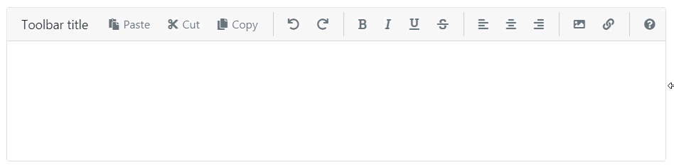
Templates
The Bootstrap Toolbar control supports templates that allow you to customize the control’s appearance and layout. A template can be applied to all toolbar items (control-level templates) or a specific item (item-level templates).
<dx:BootstrapToolbar runat="server">
    <ItemTemplate>
        <span class="<%# Eval("IconCssClass") %>" data-toggle="tooltip" title="<%# Eval("Text") %>"></span>
    </ItemTemplate>
    <ClientSideEvents Init="onClipboardToolbarInit" />
    <Items>
        <dx:BootstrapToolbarItem Name="Paste" Text="Paste" IconCssClass="fa fa-2x fa-paste" />
        <dx:BootstrapToolbarItem Name="Cut" Text="Cut" IconCssClass="fa fa-2x fa-cut fa-rotate-270" />
        <dx:BootstrapToolbarItem Name="Copy" Text="Copy" IconCssClass="fa fa-2x fa-copy" />
    </Items>
</dx:BootstrapToolbar>
Control-level templates’ API:
- ItemTemplate – Specifies a template applied to all toolbar items.
- RootItemTemplate – Specifies a template applied to root toolbar items.
- ItemTextTemplate – Specifies a template applied to the text content of all toolbar items.
- RootItemTextTemplate – Specifies a template applied to the text content of root toolbar items.
- SubMenuTemplate – Specifies a template applied to all toolbar submenus.
Item-level templates’ API:
- Template – Specifies a template applied to the current item.
- TextTemplate – Specifies a template applied to the current item’s text content.
- SubMenuTemplate – Specifies a template applied to the current item’s submenus.
Adaptivity
The Bootstrap Toolbar automatically adapts to container size change or to various target device sizes. The following settings allow you to control what happens when the toolbar cannot fit into its container:
The Title property specifies the toolbar title that is never hidden.
EnableCollapseRootItemsToIcons set to true hides the text of all items that contain icons. Additionally, you can use the item’s AdaptivePriority property to hide a specific item first of others.
EnableAutoHideRootItems set to true moves the root items one by one to the root submenu until the toolbar contains the minimum number of root items (specified by the MinRootItemsCount property).
Automatic Postback
You can set the AutoPostBack property to true to automatically initiate a postback when a user performs an action that can be handled on the server side (for example, clicks a toolbar item).
One of the following events is fired on the server in response to a postback:
- ItemClick – Fires when a toolbar item has been clicked.
- ItemCommand - Fires when a control contained within a templated toolbar item raises the Command event.
Fully Featured Client-Side API
On the client side, use the BootstrapClientToolbar class to interact with the control as specified below:
- ItemClick – Fires when an end-user clicks a toolbar item.
- ItemMouseOver / ItemMouseOut - Fires when the mouse cursor moves onto/outside a toolbar item.
- PopUp / CloseUp – Fires for a toolbar item when it displays/closes a drop-down menu.
- GetItem(index) - Returns a toolbar item specified by its index within the item collection.
- GetSelectedItem / SetSelectedItem(item) – Gets/sets the selected toolbar item.
- GetVisible / SetVisible(visible) – Gets/set the toolbar control’s visibility.
Online Demos
DevExpress Bootstrap controls are shipped with online feature-based demos. To preview the Bootstrap Toolbar and its features, click See Demos.