Form Layout Rendering
- 3 minutes to read
The Bootstrap Form Layout control’s functionality is best understood taking into consideration how it is rendered using Bootstrap classes. This document provides information on Form Layout rendering specifics. You can use this information to construct efficient adaptive form layouts.
The Form Layout control renders itself using the Bootstrap grid system so that the resulting markup can seamlessly integrate with Bootstrap-powered page layouts. Because of this specific, you can approach creating form layouts with DevExpress Bootstrap Controls in the same way you approach creating page layouts using the Bootstrap grid system.
When constructing form layouts, you need to think in terms of the following basic elements.
Virtual Columns
In accordance with the Bootstrap grid layout paradigm, you can control the adaptive behavior of the Form Layout control or by manipulating its virtual columns.
Each Form Layout item can occupy from one to twelve columns in the current row. To specify how many columns an item should occupy, depending on the current screen resolution, use the following properties:
| Property Name | Description | Rendered Bootstrap Classes |
|---|---|---|
| BootstrapLayoutItem.ColSpanXl | Specifies the number of virtual columns an item occupies on screens with a resolution bigger than or equal to 1200px. | .col-xl-* |
| BootstrapLayoutItem.ColSpanLg | Specifies the number of virtual columns an item occupies on screens with a resolution bigger than or equal to 992px. | .col-lg-* |
| BootstrapLayoutItem.ColSpanMd | Specifies the number of virtual columns a layout item occupies on screens with a resolution bigger than or equal to 768px. | .col-md-* |
| BootstrapLayoutItem.ColSpanSm | Specifies the number of virtual columns an item occupies on screens with a resolution bigger than or equal to 576px. | .col-sm-* |
| BootstrapLayoutItem.ColSpanXs | Specifies the number of virtual columns an item occupies on screens with a resolution less than 576px. | .col-xs-* |
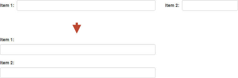
For example, consider the following declaration.
<dx:BootstrapFormLayout ID="BootstrapFormLayout1" runat="server">
    <Items>
        <dx:BootstrapLayoutItem Caption="Item 1" ColSpanSm="12" ColSpanMd="8">
        ...
        </dx:BootstrapLayoutItem>
        <dx:BootstrapLayoutItem Caption="Item 2" ColSpanSm="12" ColSpanMd="4">
        ...
        </dx:BootstrapLayoutItem>
    </Items>
</dx:BootstrapFormLayout>
This declaration will produce the following page markup.
<div class="dxbs-fl form-horizontal" id="BootstrapFormLayout1">
    <div class="row">
        <div id="BootstrapFormLayout1_0" class="col-sm-12 col-md-8">
        ...
        </div>
        <div id="BootstrapFormLayout1_1" class="col-sm-12 col-md-4">
        ...
        </div>
    </div>
</div>
The image below illustrates how this layout automatically responds to switching from medium to small screen resolution.
The BootstrapLayoutGroup class also exposes ColSpanXX properties, which you can use to align items within a layout group.
Rows
By default, all layout items are rendered within a single Bootstrap grid row (a DIV.row element). Consequently, an item is moved to the next row only if it can not be displayed in the current row (there are not enough vacant virtual columns). To force an item to start a new row, set the items BootstrapLayoutItem.BeginRow property to true.
For example, consider the following declaration.
<dx:BootstrapFormLayout ID="BootstrapFormLayout1" runat="server">
    <Items>
        <dx:BootstrapLayoutItem Caption="">
        ...
        </dx:BootstrapLayoutItem>
        <dx:BootstrapLayoutItem Caption="" BeginRow="true">
        ...
        </dx:BootstrapLayoutItem>
        <dx:BootstrapLayoutItem Caption="">
        ...
        </dx:BootstrapLayoutItem>
    </Items>
</dx:BootstrapFormLayout>
This declaration will produce the following page markup.
<div class="dxbs-fl form-horizontal" id="BootstrapFormLayout1">
    <div class="row">
        <div id="BootstrapFormLayout1_0" class="col-md-6">
        ...
        </div>
    </div>
    <div class="row">
        <div id="BootstrapFormLayout1_1" class="col-md-6">
        ...
        </div>
        <div id="BootstrapFormLayout1_2" class="col-md-6">
        ...
    </div>
    </div>
</div>