Data Editors
- 4 minutes to read
DevExpress Bootstrap Data Editors are a powerful collection of data edit and multi-purpose server controls rendered using Bootstrap CSS classes. These controls can function in bound and unbound modes, both as standalone data editors and within container controls such as the DevExpress Bootstrap Grid View.
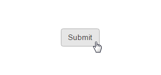
| The Button control extends standard button functionality by providing an enhanced client API and allows you to automatically trigger the validation mechanism for DevExpress web controls on both the client side and server side. |
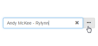
| The Button Edit control is a text box editor that allows one or more buttons to be displayed within its client region. |
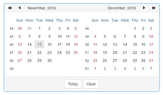
| The Calendar control allows end-users to select dates and navigate through months and years. It supports the multi-month view, in which multiple months are displayed simultaneously, organized in several rows and columns. |
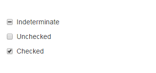
| The Check Box control is a check editor that allows an end-user to specify yes/no or true/false conditions. In addition to the default Checked and Unchecked states, the Check Box control supports a third, grayed (Indeterminate) state when the corresponding option is enabled. |
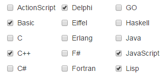
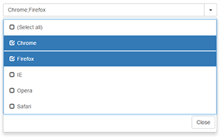
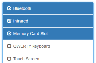
| The Check Box List control displays a group of checkboxes that allows an end-user to select multiple items. In the data-bound mode, the list’s contents are generated dynamically based on the data source. |
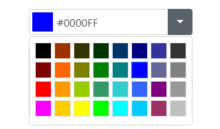
| The Color Edit control’s UI allows users to select colors from a predefined drop-down palette. Users can also add a Custom Color palette to the drop-down color editor to select custom colors. |
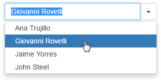
| The Combo Box editor combines the functionality of a single-line text editor, button editor, and dropdown list editor. The editor’s dropdown displays a list of items that can be selected by end-users. |
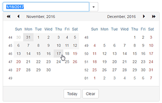
| The Date Edit control is a date editor control that combines the functionality of a single-line text editor, button editor and dropdown calendar. Two Date Edit controls can be combined to implement a date range picker functionality. |
| The Dropdown Edit control is an editor containing an edit box to display the editor value and a specific button that opens a dropdown window whose content can be templated. You can provide custom buttons to be displayed within the editor and customize their appearance and behavior. |
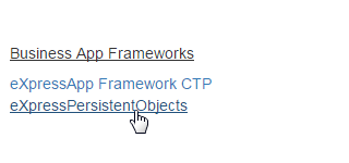
| The Hyperlink editor presents its content as a hyperlink with the specified URL, text, and target window or frame. |
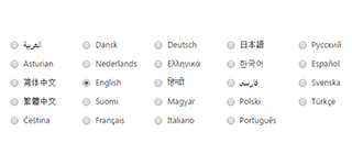
| The List Box control displays a list of items that can be selected by end-users. The List Box control supports the following selection modes.
|
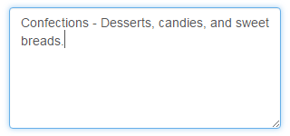
| The Memo control is a text editor which allows multi-line input. |
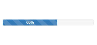
| The Progress Bar control allows you to visually indicate a lengthy operation progress, operation rate, etc. |
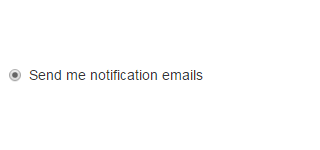
| The Radio Button control is a button that can be selected, but not cleared, by an end-user. A Radio Button paired with other radio button controls enables end-users to select a single option from a group of choices. The Radio Button control permits you to intersperse the radio buttons in a group with other content on the page. |
| The Radio Button List editor is a radio button group that provides end-users with the capability to select a single item at a time. The Radio Button List control supports the data-bound mode, in which the list contents are generated dynamically based on data obtained from a data source. |
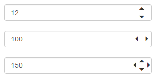
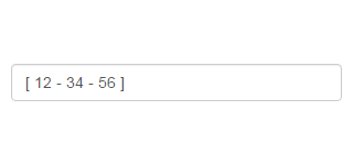
| The Spin Edit control provides end-users with easy numeric value editing by incrementing and decrementing edit values, using spin buttons, a mouse wheel or keyboard. |
| The Text Box control is a single-line text editor. |
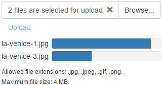
| The Upload Control allows you to provide a way for end-users to save files to the server via the browser. It offers a number of advanced features such as uploading files via AJAX callbacks, built-in validation of the uploaded file against the specified criteria, an enhanced client-side API and others. |