GridDataColumnHeaderFilterSettings.Mode Property
Specifies the type of header filter used for the current column.
Namespace: DevExpress.Web
Assembly: DevExpress.Web.v22.1.dll
NuGet Package: DevExpress.Web
Declaration
[DefaultValue(GridHeaderFilterMode.Default)]
public GridHeaderFilterMode Mode { get; set; }Property Value
| Type | Default | Description |
|---|---|---|
| GridHeaderFilterMode | Default | One of the GridHeaderFilterMode enumeration values. |
Available values:
| Name | Description | Image |
|---|---|---|
| Default | For date columns is equal to the |
|
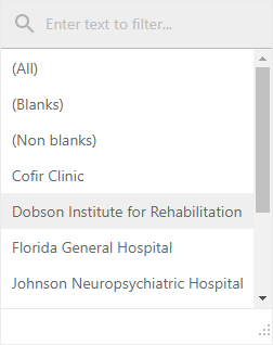
| List | The header filter is displayed as a regular list of filter items. Clicking an item invokes a corresponding action and automatically closes the dropdown. |
|
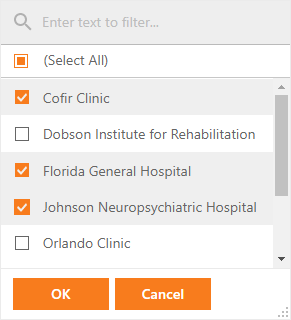
| CheckedList | The header filter is displayed as a checked list of filter items. In this mode, an end-user can select more than one item simultaneously. When the dropdown window is closed by clicking the OK button, the grid will display those records that contain the checked values. |
|
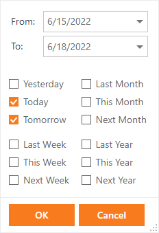
| DateRangePicker | (For date columns only). The header filter displays a date range picker and a set of predefined items. Use the SettingsHeaderFilter.DateRangePickerSettings property to customize the editor settings. |
|
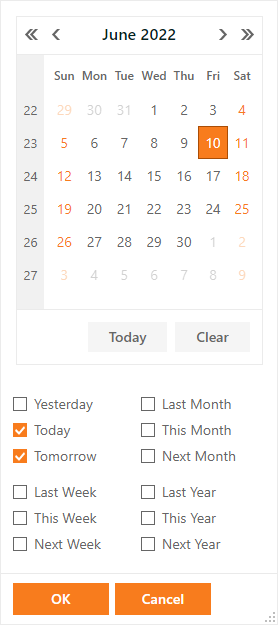
| DateRangeCalendar | (For date columns only). The header filter displays a calendar and a set of predefined items. Use the SettingsHeaderFilter.DateRangeCalendarSettings property to customize the calendar settings. |
|
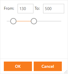
| NumericRangePicker | (For numeric columns only). The header filter displays two spin editors and a track bar. Use the NumericRangeSpinEditSettings and NumericRangeTrackBarSettings properties to customize settings of the spin editors and track bar. |
|
Remarks
Example
The following example illustrates how to use the Mode property.
Web Forms approach:
Note
For a full example, see the ASPxGridView - Customization Dialog demo.
<dx:ASPxGridView ID="Grid" runat="server" DataSourceID="ProductsDataSource"
    EnableRowsCache="false" Width="100%">
    <Columns>
        <dx:GridViewDataTextColumn FieldName="ProductName">
            <Settings AutoFilterCondition="Contains" />
        </dx:GridViewDataTextColumn>
        <dx:GridViewDataComboBoxColumn FieldName="CategoryID" Caption="Category Name" SortIndex="0" SortOrder="Ascending" AdaptivePriority="1">
            <PropertiesComboBox DataSourceID="CategoriesDataSource" ValueField="CategoryID" TextField="CategoryName" ValueType="System.Int32" />
            <Settings AllowHeaderFilter="True" AllowAutoFilter="False" SortMode="DisplayText" />
            <SettingsHeaderFilter Mode="CheckedList" />
        </dx:GridViewDataComboBoxColumn>
        ...
    </Columns>
</dx:ASPxGridView>
MVC approach:
Note
For a full example, see the GridView - Customization Dialog demo.
@Html.DevExpress().GridView(settings => {
    settings.Name = "GridView";
    settings.SettingsCustomizationDialog.Enabled = true;
    ...
    settings.Columns.Add(c => {
        c.FieldName = "ProductName";
        c.Settings.AutoFilterCondition = AutoFilterCondition.Contains;
    });
    settings.Columns.Add(c => {
        c.FieldName = "CategoryID";
        c.Caption = "Category Name";
        c.SortIndex = 0;
        c.SortOrder = DevExpress.Data.ColumnSortOrder.Ascending;
        c.AdaptivePriority = 1;
        c.Settings.AllowHeaderFilter = DefaultBoolean.True;
        c.Settings.AllowAutoFilter = DefaultBoolean.False;
        c.Settings.SortMode = DevExpress.XtraGrid.ColumnSortMode.DisplayText;
        c.SettingsHeaderFilter.Mode = GridHeaderFilterMode.CheckedList;
        c.EditorProperties().ComboBox(cb => {
            cb.DataSource = NorthwindDataProvider.GetCategories();
            cb.TextField = "CategoryName";
            cb.ValueField = "CategoryID";
            cb.ValueType = typeof(int);
        });
    });
}).Bind(Model).GetHtml()