ButtonEditPropertiesBase.Buttons Property
Gets the collection of editor buttons.
Namespace: DevExpress.Web
Assembly: DevExpress.Web.v19.2.dll
Declaration
Property Value
| Type | Description |
|---|---|
| EditButtonCollection | An EditButtonCollection object representing the collection of buttons displayed within the editor. |
Remarks
Use the Buttons property to access the collection of editor buttons.
Note that the ClearButton instance can’t be used within the Buttons collection. Instead, use the ASPxButtonEditBase.ClearButton property to adjust the clear button’s configuration.
<dx:ASPxButtonEdit ID="btnTest" runat="server" ClearButton-DisplayMode="Always">
    <ClearButton Position="Right" DisplayMode="Always"></ClearButton>
Note
The Buttons property synchronizes its value with the editor’s ASPxButtonEditBase.Buttons property.
Example
This example demonstrates how to customize the collection of an editor’s edit buttons and how to change the DropDownButton position.
The default drop-down button’s position can be changed via the EditButton.Position property. Using this property, you can display the button at the left or at the right control side. To display the drop-down button at the custom position (between other edit buttons), hide the default button using the EditButton.Visible property. After that, you can create a custom drop-down button in the required place.
Note
To work properly, a control should have only one drop-down button: a default one or custom one (with a hidden default drop-down button).
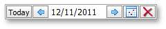
The code sample below demonstrates how to create a custom EditButtonCollection within the ASPxDateEdit control. The image below shows the result.
<dx:ASPxDateEdit ID="ASPxDateEdit1" runat="server" Width="220px" ClientInstanceName="dateedit">
     <ClientSideEvents ButtonClick="onButtonClick" />
     <DropDownButton Visible="False">
     </DropDownButton>
     <Buttons>
          <dx:EditButton Text="Today" Position="Left" ToolTip="Today">
          </dx:EditButton>
          <dx:EditButton Position="Left" ToolTip="Previous day">
               <Image Url="~/Left.png">
               </Image>
          </dx:EditButton>
          <dx:EditButton ToolTip="Next day">
               <Image Url="~/Right.png">
               </Image>
          </dx:EditButton>
          <dx:DropDownButton ToolTip="Show calendar">
               <Image Url="~/Calendar.png">
               </Image>
          </dx:DropDownButton>
          <dx:EditButton ToolTip="Clear">
               <Image Url="~/Clear.png">
               </Image>
          </dx:EditButton>
     </Buttons>
</dx:ASPxDateEdit>
function onButtonClick (s, e) {
     var date = dateedit.GetDate();
     switch (e.buttonIndex) {
          case 0:
               var today = new Date();
               dateedit.SetDate(today);
               break;
          case 1:
               date.setDate(date.getDate() - 1);
               dateedit.SetDate(date);
               break;
          case 2:
               date.setDate(date.getDate() + 1);
               dateedit.SetDate(date);
               break;
          case 4:
               dateedit.SetValue(null);
     };
}