ASPxDropDownEdit Class
An editor that provides the drop-down list functionality.
Namespace: DevExpress.Web
Assembly: DevExpress.Web.v23.2.dll
NuGet Package: DevExpress.Web
Declaration
Remarks
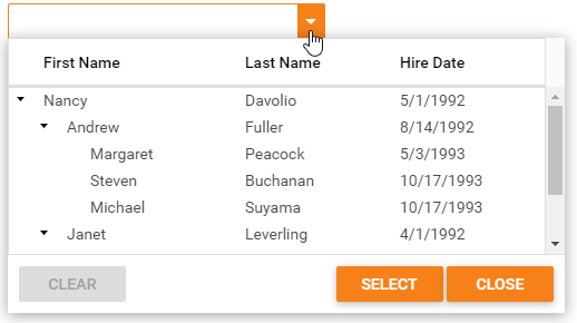
The ASPxDropDownEdit provides an edit box to display the editor value and a specific drop-down button that opens a dropdown window. The drop-down edit control allows you to define its value based on the value(s) of a control(s) integrated into the editor’s drop-down window.
Create a Drop Down Edit
Design Time
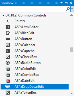
The ASPxDropDownEdit control is available on the DX.23.2: Common Controls toolbox tab in the Microsoft Visual Studio IDE.
Drag the control onto a form and customize the control’s settings, or paste the control markup in the page’s source code.
Note
To properly function, DevExpress controls require that special modules, handlers and options are registered in the the Web.config file. Switch the Microsoft Visual Studio IDE to the Design tab to automatically update the Web.config file with the required DevExpress information.
<dx:ASPxDropDownEdit ID="ASPxDropDownEdit1" runat="server">
    ...
</dx:ASPxDropDownEdit>
Run Time
using DevExpress.Web;
...
protected void Page_Load(object sender, EventArgs e)
{
    ASPxDropDownEdit de = new ASPxDropDownEdit();
    de.ID = "ASPxDropDownEdit1";
    Page.Form.Controls.Add(de);

    de.ClearButton.DisplayMode = ClearButtonDisplayMode.Always;
    de.ClearButton.Position = ButtonsPosition.Right;
}
Client-Side API
The ASPxDropDownEdit’s client-side API is implemented with JavaScript language and exposed by the ASPxClientDropDownEdit object.
Availability | Available by default. |
Client object type | |
Access name | |
Events |
Note
When ASPxDropDownEdit’s ASPxEdit.Enabled property is set to false, the drop-down window elements are not rendered. This behavior is designed to reduce unnecessary markup when the editor is disabled. Use the ASPxEditBase.ClientEnabled property to have the disabled drop-down edit control with rendered content.
Templates
You can use templates to specify the control’s content - button (ASPxDropDownEdit.ButtonTemplate) and drop-down window (ASPxDropDownEdit.DropDownWindowTemplate).
ASPX
<dx:ASPxDropDownEdit ClientInstanceName="checkComboBox" ID="ASPxDropDownEdit1" ...>
    <DropDownWindowTemplate>
        <dx:ASPxListBox Width="100%" ID="listBox" ...>
            <Items>
            ...
            </Items>
        </dx:ASPxListBox>
    </DropDownWindowTemplate>
</dx:ASPxDropDownEdit>
Null Prompt Text
You can use the editor’s NullText property to display a prompt in the editor’s edit box. The prompt text disappears when the editor receives focus.
<dx:ASPxDropDownEdit ID="ASPxDropDownEdit1" runat="server" NullText="Test Text" >
    ...
</dx:ASPxDropDownEdit>
Button Collection
The drop-down edit control allows you to create custom edit buttons (Buttons).
<dx:ASPxDropDownEdit ID="ASPxDropDownEdit1" runat="server"  >
    <Buttons>
        <dx:EditButton Text="Button1">
        </dx:EditButton>
    </Buttons>
</dx:ASPxDropDownEdit>
Validation
The drop-down edit control allows you to validate its data on the client and server side.
<dx:ASPxDropDownEdit ID="ASPxDropDownEdit1" ClientInstanceName="dde" runat="server" >
    ...
    <ValidationSettings>
        <RequiredField IsRequired="true" />
    </ValidationSettings>
</dx:ASPxDropDownEdit>