ASPxDiagram Class
A diagram control.
Namespace: DevExpress.Web.ASPxDiagram
Assembly: DevExpress.Web.ASPxDiagram.v19.2.dll
Declaration
Remarks
The ASPxDiagram control’s visual interface allows you to design new and modify existing diagrams.

Create a Diagram Control
Design Time
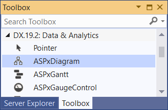
The ASPxDiagram control is available on the DX.19.2: Data & Analytics toolbox tab in the Microsoft Visual Studio IDE.
Drag the control onto a form and customize the control’s settings, or paste the control markup in the page’s source code.
<dx:ASPxDiagram ID="Diagram" runat="server">
</dx:ASPxDiagram>
Run Time
using DevExpress.Web.ASPxDiagram;
...
protected void Page_Load(object sender, EventArgs e) {
        ASPxDiagram diagram = new ASPxDiagram();
        diagram.ID = "ASPxDiagram1";
        // Add the created control to the page
        Page.Form.Controls.Add(diagram);
}
Client-Side API
The ASPxDiagram‘s client-side API uses JavaScript and is exposed by the ASPxClientDiagram object.
Availability | Available by default. |
Class name | |
Access name | |
Events |
Features
Bind to Data
The ASPxDiagram control can load external tree-like and graph structures. The supported data structures are listed below.
Node and Edge Data Sources
Specify a data source for shapes (NodeDataSourceID) and for shape connectors (EdgeDataSourceID). You must add mapping information for a shape’s Key and a connector’s Key, FromKey and ToKey properties. Optionally, you can specify other mapping properties for shapes and mapping properties for connectors.
The SettingsAutoLayout property allows you to specify the auto-layout algorithm and the orientation the control should use to build a diagram.
<dx:ASPxDiagram ID="Diagram" runat="server" Width="100%" Height="600px"
    NodeDataSourceID="FlowNodeDataSource" EdgeDataSourceID="FlowEdgeDataSource">
    <SettingsAutoLayout Type="Layered" Orientation="Vertical" />
    <Mappings>
        <Node ID="itemKey" />
        <Edge ID="key" FromID="beginItemKey" ToID="endItemKey" />
    </Mappings>
</dx:ASPxDiagram>
Linear Tree-Like Data Structure
Use the NodeDataSourceID property to bind the control to a data source. You must set the Key and ParentKey properties that allow the ASPxDiagram control to transform the linear structure to hierarchical. Optionally, you can specify other mapping properties for shapes.
<dx:ASPxDiagram ID="Diagram" runat="server" Width="100%" Height="600px" NodeDataSourceID="DepartmentsDataSource">
    <Mappings>
        <Node ID="Key" ParentID="ParentKey" />
    </Mappings>
</dx:ASPxDiagram>
Load and Save Diagram Content
Server Side
Use the Import(String) and Export() methods to load and save the diagram data in JSON format on the server side.
<dx:ASPxDiagram ID="Diagram" runat="server" Width="100%" Height="600px"/>
<dx:ASPxButton ID="btnSave" runat="server" Text="Save" OnClick="btnSave_Click"/>
<dx:ASPxButton ID="btnLoad" runat="server" Text="Load" OnClick="btnLoad_Click" />
using System.IO;
...
protected void btnSave_Click(object sender, EventArgs e) {
    using (StreamWriter diagramData = File.CreateText(MapPath(diagramDataPath))) {
        diagramData.WriteLine(Diagram.Export());
    }
}
protected void btnLoad_Click(object sender, EventArgs e) {
    Diagram.Import(File.ReadAllText(MapPath(diagramDataPath)));
}
Client Side
Use the Import(data) and Export methods to load and save the diagram data in JSON format on the client side.
<script>
    var diagramData;
    function SaveDiagramData(s, e) {
        diagramData = diagram.Export();
    };
    function LoadDiagramData(s, e) {
        diagram.Import(diagramData);
    };
</script>

<dx:ASPxDiagram ID="ASPxDiagram1" runat="server" ClientInstanceName="diagram" />

<dx:ASPxButton ID="btnSave" runat="server" Text="Save" AutoPostBack="False" ClientSideEvents-Click="SaveDiagramData" />
<dx:ASPxButton ID="btnLoad" runat="server" Text="Load" AutoPostBack="False" ClientSideEvents-Click="LoadDiagramData" />
Note
The ASPxDiagram stores an opened diagram’s data in its own text format. Modifying data returned by the Export() method is not recommended. A modified document can be loaded incorrectly.
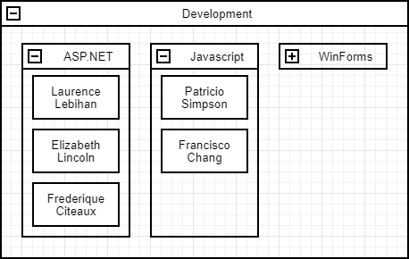
Containers
The horizontal and vertical containers allow you to combine other shapes within a container. The control supports stacked containers that can be expanded and collapsed.
You can load a diagram with containers from a data source. Use the ContainerKey property to specify the name of a data source field that provides the key of a shape’s parent container shape. Note, the parent container node must be of the VerticalContainer or HorizontalContainer type.
<dx:ASPxDiagram ID="Diagram" runat="server" NodeDataSourceID="NodeDataSource" Width="100%" Height="600px">
    <Mappings>
        <Node Key="ID" ContainerKey="ContainerID" Type="Type" Text="Text" Left="X" Top="Y" Width="Width" Height="Height" />
    </Mappings>
    ...
</dx:ASPxDiagram>
See demo | Online example: Diagram for Web Forms - How to bind containers to an in-memory data source
Custom Shapes
Use the CustomShapes property to extend the collection of built-in shapes with custom shapes, and the SettingsToolbox property to add a custom shape category to a data toolbox.
Note
Shape images should be supplied as SVG files.
<dx:ASPxDiagram ID="Diagram" runat="server" Width="100%" Height="600px">
    <SettingsToolbox>
        <Groups>
            <dx:DiagramToolboxGroup Category="Custom" CustomCategoryName="hardware" Title="Hardware" />
        </Groups>
    </SettingsToolbox>
    <CustomShapes>
        <dx:DiagramCustomShape Category="hardware" Type="internet" Title="Internet"
        BackgroundImageUrl="../Content/customshapes/shapes/internet.svg"
        BackgroundImageLeft="0.15" BackgroundImageTop="0" BackgroundImageWidth="0.7" BackgroundImageHeight="0.7"
        DefaultWidth="0.75" DefaultHeight="0.75" DefaultText="Internet" AllowEditText="true"
        TextLeft="0" TextTop="0.7" TextWidth="1" TextHeight="0.3">
            <ConnectionPoints>
                <dx:DiagramShapeConnectionPoint Left="0.5" Top="0" />
                <dx:DiagramShapeConnectionPoint Left="0.9" Top="0.5" />
                <dx:DiagramShapeConnectionPoint Left="0.5" Top="1" />
                <dx:DiagramShapeConnectionPoint Left="0.1" Top="0.5" />
            </ConnectionPoints>
        </dx:DiagramCustomShape>
        ...
    </CustomShapes>
</dx:ASPxDiagram>

Simple View
Set the SimpleView option to true to enable Simple View mode. In Simple View mode, the control does not divide the work area into pages and the diagram’s content occupies all the available area inside the control.

<dx:ASPxDiagram ID="Diagram" runat="server" Width="100%" Height="600px" SimpleView="true">
</dx:ASPxDiagram>
Read Only Mode
Set the ReadOnly property to true to protect the ASPxDiagram control from edit operations.
<dx:ASPxDiagram ID="Diagram" runat="server" Width="100%" Height="600px" ReadOnly="true">
</dx:ASPxDiagram>
UI Customization
Use the following properties to customize the ASPxDiagram control’s UI elements:
- The SettingsToolbox property controls the toolbox’s visibility and specifies the visible groups.
- The SettingsSidePanel property controls the side panel’s visibility.
<dx:ASPxDiagram ID="Diagram" runat="server" Width="100%" Height="600px">
    <SettingsToolbox Visibility="Visible">
        <Groups>
            <dx:DiagramToolboxGroup Category="General" />
            <dx:DiagramToolboxGroup Category="Custom" CustomCategory="hardware" Title="Hardware" />
        </Groups>
    </SettingsToolbox>
    <SettingsSidePanel Visibility="Visible" />
    <CustomShapes>
      ...
    </CustomShapes>
</dx:ASPxDiagram>

Export to Image Format
You can export a diagram to SVG, PNG, and JPEG file formats.
To export a diagram, click Export and select the file format.
