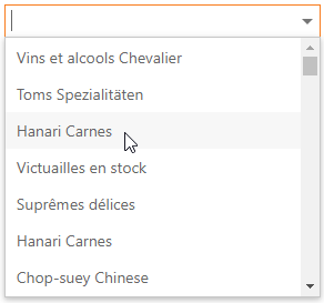
ASPxComboBox Class
An editor which displays a list of items within its dropdown window.
Namespace: DevExpress.Web
Assembly: DevExpress.Web.v23.2.dll
NuGet Package: DevExpress.Web
Declaration
public class ASPxComboBox :
    ASPxAutoCompleteBoxBase,
    IListBoxColumnsOwner,
    IValueTypeHolder,
    IControlDesigner,
    IListEditItemRequestEventOwner,
    IListEditCustomFilteringEventOwner,
IListEditServerModeOwnerRemarks
The ASPxComboBox control combines the functionality of a text editor, button editor, and drop-down list editor. The editor’s drop-down menu displays a list of items that users can select.
Create a ComboBox Control
Design Time
The ASPxComboBox control is available on the DX.23.2: Common Concepts toolbox tab in the Microsoft Visual Studio IDE.
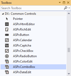
Drag the control onto a form and customize the control’s settings, or paste the control’s markup in the page’s source code.
<dx:ASPxComboBox ID="ASPxComboBox1" runat="server">
</dx:ASPxComboBox>
Run Time
using DevExpress.Web;
//...
protected void Page_Load(object sender, EventArgs e) {
    ASPxComboBox comboBox = new ASPxComboBox();
    comboBox.ID = "ASPxComboBox1";
    // Add the created control to the page
    Page.Form.Controls.Add(comboBox);
}
Client-Side API
Availability | Set the ASPxEditBase.EnableClientSideAPI property to |
Client object type | |
Access name | |
Events |
Bind to Data
Specify the DataSourceID property to bind ASPxComboBox at design time, or call the DataBind() or DataBindItems() method to bind the editor at runtime.
Important
If you bind ASPxComboBox at runtime, make sure that you perform this operation during each round trip to the server in the control’s Init or Page_Init event.
The ASPxComboBox automatically binds its items to data if the data source fields are named in the same way as the item properties (Text, Name, ImageUrl). Otherwise, you should specify these properties:
Name | Description |
|---|---|
Specifies the data source field that contains the image location for the editor’s items. | |
Specifies the data source field that contains texts to display in the dropdown. | |
Specifies the data source field that contains values for the editor’s items. |
<dx:ASPxComboBox ID="ASPxComboBox1" runat="server"
    DataSourceID="ProductsDataSource" TextField="ProductName" ValueField="ProductName">
    <!--...-->
</dx:ASPxComboBox>
<ef:EntityDataSource runat="server" ID="ProductsDataSource" ... />
The ASPxAutoCompleteBoxBase.Items collection contains the ASPxComboBox‘s items. You can access an individual item and specify its properties (ListEditItem).
See also: How to bind the ASPxComboBox to a data source
Database Server Mode
In this mode, the editor loads only required (visible) items to the server memory and executes data operations (for instance, filtering) at the data source level. The GridViewDataComboBoxColumn object does not support database server mode.
Bind the ASPxComboBox to the LinqServerModeDataSource or EntityServerModeDataSource and set the EnableCallbackMode property to true to enable the database server mode.
See also: Binding to Large Data
Item Load Modes
The ASPxComboBox supports the following load modes:
Load Mode | Description | Affected Properties |
|---|---|---|
Default | The editor loads items and executes all data operations (for instance, scrolling, filtering, and so on) on the client without a round trip to the server. | EnableCallbackMode=”False” |
On-Demand | You can use callbacks to load items from the server on demand. For instance, the editor can dynamically load non-displayed items when a user scrolls the dropdown. | EnableCallbackMode = “True” |
Dynamic | You can manually populate a dropdown list with the required items based on the filter criteria and a user’s scroll action. | EnableCallbackMode=”True” |
<dx:ASPxComboBox ID="ASPxComboBox1" runat="server"  EnableCallbackMode="true" CallbackPageSize="30"
    DataSourceID="SqlDataSource1" ValueField="ShipName" TextField="ShipName">
</dx:ASPxComboBox>
<asp:SqlDataSource ID="SqlDataSource1" runat="server" ...></asp:SqlDataSource>
See also: Item Load Modes
Incremental Filtering
Use the ASPxAutoCompleteBoxBase.IncrementalFilteringMode property to enable the control to filter data while a user types the filter string.
Filter Mode | Description |
|---|---|
StartsWith | The editor filters items that begin with the filter string. |
Contains | The editor filters items that contain the filter string. |
<dx:ASPxComboBox ID="Countries" runat="server" EnableCallbackMode="True" IncrementalFilteringMode="StartsWith">
    <Items>
        <!--...-->
    </Items>
</dx:ASPxComboBox>
You can also use the following properties:
Property | Description |
|---|---|
Specifies the time interval after which the editor filters items. | |
Specifies the minimum filter string length to filter items. |
See also: Incremental Filtering
Custom Filtering
You can filter items by multiple words and columns, or use diacritic characters in the filter string.
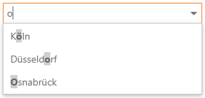
<dx:ASPxComboBox ID="CmbWithClientFiltering" runat="server" ValueField="Name" TextField="Name" DataSourceID="GermanCitiesDataSource" IncrementalFilteringMode="Contains">
    <ClientSideEvents ItemFiltering="onItemFiltering" CustomHighlighting="onCustomHighlighting" />
</dx:ASPxComboBox>
See also: Custom Filtering
Display Format
You can specify indexed placeholders (such as “{0}”, “{1}”, and so on) and literals for the following properties to customize the text of the ASPxComboBox‘s edit box:
Property | Description |
|---|---|
Defines a pattern to display the selected item’s text when there are several columns in the dropdown. | |
Defines the pattern applied to the editor’s value. |
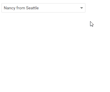
<dx:ASPxComboBox ID="ASPxComboBox4" runat="server" DataSourceID="EmployeesDataSource"
                 TextFormatString="{0} from {2}" ValueField="EmployeeID">
    <Columns>
        <!--...-->
    </Columns>
</dx:ASPxComboBox>
Multi-Column Mode
The ASPxComboBox allows you to display a collection of data source fields as multiple columns in the drop-down list.
In design mode, invoke the Designer… and select the Columns… item from the smart tag menu to add and configure columns.
Alternatively, you can use the ASPxComboBox.Columns property to access the editor’s columns collection. Specify the ListBoxColumn.FieldName property to bind the column’s items to a data source field.
You can also specify header caption, width, visibility state, and other settings for columns.
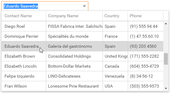
<dx:ASPxComboBox ID="CmbCustomers" runat="server" DataSourceID="CustomersDataSource" ValueField="CustomerID" ValueType="System.String" TextFormatString="{0}" EnableCallbackMode="true">
    <Columns>
        <dx:ListBoxColumn FieldName="ContactName" />
        <!--...-->
    </Columns>
</dx:ASPxComboBox>
See also: List Editors in Multi-Column Mode
Item Images
The ASPxComboBox‘s drop-down window can display items with associated images.
Property | Description |
|---|---|
Specifies a uniform image for all editor’s items. | |
Specifies an image for an individual item. | |
Specifies a data field that contains image URLs. |
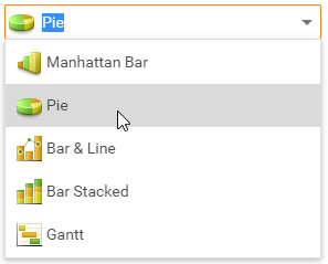
<dx:ASPxComboBox ID="ASPxComboBox2" runat="server" ShowImageInEditBox="True">
    <ItemImage Height="24px" Width="23px" />
    <Items>
        <dx:ListEditItem Text="Manhattan Bar" ImageUrl="your path" />
        <!--...-->
    </Items>
</dx:ASPxComboBox>
Item Appearance Customization
The ASPxComboBox allows you to customize item appearance. Use the ItemTextCellPrepared and ItemRowPrepared events to specify the style of the drop-down window’s cells and rows.
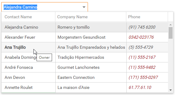
<dx:ASPxComboBox ID="customersComboBox" runat="server" DataSourceID="CustomersDataSource" ValueField="CustomerID" ValueType="System.String" TextFormatString="{0}" EnableCallbackMode="true" OnItemTextCellPrepared="customersComboBox_ItemTextCellPrepared" OnItemRowPrepared="customersComboBox_ItemRowPrepared">
    <Columns>
        <dx:ListBoxColumn FieldName="ContactName" />
        <dx:ListBoxColumn FieldName="CompanyName" />
        <dx:ListBoxColumn FieldName="Phone" />
    </Columns>
</dx:ASPxComboBox>
Item Template
Use the ASPxAutoCompleteBoxBase.ItemTemplate property to define a custom layout for the editor’s items.
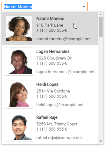
<dx:ASPxComboBox ID="ComboBox" EnableCallbackMode="true" DataSourceID="ContactsDataSource" TextField="Name" runat="server">
    <ItemTemplate>
        <table>
            <tr>
                <td rowspan="2">
                    <div class="frame">
                        <img class="photo" alt="photo" src="<%# Page.ResolveUrl(Eval("PhotoUrl").ToString()) %>" />
                    </div>
                </td>
                <!--...-->
        </table>
    </ItemTemplate>
</dx:ASPxComboBox>
Customizable Button Collection
The ASPxComboBox contains an edit button collection (EditButtonCollection) that allows you to define button appearance and handle its events. You can also customize the DropDownButton‘s settings.

<dx:ASPxComboBox ID="ASPxComboBox" runat="server">
    <Buttons>
        <dx:EditButton Text="Previous" Position="Left" />
        <dx:EditButton Text="Next" Position="Right" />
    </Buttons>
</dx:ASPxComboBox>
See also: EditButton
Built-in Validation
The ASPxComboBox supports the client-side and server-side validation.
The control allows you to define validation rules in the following ways:
The ValidationSettings.RequiredField property allows you to mark the editor as required.
The ValidationSettings.RegularExpression property allows you to validate the editor’s value based on a regular expression.
Validation events validate the editor’s input data on the client or server.
<dx:ASPxComboBox ID="ASPxComboBox" runat="server" DataSourceID="SqlDataSource1" TextField="City" ValueField="City" >
    <ValidationSettings ErrorTextPosition="Bottom" Display="Dynamic">
        <RequiredField IsRequired="True" ErrorText="Select a city!" />
    </ValidationSettings>
</dx:ASPxComboBox>
See also: Validation