ASPxButton Class
A button control.
Namespace: DevExpress.Web
Assembly: DevExpress.Web.v21.2.dll
NuGet Package: DevExpress.Web
Declaration
public class ASPxButton :
    ASPxWebControl,
    IButtonControl,
    IRequiresLoadPostDataControl,
IAssociatedControlIDRemarks
The Button offers extended functionality not available with the standard ASP.NET button. It ships with an enhanced client API and supports the DevExpress appearance customization engine.
Create a Button
Design Time
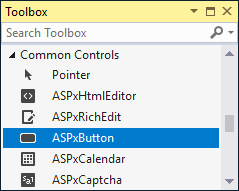
The ASPxButton control is available on the DX.21.2: Common Controls toolbox tab in the Microsoft Visual Studio IDE.
Drag the control onto a form and customize the control’s settings, or paste the control markup in the page’s source code.
Note
To properly function, DevExpress controls require that special modules, handlers and options are registered in the the Web.config file. Switch the Microsoft Visual Studio IDE to the Design tab to automatically update the Web.config file with the required DevExpress information.
<dx:ASPxButton ID="MyButton" runat="server" Text="Show Alert" AutoPostBack="False" >
     <ClientSideEvents Click="function(s, e) {alert('Hello, world');}" />
</dx:ASPxButton>
Run Time
using DevExpress.Web;
...
protected void Page_Load(object sender, EventArgs e) {
     ASPxButton button = new ASPxButton();
     button.ID = "MyButton";
     button.Text = "Show Alert";
     button.AutoPostBack = false;
     button.ClientSideEvents.Click = "function(s, e) {alert('Hello, world');}";
     // Add the created control to the page
     Page.Form.Controls.Add(button);
}
Client-Side API
The ASPxButton‘s client-side API is implemented with JavaScript language and exposed by the ASPxClientButton object.
Availability | Available if the EnableClientSideAPI property is set to true, or the ClientInstanceName property is defined, or any client event is handled. |
Client object type | |
Access name | |
Events |
Render Modes
Use the RenderMode property to specify how the ASPxButton control is rendered on the page. The ButtonRenderMode enumeration lists the property’s available values.
Set the Native property to true to render the ASPxButton control as a native input element.
<dx:ASPxButton ID="btnNewItem" runat="server" RenderMode="Link" Text="New Item" AutoPostBack="false"
    ImagePosition="Right" Image-IconID="actions_additem_16x16gray" />
<dx:ASPxButton ID="btnDelete" runat="server" RenderMode="Danger" Text="Delete" Width="164px" AutoPostBack="false" />
<dx:ASPxButton ID="btnNative" runat="server" Native="True" Text="Native" Width="164px"  AutoPostBack="false" />
Radio Button Mode
Use the GroupName property to create a mutually exclusive group of buttons. When the GroupName property is set, only one button in the specified group can be checked at one time. The Checked property specifies a button’s checked state. When a checked state is changed, the CheckedChanged event fires.
<dx:ASPxButton ID="ASPxButton1" runat="server" AutoPostBack="False" GroupName="G" Text="Option 1" Checked="True" />
<dx:ASPxButton ID="ASPxButton2" runat="server" AutoPostBack="False" GroupName="G" Text="Option 2" />
<dx:ASPxButton ID="ASPxButton3" runat="server" AutoPostBack="False" GroupName="G" Text="Option 3" />
Validation
When the ASPxButton control is clicked, it forces validation of all verifiable web controls on a web page on both the client side and server side. Set the AutoPostBack property to false to perform client-side validation only. Set the CausesValidation property to false to prevent any validation.