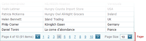
Pager
The pager enables end-users to navigate through the GridView’s data. It consists of navigation buttons: “next”, “last”, “previous”, “first”, an indicator that displays the current page number, the total number of pages, and a page size item allowing end-users to specify the number of items displayed on a page.
The table below lists the main members which affect the element’s appearance and functionality:
Characteristics | Members |
|---|---|
Position | ASPxGridPagerSettings.Position (via GridViewSettings.SettingsPager.Position) |
Settings | |
Style |
GridViewStyles.PagerTopPanel (via GridViewSettings.Styles.PagerTopPanel) GridViewStyles.PagerBottomPanel (via GridViewSettings.Styles.PagerBottomPanel) |