ComboBox
- 6 minutes to read
ComboBox combines the functionality of a single-line text editor, button editor and dropdown list editor. The editor’s dropdown displays a list of items that can be selected by end-users. Selecting an item changes the editor’s edit value.
To learn more about ComboBox and see it in action, refer to our online demos.
Implementation Details
ComboBox is realized by the ComboBoxExtension class. Its instance can be accessed via the ExtensionsFactory.ComboBox helper method, which is used to add a ComboBox extension to a view. This method’s parameter provides access to the ComboBox‘s settings implemented by the ComboBoxSettings class, allowing you to fully customize the extension.
ComboBox‘s client counterpart is represented by the MVCxClientComboBox object.
Declaration
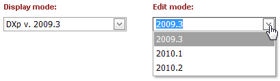
ComboBox can be added to a view in the following manner.
@Html.DevExpress().ComboBox(settings => {
    settings.Name = "comboBox1";
    settings.Width = 180;
    settings.SelectedIndex = 0;
    settings.Properties.DisplayFormatString = "DXp v. {0}";
    settings.Properties.ValueType = typeof(string);
    settings.Properties.Items.Add("2009.3");
    settings.Properties.Items.Add("2010.1");
    settings.Properties.Items.Add("2010.2");
}).GetHtml()
Note
The Partial View should contain only the extension’s code.
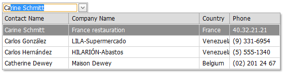
The code result is demonstrated in the image below.
Main Features
Data-Bound and Unbound Modes Support (See demo)
The editor’s contents can be generated dynamically by binding the editor to a data source, as well manually populating the editor’s item collection. When retrieving items from the data source, item characteristics such as the text, value, and image are obtained from specific data fields that can be defined manually or are obtained automatically providing the data fields named in a specific way. See the Binding Data Editors to Data topic to learn more.
Three Item Loading Modes
Combo Box items can be loaded from the server on demand (via callbacks) when the editor’s callback routing logic is defined using the AutoCompleteBoxBaseSettings.CallbackRouteValues property.
Loading Mode Description Default All items are loaded to the client side, so all data operations (such as scrolling, filtering) are performed on the client, without generating a round trip to the server. On-Demand Items are loaded from the server on demand, via callbacks. For instance, list items that are not currently displayed within the editor’s dropdown window can be dynamically loaded when an end-user scrolls the list. This callback mode makes the first page load much faster, since only a few items need to be initially loaded. Dynamic You can manually populate a dropdown list with the required item portions, based on the currently applied filter criteria (the ComboBoxSettings.Properties.IncrementalFilteringMode (AutoCompleteBoxPropertiesBase.IncrementalFilteringMode) property value is other then “None”) and the list scrolling performed. Incremental Filtering (See demo)
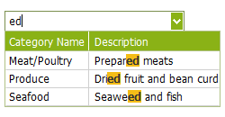
You can enable your end-users to filter list items dynamically, based upon the text typed into the editor’s input box on the client side (find-as-you-type filtering). The following filter modes are available.
Loading Mode Description StartsWith The editor is filtered for list items that begin with the search string. Contains The editor is filtered for list items that contain the search string. The found search string is highlighted within items for clarity. You can enable the required filter mode via the ComboBoxSettings.Properties.IncrementalFilteringMode (AutoCompleteBoxPropertiesBase.IncrementalFilteringMode) property.
Custom Filtering (See demo)
The ComboBox enables you to implement custom filtering logic on the server and client sides. For example, you can filter items by several words and multiple columns simultaneously or filter items that contain diacritic characters. Refer to the Custom Filtering for more information.
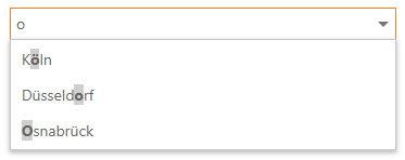
Delayed Filtering (See demo)
You can define the time interval between the time a user starts typing within the editor’s edit box (the ComboBoxSettings.Properties.IncrementalFilteringDelay (AutoCompleteBoxPropertiesBase.IncrementalFilteringDelay) property) and the time that filtering is applied. Moreover, when the ComboBox editor is in an incremental filtering mode, it has the capability to start filtering only after an end-user has typed a specific number of symbols in the editor’s text box (see the ComboBoxSettings.Properties.FilterMinLength (AutoCompleteBoxPropertiesBase.FilterMinLength) property).
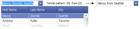
Display Formatting (See demo)
Editor display values can be formatted using the standard formatting mechanism. The ComboBoxSettings.Properties.TextFormatString (AutoCompleteBoxPropertiesBase.TextFormatString) property allows you to define the pattern used to format the selected item’s text displayed within the editor’s edit box.
Multi-Column Mode (See demo)
It’s possible to represent the ComboBox’s list data in several columns. This functionality is in effect if the editor’s items collection is obtained from a data source. You can also define a column’s header caption, width, visibility state and other settings for columns.
Item Images
You can specify a uniform image for all editor items (the ComboBoxSettings.Properties.ItemImage (AutoCompleteBoxPropertiesBase.ItemImage) property) or define images for individual items (see the ComboBoxSettings.Properties.ImageUrlField (AutoCompleteBoxPropertiesBase.ImageUrlField) property). Images associated with list items are displayed within the editor’s dropdown list. The selected item image can be displayed within the editor’s edit box in addition to the text.
Customizable Button Collection
The ComboBox editor provides a collection to maintain its custom edit buttons. Each button exposes a set of properties allowing the button’s appearance and behavior to be defined. The settings of the default button, which invokes the dropdown window when clicked, can be customized as well.

Built-in Validation
The ComboBox extension allows you to perform data validation both on the client and server side. See the Built-in Validation topic to learn more.
Full-Featured Client-Side API
The ComboBox provides you with a comprehensive client-side API. This API is implemented using JavaScript and is exposed via the MVCxClientComboBox object. The MVCxClientComboBox object serves as a client-side equivalent of the ComboBox extension.
You can modify the editor behavior using the following methods.
Method Description ASPxClientComboBox.AddItem Adds a new item to the end of the control’s item collection. ASPxClientComboBox.BeginUpdate Prevents the client combobox editor from being rendered until the ASPxClientComboBox.EndUpdate method is called. ASPxClientComboBox.ClearItems Removes all items from the client combo box editor. ASPxClientComboBox.EndUpdate Re-enables editor render operations after a call to the ASPxClientComboBox.BeginUpdate method and forces an immediate re-rendering. ASPxClientComboBox.FindItemByText Returns a combo box item by its text. ASPxClientComboBox.FindItemByValue Returns a combo box item by its value. ASPxClientComboBox.GetItem Returns an item specified by its index within the combo box editor’s item collection. ASPxClientComboBox.GetItemCount Gets the number of items contained in the editor’s item collection. ASPxClientComboBox.GetSelectedIndex Returns the index of the selected item within the combo box editor. ASPxClientComboBox.GetSelectedItem Returns the combo box editor’s selected item. ASPxClientComboBox.GetText Gets the text displayed in the editor’s edit box. ASPxClientComboBox.InsertItem Adds a new item to the control’s items collection at the specified index. ASPxClientComboBox.MakeItemVisible Scrolls the editor’s item list, so that the specified item becomes visible. ASPxClientComboBox.PerformCallback Sends a callback to the server. ASPxClientComboBox.RemoveItem Removes an item specified by its index from the client list editor. ASPxClientComboBox.SetSelectedIndex Sets the combobox editor’s selected item specified by its index. ASPxClientComboBox.SetSelectedItem Sets the list editor’s selected item. ASPxClientComboBox.SetText Specifies the text displayed within the editor’s edit box.