RadioButtonList
- 2 minutes to read
RadioButtonList represents a group of radio button editors that allow you to select one option from several.
Implementation Details
RadioButtonList is realized by the RadioButtonListExtension class. Its instance can be accessed via the ExtensionsFactory.RadioButtonList) helper method, which is used to add a RadioButtonList extension to a view. This method’s parameter provides access to the RadioButtonList‘s settings implemented by the RadioButtonListSettings class, allowing you to fully customize the extension.
The RadioButtonList‘s client counterpart is represented by the ASPxClientRadioButtonList object.
Declaration
RadioButtonList can be added to a view in the following manner.
View code (ASPX):
<%
Html.DevExpress().RadioButtonList(
settings => {
settings.Name = "radioButtonList1";
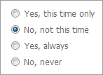
settings.Properties.Items.Add("Yes, this time only");
settings.Properties.Items.Add("No, not this time");
settings.Properties.Items.Add("Yes, always");
settings.Properties.Items.Add("No, never");
settings.SelectedIndex = 1;
}
)
.Render();
%>
View code (Razor):
@Html.DevExpress().RadioButtonList(
    settings => {
        settings.Name = "radioButtonList1";

        settings.Properties.Items.Add("Yes, this time only");
        settings.Properties.Items.Add("No, not this time");
        settings.Properties.Items.Add("Yes, always");
        settings.Properties.Items.Add("No, never");

        settings.SelectedIndex = 1;
    }).GetHtml()
Note
The Partial View should contain only the extension’s code.
The code result is demonstrated in the image below.
Main Features
The RadioButtonList editor is a radio button group that provides end-users with the ability to select a single item at a time.
The RadioButtonList supports both data-bound and unbound modes. This means that its contents can be generated dynamically by binding the editor to a data source, as well as manually populating the control’s item collection.
Selection
The item selected within the RadioButtonList can be determined by iterating through list items and inspecting an item’s ListEditItem.Selected property. You can easily manipulate a select item on the client side by using specific client methods (ASPxClientListEdit.GetSelectedItem/ASPxClientListEdit.SetSelectedItem, ASPxClientListEdit.GetSelectedIndex/ASPxClientListEdit.SetSelectedIndex).
Layout Customization
The RadioButtonList layout is flexibly customized. You can display check box items in several columns using the RadioButtonListSettings.Properties.RepeatColumns (CheckListPropertiesBase.RepeatColumns) property, set a direction of items within the editor (horizontal or vertical through the RadioButtonListSettings.Properties.RepeatDirection (CheckListPropertiesBase.RepeatDirection) property), and specify whether items are aligned within a table or rendered without any table structure using the RadioButtonListSettings.Properties.RepeatLayout (CheckListPropertiesBase.RepeatLayout) property.
Custom Item Images
The RadioButtonList editor allows you to specify images for its items. You can specify one image for all items within the control using the RadioButtonListSettings.Properties.ItemImage (ListEditProperties.ItemImage) property, or set a particular image for each item using the item’s ListEditItem.ImageUrl property.