CheckBox
- 3 minutes to read
CheckBox represents a check editor that allows the end user to make a selection, such as true/false or yes/no.
Implementation Details
CheckBox is realized by the CheckBoxExtension class. Its instance can be accessed via the ExtensionsFactory.CheckBox helper method, which is used to add a CheckBox extension to a view. This method’s parameter provides access to the CheckBox‘s settings implemented by the CheckBoxSettings class, allowing you to fully customize the extension.
CheckBox‘s client counterpart is represented by the ASPxClientCheckBox object.
Declaration
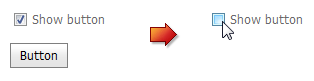
CheckBox can be added to a view in the following manner.
@Html.DevExpress().CheckBox(settings => {
    settings.Name = "checkBox1";
    settings.Checked = true;
    settings.Text = "Show button";
    settings.Properties.ClientSideEvents.CheckedChanged = "function (s, e){ myButton.SetVisible(!myButton.GetVisible());}";
}).GetHtml()

@Html.DevExpress().Button(settings => {
    settings.Name = "myButton";
    settings.EnableClientSideAPI = true;
}).GetHtml()
Note
The Partial View should contain only the extension’s code.
The code result is demonstrated in the image below.
Main Features
The CheckBox extension is a check editor that allows end-users to select yes/no or true/false conditions. A check state can be switched by clicking the editor with the mouse or by pressing the SPACE key when the editor has focus.
The CheckBox offers the following features.
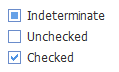
Three State Support
A check box can be set to either the checked or unchecked check state by default. Additionally, you can enable the third grayed (indeterminate) state using the CheckBoxSettings.Properties.AllowGrayed (CheckBoxProperties.AllowGrayed) property.
Native Rendering
The CheckBox supports native rendering as a native HTML input element of the checkbox type. When the native HTML mode is enabled, an extension appearance depends on how a client browser renders native HTML elements. This reduces the render size and improves the editor’s overall performance. Set the CheckBoxSettings.Native property value to true to enable native rendering.
Appearance Customization
A check box edit region (check mark) is represented by an image within the CheckBox editor by default. It is possible to assign your own images to be displayed for different check box states.

You can customize the extension appearance using predefined built-in visual themes. See this topic to learn more: Applying Themes.
Built-in Validation
The CheckBox extension allows you to perform data validation both on the client and server side. See the Built-in Validation topic to learn more.
Full-Featured Client-Side API
The CheckBox provides you with a comprehensive client-side API. This API is implemented using JavaScript and is exposed via the ASPxClientCheckBox object. The ASPxClientCheckBox object serves as the client-side equivalent of the CheckBox extension.
You can operate with the editor values using the following methods.
Method Description ASPxClientCheckBox.GetChecked Returns a value indicating whether the check box editor is checked. ASPxClientCheckBox.GetCheckState Returns a value which specifies a check box checked state. ASPxClientCheckBox.GetText Returns the text displayed within the editor. ASPxClientCheckBox.SetChecked Sets a value which specifies the checked status of the check box editor. ASPxClientCheckBox.SetCheckState Sets a value specifying the state of a check box. ASPxClientCheckBox.SetText Sets the text to be displayed within the editor.